Web Design Layouts | Types, Elements and Uses
Last Updated :
14 May, 2024
A web design layout is the structure that defines how elements are placed on a webpage. It is the plan that guides the visual presentation of the content on a webpage. A good web design layout organizes the text, images, video & other elements on a webpage in a way that conveys information effectively while maintaining an eye-catching appearance.
Web design layouts are the elements that make up a webpage. They are essential for creating a smooth user experience. They control the placement of content, text & multimedia providing visual organization & ease of use. Different layouts like grid, and asymmetric & offer different visual styles & features to meet different needs & user preferences.
A well-designed layout combines aesthetics with functionality, making it easier to read, easier to use & more engaging for users. It is the foundation that builds a website presentation, creating an immersive digital space where content is presented effectively & interactions are easy to understand.
Types of Web Design Layouts
- Static layout: A static layout keeps elements the same size & position on all pages of your website. Images, text blocks & navigation menu stay the same on all devices & screens.
- Fluid or Liquid Layout: Fluid layouts use relative units such as percentages instead of fixed pixels. Fluid layouts are responsive & can be adjusted to fit any screen size. In this, the size of the element increases/decreases depending on the size of the screen window.
- Responsive layout: The goal of responsive design is to create responsive layouts that look great on any device & on any screen size. Responsive design works by combining fluid grids, responsive images & responsive CSS media queries.
- Grid layout: Grid-based layouts use a grid structure to organize the content elements. It uses columns, rows & modules to achieve a well-ordered & aesthetically pleasing layout.
- Asymmetrical layout: In contrast to balanced designs, asymmetrical layouts use different shapes, placement & visual weightings to create a different & unusual look.
Why to Use?
Choosing the right web design layout can make all the difference in accomplishing certain goals & improving user experience. Static layouts while less common in the modern era provide uniformity across pages and are perfect for websites where consistency is a priority. Fluid layouts are responsive to different screen sizes. This means that content can be accessed on multiple devices making it more accessible. Responsive schemes highly demandable. A grid layout allows you to organize your content in a logical way. This helps to ensure that your content is organized & in harmony with each other. This is important because it helps to make your content easier to understand & to engage with. Asymmetrical layouts encourage innovation, create distinct visual identity, draw attention & design websites looking to differentiate themselves.
Each layout serves a different purpose such as static for consistency, fluid or responsive for flexibility, grid for organization & asymmetric for innovation. This allows designers to match the layout to the websites goals, target audience & user journey improving usability.
Key Elements
- Header: The section at the top of your website that contains your logo, your navigation menu & often your contact details or search bar. These are the most important navigation tools.
- Navigation: Whether it is the header, the footer intuitive menus that guide users through different parts of the website improve accessibility & user experience.
- Content area: A central space that houses the essential content such as text, photos, video & other content arranged in order of importance for ease of access.
- Whitespace: The blank area is used strategically around elements to improve readability, highlight content & reduce clutter.
- Sidebar: Optional but helpful for add ons, navigation links it supports the core content without taking away from it.
- Color & visual Elements: Color schemes & other visual elements that maintain brand identity, improve visual appeal & capture the attention of users.
 Elements of Web Design Layout
Working Process
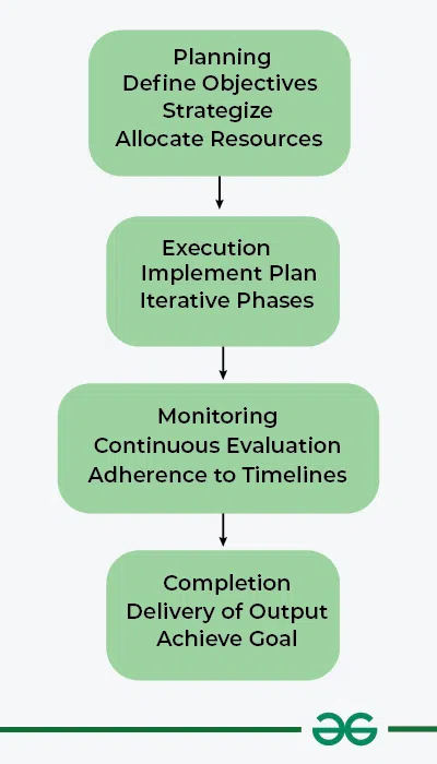
A working process is a set of steps/techniques used to accomplish a task or goal effectively. It is the process of planning, executing & completing tasks in an organized manner. It usually starts with strategic planning sessions to set goals, followed by strategic planning & delegation of tasks. Clear channels of communication & roles are important throughout the process. Then execution occurs often in the form of iterative phases where feedback & changes can be made. This is followed by continuous monitoring & evaluation to ensure timelines & quality criteria are adhered to. Finally the process ends with the final product of the objective. Flexibility & continuous improvement are key components of any successful work process to increase efficiency & maximize performance.
- Strategic planning session: These are the first meetings where you set goals & objectives. This is when you brainstorm, come up with ideas & get a clear idea of what you want to achieve with your task.
- Clear communication & roles: This step focuses on creating clear & transparent communication channels within your team. This step involves creating clear roles & responsibilities so that everyone understands their roles & what is expected of them.
- Execution & iterative phase: Execution is the process of carrying out the tasks that have been set out in advance. This is usually done in the form of iterative steps where feedback & changes can be made. This step by step approach allows you to make changes & improvements as your project progresses.
- Monitoring & continuous evaluation: This process is carried out throughout the process. This includes monitoring progress identifying bottlenecks & ensuring timelines & quality criteria are adhered to.
- Final goal or output: This is the point at which the end product & the goals are completed.
 Working Process
Some Practices to Avoid During Web Layout
- Avoid over the top design elements that overload users & prevent them from navigating information.
- Avoid mixing colors using low contrast that distracts the eye or makes it difficult to read the text on your website.
- Do not use too many fonts & different font sizes & styles all over your website.
- If responsiveness is not taken care of across devices you will suffer from poor user experience on different screen sizes.
- Avoid auto playing media.
Conclusion
One of the most important things to consider when designing a website layout is user experience. Avoid intrusive elements such as auto playing media. Make sure the text is legible by using consistent typography & make sure it is easy to navigate. Responsive design is easy to use navigate and optimized loading times add to the overall user experience. Balancing the two creates a friendly, interactive & accessible online space that appeals to a broad range of users.
Similar Reads
Layout Element in Web Design
What are Web Layouts?Web Layout Elements play a vital role in structuring and designing a web page responsive and effective. This is a crucial thing when companies or organizations work for their website as few provide the information visually perfectly and few make the transactions on their website
6 min read
Visual Elements of Web Design
Visual elements are the basic parts that make up any design. These include lines, shapes, colors, textures, typography, space, and images. When used together, these elements help create designs that look good and communicate messages clearly. Understanding these visual elements is important for anyo
8 min read
Functional Elements of Web Design
Website design generally refers to arranging of contents of a website so that it can provide a better experience to users. Most of the websites are designed using HTML (Hypertext Markup language) as a programming language. In order to make a website functional i.e., to meet the primary purpose and r
6 min read
Visual Hierarchy Element in Web Design
In web design, we have limited time and limited user's attention and it is tough to convey our message to the visitor in that limited time meanwhile also ensuring no miscommunication happens. Visual Hierarchy enables us to guide the user on what's more important to them as well as to us hence preven
5 min read
Principle and Elements of Ecommerce UI/UX Design
What is E-Commerce?E-commerce also known as online commerce facilitates the buying and selling of goods and services over the Internet. E-commerce encompasses components such as online stores secure electronic payment methods, digital marketing techniques such as search engine optimization (SEO) and
5 min read
UI Design of Travel and Tourism Website
Designing a Travel & Tourism Web UI means to cover every possible method to attract users to the site in order to increase the user interactivity and dependency of the user on the site rather than opting for the conventional set of rules to book a travel. In this article we will be covering basi
3 min read
Navigation Element in Web Design
Navigation elements are an important part of web design. Proper navigation, always helps users in finding what they are looking for in a website. Navigation elements are buttons, menus, links, and breadcrumbs which makes it easier for the user to navigate through the website and find information. In
5 min read
8 Types of Graphic Design with Examples
Graphic design is everywhere, shaping how we interact with the world through visuals. From creating eye-catching logos to developing user-friendly websites and apps there are 8 different types of graphic design. This article is perfect for anyone curious about graphic design's role in our daily live
6 min read
Role of Coding in Web Design Process
Coding allows web designers to make websites that can interact with users, databases, and other web resources. Coding also lets web designers add various features and functions, such as navigation, layout, animation, responsiveness, accessibility, and security Today we will look at the significant r
6 min read
CSS Rules in Web Design for All Screens
A website is a beautiful convergence of art, tech, and science. It reflects all in the web design field. To craft a fully functional, appealing, intuitive, user-friendly HTML, CSS, and Javascript are the three major parts of web design. HTML is like a document skeleton; CSS manages the visuals and l
6 min read