Visualizing high-dimensional data helps uncover patterns, relationships and insights that are not easily seen in raw data. By reducing complexity and projecting data into two or three dimensions, these techniques make it easier to interpret and analyze large datasets effectively.
1. Principal Component Analysis (PCA)
Principal Component Analysis (PCA) is a popular dimensionality reduction technique that converts high-dimensional data into fewer dimensions while preserving the maximum possible variance. It helps simplify complex datasets for easier visualization and analysis.
- Identifies principal components the directions of maximum variance in the data.
- Reduces the number of features making models simpler and faster.
How PCA Works
- Standardize the Data: Ensure each feature has a mean of zero and a standard deviation of one.
- Compute the Covariance Matrix:The covariance matrix captures the relationships between different features.
- Calculate Eigenvalues and Eigenvectors: Eigenvectors define the directions of the principal components, while eigenvalues indicate how much variance each component captures.
- Select Principal Components: Choose the top k eigenvectors corresponding to the largest eigenvalues.
- Transform the Data: Project the original standardized data onto the selected principal components to obtain the reduced-dimensional representation.
When to Use PCA
- Suitable for reducing dimensionality in datasets with linear relationships between features.
- Effective when the first few principal components capture most of the variance.
- Useful for noise reduction and visualization while preserving important information.
Implementation of Principal Component Analysis
Here we show how PCA reduces high-dimensional data into a lower-dimensional form for effective visualisation while preserving key variance.
- Generates a synthetic high-dimensional dataset with 50 features.
- Applies PCA to reduce the data to 2 principal components.
- Visualizes the reduced data using a scatter plot to show variance preservation.
import numpy as np
from sklearn.decomposition import PCA
import matplotlib.pyplot as plt
np.random.seed(42)

data = np.random.rand(100, 50)
pca = PCA(n_components=2)
transformed_data = pca.fit_transform(data)

plt.scatter(transformed_data[:, 0], transformed_data[:, 1])
plt.title('PCA of High-Dimensional Data')
plt.xlabel('Principal Component 1')
plt.ylabel('Principal Component 2')
plt.show()
Output:

This scatter plot shows the data after applying PCA where each point represents a sample projected onto the first two principal components. The spread along these axes indicates how PCA captures the maximum variance of the original high-dimensional data in a 2D space making patterns easier to visualize.
2. t-Distributed Stochastic Neighbor Embedding (t-SNE)
t-SNE is a non-linear dimensionality reduction technique used to visualize high-dimensional data in two or three dimensions. It preserves local similarities between data points by minimizing the divergence between high and low-dimensional pairwise similarities making clusters and local structures in complex datasets easier to identify.
How t-SNE Works
- Compute Pairwise Similarities: Measure similarities between points in the high-dimensional space using probability distributions.
- Minimize Divergence: Use gradient descent to minimize the Kullback–Leibler (KL) divergence between high and low-dimensional similarity distributions.
- Transform Data: Map high-dimensional data to a 2D or 3D space while preserving local neighborhood structure for visualization.
When to Use t-SNE
- Helpful for visualizing clusters and local patterns in high-dimensional data.
- Less effective for preserving global structure or overall distances.
- Ideal for exploratory data analysis and understanding data distribution visually.
Implementation of t-SNE
Here we demonstrate how t-SNE reduces high-dimensional data into a lower-dimensional space for effective visualization by preserving local relationships between data points.
- Generates a synthetic high-dimensional dataset with 100 samples and 50 features.
- Applies t-Distributed Stochastic Neighbor Embedding (t-SNE) to reduce the data to 2 dimensions.
- Visualizes the transformed data using a scatter plot to highlight clusters and local structure in the data.
import numpy as np
from sklearn.manifold import TSNE
import matplotlib.pyplot as plt

np.random.seed(42)
data = np.random.rand(100, 50)


tsne = TSNE(n_components=2, random_state=42)
tsne_results = tsne.fit_transform(data)

plt.scatter(tsne_results[:, 0], tsne_results[:, 1])
plt.title('t-SNE of High-Dimensional Data')
plt.xlabel('t-SNE Component 1')
plt.ylabel('t-SNE Component 2')
plt.show()
Output:
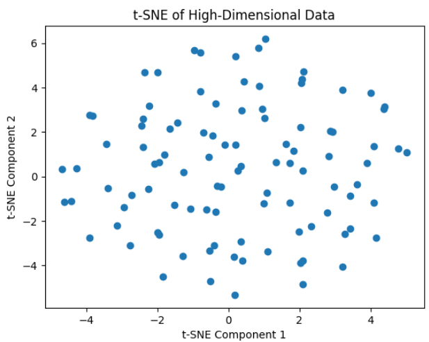
The output shows the t-SNE projection of 100 points from a 50-dimensional dataset, where the high-dimensional structure is visualized in two components without any clear clusters.
3. Parallel Coordinates
Parallel coordinates is a useful technique used for visualizing high-dimensional data. Instead of plotting data in traditional Cartesian space, each feature is represented as a vertical axis and every data point is visualized as a polyline intersecting each axis at its corresponding feature value.
How It Works
Parallel coordinates plots visualize high-dimensional data by representing each feature as a vertical axis. Each observation is drawn as a line that connects its values across all axes. This way patterns, correlations, clusters and outliers in the data become visible.
To use parallel coordinates effectively:
- Normalize the Data: Since features may have different scales, apply min–max scaling or standardization so all axes are comparable.
- Draw the Lines: Each data point becomes a line intersecting each axis at its feature values. Color coding can be used to highlight categories or classes.
- Improve Readability: Reduce clutter by adjusting line transparency, width and colors. Increasing figure size can also make patterns easier to see.
By combining normalization, plotting and visual adjustments, parallel coordinates allow simultaneous comparison of multiple features and help uncover relationships or anomalies in high-dimensional datasets.
When to Use
- Best suited for exploring multivariate datasets with many features
- Useful for comparing multiple attributes simultaneously
- Effective for pattern discovery, cluster separation and outlier detection
Note: For datasets with too many features or observations, the plot can become cluttered and difficult to interpret.
Implementing Parallel Coordinates
Here we creates a parallel coordinates plot using a sample dataset with multiple features and a class label. It visualizes how each observation (row) spans across all features with different colors representing different classes.
- Import pandas and matplotlib to handle data and plotting.
- Each row in the DataFrame is drawn as a line across the feature axes.
- Lines are color-coded based on the Class column for easy comparison.
- Readability is enhanced with transparency, line width, grid, labels and rotated x-axis ticks.
import pandas as pd
import matplotlib.pyplot as plt
from pandas.plotting import parallel_coordinates

data = {
    'Feature1': [1, 2, 3, 4, 5],
    'Feature2': [5, 4, 3, 2, 1],
    'Feature3': [2, 3, 4, 5, 1],
    'Feature4': [4, 1, 5, 2, 3],
    'Class': ['A', 'B', 'A', 'B', 'A']
}

df = pd.DataFrame(data)

plt.figure(figsize=(10, 6))
parallel_coordinates(
    df,
    'Class',
    color=('#556270', '#4ECDC4'),
    alpha=0.7,
    linewidth=2
)

plt.title('Parallel Coordinates Plot', fontsize=16)
plt.xlabel('Features', fontsize=12)
plt.ylabel('Values', fontsize=12)
plt.grid(True)
plt.legend(title='Class', fontsize=10)
plt.xticks(rotation=45, fontsize=10)
plt.yticks(fontsize=10)
plt.tight_layout()
plt.show()
Output:

The plot shows each data point as a line crossing all feature axes with colors distinguishing the classes. It highlights patterns and differences between Class A and Class B across the four features
4. Radial Basis Function Networks (RBFNs)
Radial Basis Function Networks (RBFNs) are neural networks that use radial basis functions, usually Gaussian, in the hidden layer. They effectively model complex non-linear relationships by mapping inputs into a higher-dimensional space, enabling easier pattern learning for tasks like classification, regression and time-series prediction.
- Hidden layer uses radial basis functions to transform inputs into a space suitable for linear modeling.
- Effective for capturing non-linear patterns and relationships in data.
- Common applications include classification, regression and time-series forecasting.
When to Use RBFNs
- When the data exhibits strong non-linear patterns
- When fast training is preferred over deep architectures
- When the problem requires smooth interpolation between data points
Note : RBFNs are sensitive to hyperparameters such as the number of radial neurons, center locations and spread (σ), which must be carefully tuned.
Relationship to Dimensionality Reduction
- RBFNs while primarily used for prediction can generate hidden-layer representations that act as lower-dimensional embeddings of high-dimensional data.
- These embeddings capture essential patterns, similar in concept to dimensionality reduction techniques like Self-Organizing Maps (SOMs).
- Unlike SOMs which are designed for visualization and topology preservation RBFNs focus on function approximation and predictive modeling.
Implementation of RBFNs
Here we implements Radial Basis Function Network (RBFN) for binary classification on a high-dimensional dataset. It selects RBF centers using KMeans computes Gaussian activations trains linear output weights and evaluates classification accuracy.
- Uses KMeans clustering to determine RBF centers for the hidden layer.
- Computes Gaussian radial basis function activations for all samples.
- Trains output weights using the pseudo-inverse for linear combination of activations.
- Evaluates performance and optionally visualizes RBF activations for the first few samples.
import numpy as np
import matplotlib.pyplot as plt
from sklearn.cluster import KMeans
from scipy.spatial.distance import cdist

np.random.seed(42)
data = np.random.rand(100, 50)
targets = np.random.randint(0, 2, 100)

num_centers = 10
kmeans = KMeans(n_clusters=num_centers, random_state=42)
kmeans.fit(data)
centers = kmeans.cluster_centers_

def rbf_activation(X, centers, sigma=1.0):
    distances = cdist(X, centers, 'euclidean')
    return np.exp(- (distances ** 2) / (2 * sigma ** 2))

sigma = 1.0
Phi = rbf_activation(data, centers, sigma)

T = targets.reshape(-1, 1)

W = np.linalg.pinv(Phi).dot(T)

preds = Phi.dot(W)
pred_classes = (preds > 0.5).astype(int)

accuracy = np.mean(pred_classes.flatten() == targets)
print(f"RBFN Classification Accuracy: {accuracy*100:.2f}%")

plt.figure(figsize=(8, 5))
plt.imshow(Phi[:10], cmap='viridis', aspect='auto')
plt.colorbar(label='RBF Activation')
plt.title('RBF Activations for First 10 Samples')
plt.xlabel('RBF Centers')
plt.ylabel('Samples')
plt.show()
Output:

The heatmap shows how strongly each input sample activates the RBF hidden neurons brighter values indicate samples closer to specific RBF centers. Based on these activations the RBF Network learns linear output weights demonstrating its ability to model non-linear decision boundaries.
5. Uniform Manifold Approximation and Projection (UMAP)
Uniform Manifold Approximation and Projection (UMAP) is a non-linear dimensionality reduction technique designed for visualization and feature extraction. Similar to t-SNE, UMAP excels at revealing complex structures in high-dimensional data, but it is typically faster and better at preserving global relationships.
UMAP works by constructing a graph representation of the data in high-dimensional space and then optimizing a low-dimensional embedding that best preserves this structure.
How UMAP Works
- High-Dimensional Graph Construction: UMAP builds a weighted graph that captures local neighborhood relationships in the original feature space.
- Low-Dimensional Optimization: The algorithm then learns a low-dimensional embedding by minimizing the difference between the high- and low-dimensional graphs.
When to Use UMAP
- When both local clusters and global structure are important
- When working with large or high-dimensional datasets
- When faster performance is needed compared to t-SNE
Implementation of UMAP
This code applies UMAP to reduce the high-dimensional Wine dataset into two dimensions and visualizes the resulting embedding with points colored by their class labels.
- Loads the Wine dataset and extracts the feature matrix.
- Applies UMAP with specified hyperparameters to compute a 2D representation.
- Plots the reduced data using a scatter plot, where colors indicate different wine classes.
import umap
import matplotlib.pyplot as plt
from sklearn.datasets import load_wine

data = load_wine()
X = data.data

umap_model = umap.UMAP(n_neighbors=5, min_dist=0.3, n_components=2, random_state=42)
X_umap = umap_model.fit_transform(X)


plt.figure(figsize=(8, 6))
plt.scatter(X_umap[:, 0], X_umap[:, 1], c=data.target, cmap='viridis')
plt.xlabel('UMAP Component 1')
plt.ylabel('UMAP Component 2')
plt.title('UMAP Projection of Wine Dataset')
plt.colorbar(label='Class')
plt.show()
Output:

The UMAP plot shows a 2D projection of the Wine dataset where samples form distinct clusters, indicating that UMAP has effectively preserved class structure. Points with similar colors (classes) grouping together demonstrate clear separation between wine types in the reduced space.
You can download code from here
Challenges in High-Dimensional Data Visualization
High-dimensional data visualization comes with several special difficulties. The Dimensionality Curse states that as the number of dimensions rises, the amount of visual space that is available to show all the data points becomes even more limited.
- Occlusion and Clutter: When there are a lot of dimensions and data points the visual representation might become congested which makes it difficult to see individual data points and their connections.
- Interpretability: Converting high-dimensional data into meaningful and understandable visuals may be a challenging process that calls for a thoughtful mix and match of visualization methods.
- Scalability: To handle the data effectively, visualizing huge datasets with several dimensions may need specialized hardware or software, which may be computationally demanding.