Flutter - Row and Column Widgets
Last Updated :
29 Jun, 2022
Row and Column are the two most important and powerful widgets in Flutter. These widgets let you align children horizontally and vertically as per the requirement. As we know that when we design any UI(User Interface) in a flutter, we need to arrange its content in the Row and Column manner so these Row and Column widgets are required when designing UI.
Constructor Of Column Class:
Column(
{Key key,
MainAxisAlignment mainAxisAlignment: MainAxisAlignment.start,
MainAxisSize mainAxisSize: MainAxisSize.max,
CrossAxisAlignment crossAxisAlignment: CrossAxisAlignment.center,
TextDirection textDirection,
VerticalDirection verticalDirection: VerticalDirection.down,
TextBaseline textBaseline,
List<Widget> children: const <Widget>[]}
)
Constructor Of Row Class:
Row(
{Key key,
MainAxisAlignment mainAxisAlignment: MainAxisAlignment.start,
MainAxisSize mainAxisSize: MainAxisSize.max,
CrossAxisAlignment crossAxisAlignment: CrossAxisAlignment.center,
TextDirection textDirection,
VerticalDirection verticalDirection: VerticalDirection.down,
TextBaseline textBaseline: TextBaseline.alphabetic,
List<Widget> children: const <Widget>[]}
)
Properties of Row and Column Widgets:
- children: This property takes in List<Widget>, that is a list of widgets to display inside the Row or the Column widget.
- clipBehaviour: This property holds Clip class as the object to decide whether the content on the Row or Column should be clipped or not.
- crossAxisAlignment: The crossAxisAlignment takes in CrossAxisAlignment enum as the object to how the children's widgets should be places in crossAxisAlignment. For Row it is vertical and for Column it is horizontal.
- direction: This property holds as the Axis enum object to decide the direction used in the main axis. For Row and Column, it is fixed.
- mainAxisAlignment: This property takes in MainAxisAlignment enum as the object to decide how the children widgets should be place in mainAxisAlignment. For Row it is horizontal and for Column it is vertical.
- mainAxisSize: This property decides the size of main-axis by taking in MainAxisSize enum as the object.
- runtimeType: This property tells the run-time type of the Row or Column widget.
- textBaseline: This property is responsible for the alignment of the text in the Row or Column widget with respect to a baseline.
- textDirection: This property controls the text direction of the Row or Column widget, which can either be from left-to-right (by default) or right-to-left.
- verticalDirection: This property takes in VerticalDirection enum as the object to determine the order in which the children should be layered.
Row:
It creates a horizontal array of children.
Alignment Properties: We can align content as per our choice by using mainAxisAlignment and crossAxisAlignment. Row's mainAxis is horizontal and cross Axis to Row's main Axis is vertical. We can align children horizontally using MainAxisAlignment and vertically using CrossAxisAlignment in that row.
Apart from these mainAxisAlignment and crossAxisAlignment, we also have some other properties like mainAxisSize,textDirection,verticalDirection etc. but we will focus on these two(mainAxisAlignment and crossAxisAlignment) in this article as these are mostly used and others in some other article.
 Row
Row
We can align the content by using the following properties:
- start: Place the children from the starting of the row.
- end: Place the children at the end of the row.
- center: Place the children at the center of the row.
- spaceBetween: Place the space evenly between the children.
- spaceAround: Place the space evenly between the children and also half of that space before and after the first and last child.
- spaceEvenly: Place the space evenly between the children and also before and after the first and last child.
We will see the difference with the help of examples. Let's suppose we want to align content such that there is space around the children in a row :
File: main.dart
Dart
import 'package:flutter/material.dart';
//function to trigger build
void main() {
runApp(const MyApp());
}
class MyApp extends StatelessWidget {
const MyApp({Key? key}) : super(key: key);
@override
Widget build(BuildContext context) {
return MaterialApp(
title: 'GeeksForGeeks',
theme: ThemeData(
primarySwatch: Colors.green,
),// ThemeData
home: const MyHomePage(),
debugShowCheckedModeBanner: false,
);// MaterialApp
}
}
class MyHomePage extends StatefulWidget {
const MyHomePage({Key? key}) : super(key: key);
@override
// ignore: library_private_types_in_public_api
_MyHomePageState createState() => _MyHomePageState();
}
class _MyHomePageState extends State<MyHomePage> {
@override
Widget build(BuildContext context) {
return Scaffold(
appBar: AppBar(
title: const Text("GeeksForGeeks"),
),// AppBar
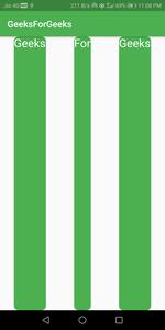
// App body consists of single Row
// Row consists of three children widgets
body: Row(
mainAxisAlignment: MainAxisAlignment.spaceAround,
children: <Widget>[
Container(
decoration: BoxDecoration(
borderRadius: BorderRadius.circular(10), color: Colors.green),
child: const Padding(
padding: EdgeInsets.all(8.0),
child: Text(
"Geeks",
style: TextStyle(color: Colors.white, fontSize: 25),
),
),
),
Container(
decoration: BoxDecoration(
borderRadius: BorderRadius.circular(10), color: Colors.green),
child: const Padding(
padding: EdgeInsets.all(8.0),
child: Text(
"For",
style: TextStyle(color: Colors.white, fontSize: 25),
),
),
),
Container(
decoration: BoxDecoration(
borderRadius: BorderRadius.circular(10), color: Colors.green),
child: const Padding(
padding: EdgeInsets.all(8.0),
child: Text(
"Geeks",
style: TextStyle(color: Colors.white, fontSize: 25),
),
),
)
],
),
);
}
}
Output:

Column:
It creates a vertical array of children.
Alignment Properties:
In this also we have mainAxisAlignment and crossAxisAlignment. In column, children are aligned from top to bottom. Main Axis is vertical and the Cross Axis is horizontal. MainAxisAlignment aligns its children vertically and CrossAxisAlignment aligns horizontally in that Column.
 Column
We can align the content by using the same properties as discussed above in Row (start, end,spaceBetween,spaceAround,spaceEvenly).
We will see the difference with the help of examples. Let's suppose we want to align content so that we have space around the children . Assign mainAxisAlignment as spaceAround as shown below:
Example
Dart
import 'package:flutter/material.dart';

//function to trigger build
void main() {
  runApp(const MyApp());
}

class MyApp extends StatelessWidget {
  const MyApp({Key? key}) : super(key: key);

  @override
  Widget build(BuildContext context) {
    return MaterialApp(
      title: 'GeeksForGeeks',
      theme: ThemeData(
        primarySwatch: Colors.green,
      ), // ThemeData
      home: const MyHomePage(),
      debugShowCheckedModeBanner: false,
    ); // MaterialApp
  }
}

class MyHomePage extends StatefulWidget {
  const MyHomePage({Key? key}) : super(key: key);

  @override
  // ignore: library_private_types_in_public_api
  _MyHomePageState createState() => _MyHomePageState();
}

class _MyHomePageState extends State<MyHomePage> {
  @override
  Widget build(BuildContext context) {
    return Scaffold(
      appBar: AppBar(
        title: const Text("GeeksForGeeks"),
      ), // AppBar
      // App body consists of single Column
      // Column consists of three children widgets
      body: Column(
        mainAxisAlignment: MainAxisAlignment.spaceAround,
        children: <Widget>[
          Container(
            decoration: BoxDecoration(
                borderRadius: BorderRadius.circular(10), color: Colors.green),
            child: const Padding(
              padding: EdgeInsets.all(8.0),
              child: Text(
                "GeeksForGeeks",
                style: TextStyle(color: Colors.white, fontSize: 25),
              ),
            ),
          ),
          Container(
            decoration: BoxDecoration(
                borderRadius: BorderRadius.circular(10), color: Colors.green),
            child: const Padding(
              padding: EdgeInsets.all(8.0),
              child: Text(
                "GeeksForGeeks",
                style: TextStyle(color: Colors.white, fontSize: 25),
              ),
            ),
          )
        ],
      ), // Column
    );
  }
}
Output:

Some more examples are :
 mainAxisAlignment.spaceEvenly
 mainAxisAlignment.spaceEvenly
 mainAxisAlignment.center
 mainAxisAlignment.center
 mainAxisAlignment.spaceBetween
 mainAxisAlignment.spaceBetween
We can also align content using combination of mainAxisAlignment and crossAxisAlignment for both Row and Column. Lets take an example of Row, set mainAxisAlignment as MainAxisAlignment.spaceAround and crossAxisAlignment as CrossAxisAlignment.stretch. By doing this(crossAxisAlignment.stretch), the height of the row will be equal to the height of the body because we have only one row.
Output:
Drawbacks:
- The row has no horizontal scrolling so when a large number of children are inserted in a single row that is not able to fit in the row then it will give us an Overflow message (for ex: Right overflowed by 560px).
- The column has no vertical scrolling so when a large number of children are inserted in a single Column whose total children size is more than the total height of the screen then it will give us an Overflow message (for ex: Bottom overflowed by 684px).
Similar Reads
Flutter - Custom Widgets
We create Custom Widgets when we want a custom look and feel to our app, and we know that there will be a repetition of a particular widget. We can create the custom widget in a new dart file with all the codes and defining the parameters that we need in the constructor. For more on how to split wid
8 min read
Flutter - Widget Tree and Element Tree
As we know, the user interface of an application when it is designed in Flutter contains a set of widgets. So that means the whole application is set to be made out of widgets. A widget describes what the view of the app would look like in the given state. Now, as the user interface contains severa
4 min read
Align Widget in Flutter
Align Widget is the widget that is used to align its child within itself and optionally sizes itself based on the child's size. Align Widget is quite flexible and can change its size according to the size of its child. Constructor of Align class: Syntax: Align({Key key, AlignmentGeometry alignment:
2 min read
Flutter - Banner Widget
Banner widget comes built-in with flutter API. It is somewhat similar to the debug banner that we are used to seeing on the top-right corner on a flutter app in debug mode. It enables us to show a message or text on top of any other widget. Below we will see its implementation with the help of an ex
3 min read
Flutter - Card Widget
Card is a built-in widget in Flutter which derives its design from Google's Material Design Library. The functionality of this widget on screen is, that it is a bland space or panel with round corners and a slight elevation on the lower side. It comes with many properties like color, shape, shadow c
4 min read
Expandable Widget in Flutter
The expandable widgets do not have a fixed size, they expand on the screen according to the available areas on the screen. Due to size constraints, certain widgets can throw rendering errors, so widgets are made expandable. The one use of expandable widgets is cards that include images, texts, and t
3 min read
Flutter - Expanded Widget
Expanded widget in flutter comes in handy when we want a child widget or children widgets to take all the available space along the main-axis (for Row the main axis is horizontal & vertical for Column). Â Expanded widget can be taken as the child of Row, Column, and Flex. And in case if we don't
5 min read
Flutter - AnimatedContainer Widget
In Flutter a container is a simple widget with well-defined properties like height, width, and color, etc. The AnimatedContainer widget is a simple container widget with animations. These types of widgets can be animated by altering the values of their properties which are the same as the Container
3 min read
Center widget in Flutter
Center widget comes built-in with flutter, it aligns its child widget to the center of the available space on the screen. The size of this widget will be as big as possible if the widthFactor and heightFactor properties are set to null and the dimensions are constrained. And in case the dimensions a
2 min read
Flutter - Folding Cell Widget
Folding Cell is the Flutter Widget that can be fold and unfold, It uses the frontWidget to show the front data, and the innerWidget to show the hidden data. Hidden is shown when the Folding cell is unfolded. When the widget is unfolded the innerWidget renders its data. When the widget is folded the
3 min read