React Suite DateRangePicker Size
Last Updated :
02 Aug, 2022
React Suite is a front-end UI library built on top of React that lets us many pre-built components to our react application. It is a developer-friendly library and is a great base for building scalable and beautiful websites and applications. In this article, we will be seeing React Suite DateRangePicker Size.
The DateRangePicker component is used to take the user's input of the date range. The size property of the DateRangePicker component is used to control the size of the component. The DateRangePicker component comes in four sizes: large, medium, small and extra-small.
React Suite DateRangePicker Size Components:
- DateRangePicker: The DateRangePicker component is used to take the user's input of the date range.
React Suite DateRangePicker Size Attributes/Props:
- size: This property is used on the DateRangePicker component to specify its size. It takes four values: "lg", "md", "sm" and "xs".
Syntax:
<DateRangePicker size="lg" />
Creating The React Application And Installing React Suite in the Project:
Step 1: Create the React application using the npx command:
npx create-react-app foldername
Step 2: After creating the project folder, move to it using the cd command:
cd foldername
Step 3: After creating the ReactJS application, Install the rsuite module so that we can use the DateRangePicker component using the following command:
npm install rsuite
Project Structure: After following the above steps, the project structure will look like this:
 Project Structure
Let's see some examples to see how the React Suite DateRangePicker size attribute/prop work.
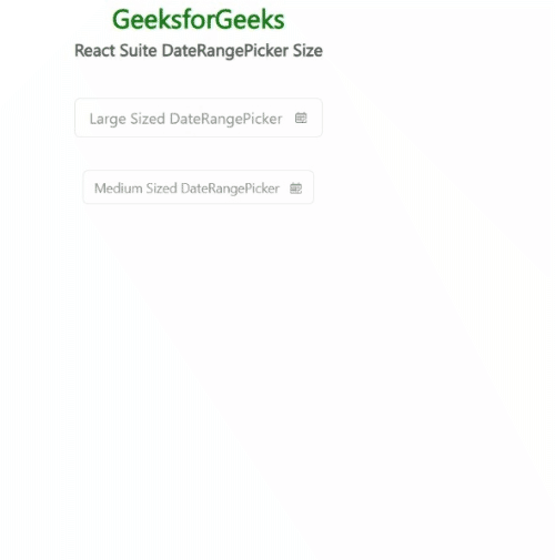
Example 1: Now replace the code in the App.js file with the code below. In this example, we used the size property of the DateRangePicker component to show its large and medium sizes.
App.js
import "rsuite/dist/rsuite.min.css";
import React from "react";
import { DateRangePicker } from "rsuite";

function App() {

    const pickerStyle = {
        marginTop: "10px",
        marginBottom: "25px"
    };

    return (

        <div className="App" style={{
            display: "flex",
            alignItems: "center",
            flexDirection: "column"
        }}>
            <header style={{
                textAlign: "center",
                display: "block",
                marginBottom: "30px"
            }}>
                <h3 style={{ color: "green" }}>
                    GeeksforGeeks
                </h3>
                <h5>React Suite DateRangePicker Size</h5>
            </header>

            <DateRangePicker size="lg"
                placeholder="Large Sized DateRangePicker"
                style={pickerStyle} />
            <DateRangePicker size="md"
                placeholder="Medium Sized DateRangePicker"
                style={pickerStyle} />
        </div>
    );
}

export default App;
Run the Application: Run your app using the following command from the root directory of the project.
npm start
Output: Go to http://localhost:3000/ in your browser to see the output.
Example 2: In this example, we used the size property of the DateRangePicker component to show its remaining two sizes i.e small and extra-small.
App.js
import "rsuite/dist/rsuite.min.css";
import React from "react";
import { DateRangePicker } from "rsuite";

function App() {
    const pickerStyle = {
        marginTop: "10px",
        marginBottom: "25px"
    };

    return (
        <div className="App" style={{
            display: "flex",
            alignItems: "center",
            flexDirection: "column"
        }}>
            <header style={{
                textAlign: "center",
                display: "block",
                marginBottom: "30px"
            }}>
                <h3 style={{ color: "green" }}>
                    GeeksforGeeks
                </h3>
                <h5>React Suite DateRangePicker Size</h5>
            </header>

            <DateRangePicker size="sm"
                placeholder="Small Sized DateRangePicker"
                style={pickerStyle} />
            <DateRangePicker size="xs"
                placeholder="Extra-Small Sized DateRangePicker"
                style={pickerStyle} />
        </div>
    );
}

export default App;
Output:

Reference: https://rsuitejs.com/components/date-range-picker/#size
Similar Reads
React Suite DateRangePicker Controlled React Suite is a popular front-end library with a set of React components that are designed for the middle platform and back-end products. It is a set of react component libraries for enterprise system products. It is a well-thought-out and developer-friendly UI framework. DateRangePicker component
3 min read
React Suite DateRangePicker Appearance React Suite is a popular front-end library with a set of React components that are designed for the middle platform and back-end products. React Suite DateRangePicker component provides the user an interface to select a date range. React Suite DateRangePicker Component's appearance prop defines how
2 min read
React Suite DateRangePicker Props React Suite is a library of React components, sensible UI design, and a friendly development experience. It is supported in all major browsers. It provides pre-built components of React which can be used easily in any web application. In this article, we’ll learn about React suite DateRangePicker Pr
4 min read
React Suite DateRangePicker Component React Suite is a popular front-end library with a set of React components that are designed for the middle platform and back-end products. DateRangePicker component allows the user to quickly select a date range. We can use the following approach in ReactJS to use the React Suite DateRangePicker Com
4 min read
React Suite DateRangePicker Size React Suite is a front-end UI library built on top of React that lets us many pre-built components to our react application. It is a developer-friendly library and is a great base for building scalable and beautiful websites and applications. In this article, we will be seeing React Suite DateRangeP
3 min read
React Suite DateRangePicker Show One Calendar React Suite is a front-end UI framework that has a set of React components that developers can use in their react app to fasten the development process. It supports all the major browsers like Chrome, Safari, Firefox, Brave, etc. In this example, we will see React Suite DateRangePicker Show One Cale
3 min read
React Suite DateRangePicker Placeholder React Suite is a front-end UI library built on top of React that lets us many pre-built components to our react application. It is a developer-friendly library and is a great base for building scalable and beautiful websites and applications. In this article, we will be seeing React Suite DateRangeP
3 min read
React Suite DateRangePicker Select Whole Week, Whole Month React Suite is a front-end UI library built on top of React that lets us many pre-built components to our react application. It is a developer-friendly library and is a great base for building scalable and beautiful websites and applications. In this article, we will see React Suite DateRangePicker
3 min read
React Suite DateRangePicker Disabled and Readonly React suite is a library of React components, sensible UI design, and a friendly development experience. It is supported in all major browsers. It provides pre-built components of React which can be used easily in any web application. In this article, we’ll learn about React suite DateRangePicker Di
3 min read
React Suite DateRangePicker Show Week Numbers React Suite is a front-end UI framework that has a set of React components that developers can use in their react app to fasten the development process. It supports all the major browsers like Chrome, Safari, Firefox, Brave, etc. In this example, we will see React Suite DateRangePicker Show Week Num
3 min read