React Suite <Notification> Props
Last Updated :
05 Jul, 2022
React suite is a library of React components that have a sensible UI design and a friendly development experience. It is supported in all major browsers. It provides pre-built components of React which can be used easily in any web application.
In this article, we'll learn about React Suite Notification components showing notification messages on the screen.
<Notification> Props:
- closable: It is a boolean value. It denotes whether to display or not to display the remove button. By default is true.
- duration: It takes a number as a value. It delays the automatic closing notification.
- onClose: A void callback function gets fired after the message is removed
- placement: It defines the position of the component. It takes either the value 'topStart', 'topCenter', 'topEnd', 'bottomStart', 'bottomCenter', 'bottomEnd'. By default, it is 'topCenter'.
- type: It denotes the type of notification. It takes either of the values 'info', 'success', 'warning', or 'error'.
- children *: It denotes the description of the message box
Syntax:
<Notification> ... </Notification>
Prerequisite:
Creating React Application and Module installation:
Step 1: Create the react project folder, for that open the terminal, and write the command npm create-react-app folder name, if you have already installed create-react-app globally. If you haven’t then install create-react-app globally by using the command npm -g create-react-app or can install locally by npm i create-react-app.
npm create-react-app project
Step 2: After creating your project folder(i.e. project), move to it by using the following command.
cd project
Step 3: now install the dependency by using the following command:
npm install rsuite
Project Structure: It will look like this:

Step to Run Application: Run the application using the following command from the project's root directory.
npm start
Example 1: In this example, we are importing the Notification and Message Component from "rsuite", and applying the default styles of the components we are importing "rsuite/dist/rsuite.min.css".
We are creating a state name close initialized as false using react hook useState, we are importing useState from 'react'. To the Notification component we are passing the duration prop setting it to 1000ms, to the closable prop we are passing close, placement prop having a value as "topStart" and the onClose prop calls the handleClose callback function that shows "Notification gets closed!" in the alert and change the state of close.
App.js: Write the below code in the app.js file:
App.js
import { useState } from "react";
import { Message, Notification } from "rsuite";
import "rsuite/dist/rsuite.min.css";
function App() {
  const [close, SetClose] = useState(false);

  const handleClose = () => {
    alert("Notification gets closed!");
    SetClose(true);
  };
  return (
    <div className="App">
      <h4>React Suite <Notification> Prop</h4>
      <Notification
        onClose={handleClose}
        duration={1000}
        closable={close}
        placement="topCenter"
      >
        <Message>
          <h4>Welcome to Geeksforgeeks!</h4>
        </Message>
      </Notification>
    </div>
  );
}

export default App;
Output:

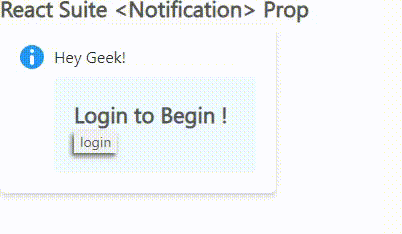
Example 2: To the above code we are adding the other three states using react hook useState naming typeText, message, and buttonText with initial values such as 'info', 'Login to Begin !' and 'login' respectively.
We are passing the typeText to the type prop of both the Notification and the Message component. Within the <h4> tags we are passing the message state. To the button label, we are adding the buttonText, we are also adding an onClick function naming handleClick changes the states. We are also setting closable the value of close the state we have created.
App.js: Write the below code in the app.js file:
App.js
import { useState } from "react";
import { Message, Notification } from "rsuite";
import "rsuite/dist/rsuite.min.css";
function App() {
  const [close, SetClose] = useState(false);
  const [typeText, setTypeText] = useState("info");
  const [message, setMessage] = useState("Login to Begin !");
  const [buttonText, setButtonText] = useState("login");

  const handleClick = () => {
    SetClose(true);
    setTypeText("error");
    setMessage("Something went wrong! Try again");
    setButtonText("Retry");
  };
  return (
    <div className="App">
      <h4>React Suite <Notification> Prop</h4>
      <Notification type={typeText} header="Hey Geek!"
        closable={close}>
        <Message type={typeText}>
          <h4>{message}</h4>

          <button
            onClick={handleClick}
            style={{ boxShadow: "-2px 3px 5px 0px" }}
          >
            {buttonText}
          </button>
        </Message>
      </Notification>
    </div>
  );
}

export default App;
Output:
Reference: https://rsuitejs.com/components/notification/#code-lt-notification-gt-code
Similar Reads
React Suite Notification Props & Hooks
React Suite is a popular front-end library with a set of React components that are designed for the middle platform and back-end products. Notification Component allows the user to display a notification message globally. The notification is also used with a toaster in react-based applications. <
4 min read
React Suite Notification Basic
React suite is a library of React components, sensible UI design, and a friendly development experience. It is supported in all major browsers. It provides pre-built components of React which can be used easily in any web application. In this article, we’ll learn about React suite Notification Basic
2 min read
React Suite <Nav.Menu> Props
React Suite is a front-end library designed for the middle platform and back-end products. The React Suite <Nav.Menu> props allow the user to navigate through a sub-list of options in form of a menu. React Suite <Nav.Menu>Props: icon: It defines an icon added to open the menu.noCaret: It
3 min read
React Suite <Nav.Item> Props
React Suite is a front-end library designed for the middle platform and back-end products. The <Nav.Item> component is used for navigation purposes in a website. A <Nav.Item> share a general Nav component and its associated styles. <Nav.Item> props: active: It is a boolean. It show
3 min read
React Suite Icon Props
A React suite is a library of React components, sensible UI design, and a friendly development experience. It is supported in all major browsers. It provides pre-built components of React which can be used easily in any web application. In this article, we'll learn about React Suite Icon Props. Reac
3 min read
React Suite Icon <Icon> Props
React Suite is a popular front-end library with a set of React components that are designed for the middle platform and back-end products. There is a lot of data that gets rendered on a web page. Sometimes we require to represent data using icons. This is when the Icon component allows the user to a
3 min read
React Suite Notification Closeable
React suite is a library of React components with a sensible UI design and a friendly development experience. It is supported in all major browsers. It provides pre-built components of React which can be used easily in any web application. The React Suite Notification component shows notification me
3 min read
React Suite <IconButton> Props
React Suite is a popular front-end library with a set of React components that are designed for the middle platform and back-end products. <IconButton> component is used when we want to use an icon as a button. It has an icon property that is used to specify the icon of the Button. IconButton
3 min read
React Suite <Modal.Title> Props
React Suite is a front-end library designed for the middle platform and back-end products. Modal components are used to create dialogs, lightboxes, popovers, etc. A modal component has three distinct areas: A Title or a header, the body, and a footer. In this article, we will look into the title por
3 min read
React Suite Notification toaster.push Method
React Suite is a library of React components, sensible UI design, and a friendly development experience. It is supported in all major browsers. It provides pre-built components of React which can be used easily in any web application. In this article, we'll learn about React Suite Notification toast
3 min read