Power BI - Practical Applications
Last Updated :
23 Jan, 2023
A feature of Microsoft Office 365 called Power BI gives business users access to insights from their data. Users of the software can visualize information using a range of tools, such as graphs and diagrams. In other words, Power BI serves as a link between your data and the individual who will ultimately utilize it to make crucial decisions. Power BI is a tool that businesses frequently utilize for informational purposes. When various departments collaborate on a project, for instance, it may be necessary to transmit information across them in such a way that everyone can understand. So that everyone is on the exact page as they do their individual jobs.
Applications of Power BI
1. Visualize Details Easily
Microsoft Power BI provides such tools that will let you visualize key data points accurately from various sources in a single dashboard. For instance, you can have a dashboard that displays the different products in your store, allowing you to track sales, costs, and expenses in one location. This will help managers at the same time that they keep their employees updated on sales and expenses.
2. Real-Time Performance
You can understand the Real-Time performance of enterprises on a variety of levels using Microsoft Power BI. For instance, have a dashboard that lists all of the projects that are active as well as their due dates. On these projects, you may also keep a close watch on how each individual employee is doing. This is a fantastic way to tell your team of changes and deadlines, keep them informed of one other's duties for certain tasks, and even allow the staff to keep an eye on their own performance.
3. Sales Analysis
Another common use for business intelligence tools like Power BI is sales analysis. Multiple dashboards that display charts can be set up to monitor user activity throughout an online session. Additionally, what product categories do your clients purchase the most frequently, or which geographical areas generate the highest revenue for you? You can adjust your business practices based on this knowledge to better meet the needs of your clients and boost sales.
4. Improving Marketing
These dashboards can show all kinds of data to assist you to enhance your marketing campaign if you or the rest of your team are working on any kind of extensive marketing effort. The software can track parameters like the price at which each product is sold individually and present all of this data so that you may develop a more successful marketing plan for upcoming campaigns.
5. Create Consistent Reporting Standards
You may gather the data and produce reports using Power BI to give you consistent reporting. If the data is delivered in a graphical manner each time, it is less stressful for the managers, and takes less time to find insights from it, and the organization may find it helpful to predict information. Additionally, it enables you to carry out targeted marketing initiatives that are guaranteed to be effective.
6. Controlling Costs
The average cost of each campaign that has been running on your website can be displayed on a dashboard. This can assist you in determining which promotions will benefit your clients and your organization. It also assists you in deciding how much money to spend on anything in the future. You can also develop dashboards that show how much money is being spent on each specific campaign this will help to have proper control of the cost of each product which leads to control of the overall cost of the organization.
7. Product Development
Another typical use for business intelligence software like Power BI is product development. When it's time to pull one product off the market and replace it with a newer and more successful one, This dashboard shows how much money is being produced for each particular product that can help your organization.
Practical Applications of Power BI
Power BI is a Microsoft tool that allows you to use datasets from multiple sources and create reports and charts to address specific business needs. Using Power BI is about providing practical solutions for real-world problems, making it the perfect tool for organizations seeking quick and easy insights with minimal effort. Let's see by creating a simple Line chart in Power BI of the Financial sales analysis dataset. Let's see the different practical applications of Power BI:
Financial Sales Analysis in Power BI
On launching the Power BI Desktop App, we get an option to Try the sample dataset; by clicking on that option, we can import the sample Financial dataset and start using it to create our Power BI Report.

The dataset gives insights into the Sales and Profits of certain products belonging to different segments in multiple countries over 2013-14. It comprises the following columns by default:

Step 1: First, navigate to the Data Tab and select the Table Tools options from the top navigation bar. Select the New Column option from the table tools and opportunities to create a new custom column.

Step 2: On clicking the New Column option, an input bar will appear where we will write a simple DAX expression to create our columns.

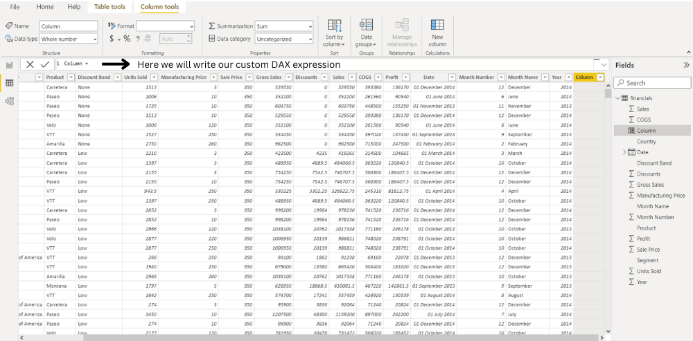
Step 3: In DAX, we can access a particular column using the following syntax - tableName[columnName],The following DAX Expression creates a new column named TotalManufacturingPrice.
TotalManufacuturingPrice = financials[Manufacturing Price]*financials[Units Sold]

Step 4: Now, using this newly created column, we make our ProfitPercentage column using the below expression.
ProfitPercentage = (financials[Profit]/financials[TotalManufacuturingPrice])*100

Step 5: Now, Select the Line chart from the Visualization. Drag the segment and drop to the X-axis, Again drag the ProfitPercent and drop to the Y-axis that we have created our custom columns, we can use a line chart which comes out to be like this:

Profit Analysis using Donut Chart in Power BI
Next, we will create another custom column called ProfitType to tell if the profit is positive, negative, or null. This can be done by using the IF function in the DAX Expression like this:
ProfitType = IF(financials[Profit]<0,"Negative",IF(financials[Profit]>0,"Positive","NULL"))
Step 1: From the top navigation bar, select the New Column option from the table tools and opportunities to create a new custom column.

Step 2: Select the donut chart from the Visualization. From the field, option drag the ProfitType and drop to the values and details. This newly created column can be further used to create a donut chart, as shown below:

Analysis of most profitable day using Bar Chart in Power BI
Suppose we also want to analyze which day of the week has the most significant number of sales or profit; so for this, we can create an additional column, Weekday, by extracting the day of the week from the Date Column already provided using the DAX WEEKDAY function like this:
Weekday = WEEKDAY(financials[Date].[Date],2)
Here, the second parameter of the function refers to the return type.
- If return type = 1, week begins on Sunday (1) and ends on Saturday (7). numbered 1 through 7.
- If Return type = 2, week begins on Monday (1) and ends on Sunday (7).
- If Return type = 3, week begins on Monday (0) and ends on Sunday (6).numbered 1 through 7.
For the above function return type is 2, i.e the week begins on Monday.
Step 1: On clicking the New Column option, an input bar will appear where we will write a simple DAX expression to create our columns.

Step 2: Using this custom column, we can plot the following bar chart and conclude that we get Maximum Profits on Tuesdays (Weekday = 2)

Similar Reads
Power BI Tutorial | Learn Power BI Power BI is a Microsoft-powered business intelligence tool that helps transform raw data into interactive dashboards and actionable insights. It allow users to connect to various data sources, clean and shape data and visualize it using charts, graphs and reports all with minimal coding.It’s widely
5 min read
Introduction & Setup the Power BI
What is Business Intelligence?Business Intelligence is the talk of a new changing and growing world that can be defined as a set of concepts and methodologies to improve decision-making in business through the use of facts and fact-based systems. The Goal of Business Intelligence is to improve decision-making in business ideas a
6 min read
Power BI - IntroductionPower BI is a software developed by Microsoft that helps you to turn raw data into clear and useful information. It helps to create interactive charts, reports and dashboards so you can easily understand your data. Whether you work in business, research or any field that uses data Power BI makes it
5 min read
Power BI - Key ComponentsPower BI is a data visualization and business intelligence tool created by Microsoft. It helps us to turn raw data into easy to understand reports and interactive dashboards which non-technical users can also create easily. In this article, we will understand its key components.Components of Power B
4 min read
Power BI - Practical ApplicationsA feature of Microsoft Office 365 called Power BI gives business users access to insights from their data. Users of the software can visualize information using a range of tools, such as graphs and diagrams. In other words, Power BI serves as a link between your data and the individual who will ulti
7 min read
How to Install Power BI on Windows?Power BI is a business analytics tool developed by Microsoft where "BI" stands for Business Intelligence. It is used to connect, visualize and analyze data from various sources. You can create interactive dashboards, reports, graphs and charts with just a few clicks. Power BI also helps with data cl
3 min read
Power BI - Data Sources and its typeIn Power BI a data source is simply where your data originally comes from. It could be a file stored on your computer, a database, an online service or any other place that Power BI can connect to. These data sources are important because they provide the basic information that Power BI uses to crea
4 min read
Differences Between Microsoft Power BI and SSRSSSRS and Power BI are both Business Intelligence (BI) tools that are made to show data to users in a easy to understand way. Even though Microsoft made both but they are designed for different types of users and used for different purposes. In this article, we will see the differences between Power
3 min read
Power BI Free vs Power BI Pro vs Power BI PremiumPower BI is a tool developed by Microsoft to help users connect to various data sources and create interactive reports. It allows you to visualize your data in a way that makes it easier to see patterns and insights. Power BI was built using some of the features from Excel, like Power Query, Power P
4 min read
The Power BI Query Editor
Power BI - How to edit in Power BI App?Power BI is a data visualization application that lets you connect, transform and find insights into the most pressing matters of your business. It helps in sourcing your data and creating visual dashboards, KPIs, and reports by editing the data as per your concerns. You can collaborate, share and i
8 min read
Power BI - DAX Date FunctionsKnowing when and how to use DAX functions helps you build strong, high-performance data models and analysis large amounts of data in Power BI. In this article, we’ll explore important DAX Date Functions to help you manage dates in Power BITo begin load a dataset that contains date fields. Here we ar
3 min read
Power BI - How to Add Conditional Columns?Creating insightful reports often requires data to be organized and categorized based on specific conditions. Conditional columns helps change or add values in a column based on logic you define. In this article, we’ll learn how to create conditional columns using Power Query Editor.Step 1: Open Pow
2 min read
DAX Aggregate Functions in Power BIMicrosoft Power BI is a tool that helps businesses to analyze data and create interactive reports and visualizations. It can connect to various data sources such as Excel, SQL databases, cloud services, etc and can perform aggregate functions on them for analysis. In this article we will learn about
6 min read
Power BI - Excel IntegrationPower BI and Excel integration combine the data visualization and reporting capabilities of Power BI with the spreadsheet functionality of Excel. By linking the two users can analyze and manipulate Power BI data directly within Excel. This is vey useful tool for those who prefer working in Excel but
3 min read
PowerBI Dash Board Visualisation
Power BI - Dashboard IntroductionPower BI allows users to convert data into visuals and graphics to explore and analyze data, collaborate on interactive dashboards and reports. A Power BI dashboard is one page that shows different charts and visuals all designed to explore and interact with your data easily.How to Create a Simple D
5 min read
Power BI - Dashboard ActionsA single page, or palette, is what is referred to as a Power BI dashboard and it employs visualizations to convey a story. As it can only fit on one page, a well-designed dashboard delivers only the essentials of the scenario. Dashboards are a feature of the Power BI service. When utilizing Power BI
8 min read
Power BI - Create a Stacked Bar ChartSometimes there is a range of scenarios where it is hard to convey the information in a table and written format. Under such situations, Bar charts make things easier and more understandable. What are Stacked Charts & Bar Charts? Stacked charts are a sort of bar chart which are multiple-series i
3 min read
Power BI - How to add Reports to Dashboards?Power BI Dashboards help you to view and summarize important information from your reports in one place. You can add an entire report or just specific parts like charts, cards or tables to a dashboard. You can also mix multiple reports into one dashboard. In this article, we’ll learn how to add full
3 min read
Power BI - Report Level FiltersFilters in Power BI sort data and knowledge based on some selected criteria. That is, you'll select particular fields or values within fields and view only the information related to them. as an example, you've got a dataset related to a store's sales. Now, using the filters you'll filter out unnece
2 min read
Power BI - How to Format Matrix?Power Bi is an extensively used operation as it helps in storing, assaying, calculating, etc. data. Power Bi contains numerous functions that are used to maintain and show data in a presentable way. Matrix is one of the Power Bi is handy functions, it's a collection of figures that are arranged into
4 min read
Power BI - SlicerSlicers are the interactive filters used to format and analyze the parts of the data more effectively. We can create a slicer easily with 4 steps, as shown in the later stage of the article. We have various options to format slicers, we can change the value of the alt text, title, etc. We can also a
6 min read
Power BI - How to Format a Card?Cards in Power BI help us display a certain value, corresponding to different dynamic scenarios. For example, want to know the total population of the world, and the population of a certain country by a slicer, all can be achieved by cards in Power BI. In this article, we will learn how to format a
5 min read
Power BI - Format Multi-Row CardMulti-Row cards in Power BI help us display multiple values, corresponding to different dynamic scenarios. For example, want to know the total population of the world, the average world's economy, annual total deaths all in a single card, to achieve such tasks we use multi-row cards. Under the field
6 min read
Power BI - How to Create a Map?A map only locates the location as a data point, whether it's a continent, country, state, city, etc. Maps can also be plotted with the help of latitude and longitude. Maps can be useful, to know the current running business over different geographical locations. For example, if geeks for geeks want
3 min read
Power BI - How to Format MapMaps are the visualizations that display dataset values on the basis of location. The location can be state, country, city, pin code, etc. We have various options to format maps. We can apply different styles to map, add legends, customize the colors of the bubbles, etc. In this article, we will lea
6 min read
Power BI - How to Create a Treemap?TreeMap in Power BI is the hierarchical chart, which is used to show the parent and child data distribution. TreeMap is shown by a group of rectangles, these rectangles are segregated on the basis of the category. The larger numeric values are present at the top, and lower numeric values are present
3 min read
Power BI - How to Format Tree Map?Tree Maps are the visualizations that display dataset values in the form of a hierarchical rectangle-cut format. We prefer Tree Map whenever we want to show large hierarchical data, in a limited space, with a better color combination, we have treemap as our first choice, also when we have a correlat
6 min read
Connect Power BI Desktop with Power BI ServicePower BI Desktop is the system version of Power BI present in the local system, It is downloaded as a free application. The comprehensive report authoring tool for report designers is Power BI Desktop. You can connect to many data sources through the desktop and then turn the data into a data model.
5 min read
Power BI - Create a TableTables are a way to represent data in the form of rows and columns. By default, the Power BI desktop creates a table itself, whenever data is dragged under the visualizations section. But, here will learn how to create the table manually, if not created by Power BI, we will also look at some aggrega
2 min read
Power BI - How to Format Table?Sometimes we want to show data in tabular format for that we have two options here one is a table and another one is a matrix. This article deals with Tables in Power BI. You can use this dataset to follow along with this article. The topic that will be covered in the articles are: Creating a simple
4 min read
Power BI - Create a Stacked Column ChartSometimes there is a range of scenarios where it is hard to convey the information in the form of a table and written format. Under such situations, Column charts make things easier and more understandable. Let's understand what is stacked column chart is and how to create a stacked column chart. Wh
3 min read
Power BI - How to Format Stacked Column Chart?Formatting is a technique to enhance the looks of the charts by giving a cosmetic appearance to the chart title and chart legend. Titles are given to the X and Y axis to add clarity for the user. Formatting commands are applied to a chart for the identical reason they're applied to a worksheet: they
5 min read
Power BI - Create 100% Stacked Column ChartA 100% stacked column chart is formed by bar lines, which show the proportion of each data value in the form of percentages. This chart is generally, used when we want to match the ratios of different column values, with different fields. For example, if we want to compare the salary and bonus of ea
4 min read
Power BI - Create 100% Stacked Bar ChartPower BI 100% stacked bar chart is used to display the relative percentage of multiple data series in stacked bars, where each stacked bar's total (cumulative) always equals 100%. In other words, A 100% stacked bar chart in power bi is a type designed to show the relative chance of multiple data ser
3 min read
Power BI - Format Stacked Bar ChartFormatting is a technique to enhance the looks of the charts by giving a cosmetic appearance to the chart title and chart legend. Titles are given to the X and Y axis to add clarity for the user. Formatting commands are applied to a chart for the identical reason they're applied to a worksheet. they
4 min read
Power BI - How to Create a Stacked Area ChartA stacked area chart is formed by combining the line chart, with the shaded area under that line. This chart is generally, used when we want to see the trends, that which field is performing better, in a particular time frame. For example, considering the stock prices of different companies, in the
3 min read
Power BI - Format Area ChartAn area chart is a combination of a line chart with an area covered below the line. We could add a secondary y-axis, with just 2 mouse clicks Power BI. We have various options to format area charts, we can change the value of the x-axis, y-axis, its title, etc. We can also add various options like s
11 min read
Power BI - Create a Radial Gauge ChartA radial Gauge chart looks similar to a speedometer of a Car. A gauge chart is a half-circle chart, which tells whether a target is achieved or not. Gauge charts are generally used to measure the progress toward a goal. In this article, we will learn how to create a radial gauge chart in Power BI. C
4 min read
Power BI - Explain Key Performance Indicators (KPIs) dashboardsThe KPIs evaluate an association’s performance in different areas by assessing quantifiable measure values. In businesses, KPIs play an essential part as visual cues that indicate growth by assessing values and measurable pretensions. A KPI always has a base value or measure which is estimated again
2 min read
Power BI _ Format KPIs Chart
Power BI _ Format Clustered Bar Chart
Power BI - How to Create a Waterfall Chart?A waterfall chart shows a running value as quantities are added or subtracted. It’s helpful to visualize how an underlying value is influenced by a series of positive and negative changes. The columns are usually encoded using color so that you can quickly identify increments and decrements. In a wa
2 min read
Power BI - Format Waterfall ChartA waterfall chart is generally used to check the trend in the data, with its ups and downs at particular intervals. We have various options to format waterfall charts, we can change the value of the x-axis, y-axis, its title, etc. We can also add various options like Breakdown, Gridlines, and data l
8 min read
Power BI - Create a Filled MapA filled map is similar to a map in Power BI. A filled map, allocates a certain area of the location mentioned, while a map only locates the location as a data point, whether it's a continent, country, etc. Filled maps can be useful, to know the exact boundaries of a location, whether it is a countr
3 min read
Power BI - Format Filled MapFilled Maps are the visualizations that display dataset values on the basis of location with the area allocated for that region. The difference between a map and a filled map is that a map only shows the data points for the selected location, but a filled map selects the area portion of that locatio
6 min read
Power BI - How to Create a Scatter Chart?A Scatter chart is a chart, representing data points, spread on a graph, to show the column values. It helps us analyze and summarise the data very efficiently. We can also add legends, bubble sizes, and animations to this chart. This graph is widely used because it can show better visualizations in
4 min read
Power BI - Format Scatter ChartScatter charts are data distribution charts, in the form of data points. We have various options to format scatter charts, we can change the value of the x-axis, y-axis, its title, etc. We can also add various options like zoom slider, markers, and grid lines in the scatter chart. In this article, w
8 min read
Showing Trends with Line Charts
Power BI - Format Line ChartA Line chart shows data in the form of a line. It is generally used when we have to show, continuous data graphically. We could add a secondary y-axis, with just 2 mouse clicks in Power BI. We have various options to format line charts, we can change the value of the x-axis, y-axis, its title, etc.
10 min read
Power BI - How to Create a Shape Map?A shape map is similar to a map in Power BI. A shape map, shows the comparison between different regions, using different color shades, on a given value. For example, suppose the number of corona cases is higher in Uttar Pradesh, with respect to Haryana. In that case, the Uttar Pradesh state will be
4 min read
Power BI - Format Donut ChartA donut chart is a circular chart, which could present values of a dataset in the form of slices of a donut. The donut chart is exactly the same as a pie chart, the only difference is pie chart has a circle, but a donut chart has a hole in the circle. We have various options to format donut charts,
6 min read
Power BI - Format Pie ChartA pie chart is a circular chart, which could present values of a dataset in the form of slices of a circle. Â We have various options to format pie charts, we can change the value of the legends, rotation, detail labels, etc. In this article, we will learn how to format a pie chart in Power BI and ex
6 min read
Power BI - Format Ribbon ChartA ribbon chart is a type of column chart, with ribbons joining each other. If the legends property is not added to the ribbon chart, then the ribbon chart is the same as the column chart. If we add legends to our chart, then a string of ribbons will be joined for each legend's values, showing the ra
8 min read
Power BI - Create a R Script VisualAn R script is different from R visuals. It helps transform our data into statistical analysis and machine learning algorithms on our datasets. It creates beautiful charts, with statistical measures. To make R Script Visual, we need to have some prerequisites i.e. Installing R in the System, and Che
4 min read
Power BI - Format Line and Stacked Column ChartA Line and Stacked Column chart is a combination of a line chart with a stacked column chart. We could add a secondary y-axis, with just 2 mouse clicks in Power BI. We have various options to format line and stacked column charts, we can change the value of the x-axis, y-axis, its title, etc. We can
11 min read
Power BI - Format Line and Clustered Column ChartA Line and Clustered Column chart is a combination of a line chart with a clustered(segregated) column chart. We could add a secondary y-axis, with just 2 mouse clicks in Power BI. We have various options to format line and clustered column charts, we can change the value of the x-axis, y-axis, its
11 min read
DAX Introduction
Power BI - How to Create Calculated Columns?Power BI Desktop there are two data modification options known as Calculated Table and Calculated Column. These two options can add a whole new table referring to existing tables and a column to any existing table using existing columns of the respective table. Calculated Columns and Calculated Tabl
3 min read
Power BI- FunctionsDAX is a very powerful feature provided with Power BI from Microsoft. DAX stands for Data Analysis Expressions. As we can understand from the name DAX consists of the functions and expressions that are used to manipulate the data or the reports. These expressions help to perform analysis of the data
5 min read
Power BI- DAX Window FunctionThe filter and value functions in DAX are some of the most complex and powerful and differ greatly from Excel functions. The lookup functions work by using tables and relationships, like a database. The filtering functions let you manipulate data context to create dynamic calculations. The WINDOW fu
5 min read
Power BI - DAX Logical FunctionsData analysis expressions, or DAX, are formulas or expressions used in calculations and data analysis. These expressions contain a variety of different functions, operators, and constants that are all evaluated collectively as a single formula to yield the desired outcomes (value or values). DAX for
5 min read
Power BI - DAX Information FunctionsData Analysis Expressions, or DAX, are formulas or expressions that are used for calculations and data analysis. These expressions consist of a number of different functions, operators, and constants that are all evaluated together as a single formula to produce the desired results (value or values)
5 min read
Power BI - DAX TEXT FunctionsDAX is a collection of operators, constants, and functions that can be used to compute and return one or more values in an expression or formula. To put it simply, DAX gives you the ability to create new data from data that already exist in your model. DAX Text Functions Tables and columns can be us
11 min read
Power BI- DAX Index FunctionData filtering is one of the most widely used data analysis techniques. Data filtering eliminates the clutter and makes important information visible to everyone, whether they are financial experts, data scientists, marketers, or salespeople. Filtered data often results in a subset of data that may
4 min read
Power BI - DAX Trigonometric FunctionsMicrosoft Power BI uses the scripting language Data Analysis Expressions (DAX) to create calculated columns, measurements, and custom tables. It offers a number of useful functions that help create formulas and expressions that can be applied to a number of data analysis issues. You can develop reli
5 min read
Power BI - DAX COUPDAY Financial FunctionData Analysis Expressions is referred to as DAX in Power BI. It is an expressive language for formulas that are also utilized in Power BI and other visualization tools. It is utilized to create many kinds of formulae. We have all been utilizing various Excel functions in MS Excel for a very long tim
5 min read
Power BI - DAX Depreciation FunctionsFormulas that do financial computations, including net present value and rate of return, use financial functions in DAX. These features are comparable to those found in Microsoft Excel's financial features. Microsoft added about 50 additional DAX capabilities to Power BI in July 2020. Some users may
9 min read
Power BI - Distinct() functionData Analysis Expressions (DAX) include many functions that return a table rather than a value. The table isn't displayed but is used to provide input to other functions. For example, you can retrieve a table and then count the distinct values in it or calculate dynamic sums across filtered tables o
2 min read
Power BI - DAX Math FunctionsA robust set of cloud-based business analytics tools called Power BI makes it simple to combine data from many sources, analyze and visualize information, and share insights. The Mathematical functions in Excel are quite similar to those in Data Analysis Expressions (DAX). Many functions in the Data
11 min read
Power BI - DAX Counting FunctionsMany functions in the Data Analysis Expressions (DAX) return a table rather than a value. The table is used as an input for other functions, but it is not displayed. For instance, get a table and count the number of distinct values it contains, or you could compute dynamic sums over filtered tables
3 min read
Power BI- DAX Bitwise FunctionsTo generate formulas and expressions in Excel data models for Power BI, Analysis Services, and Power Pivot, Data Analysis Expressions (DAX), a group of functions and operators, can be combined. Data Analysis Expression is a feature of the Power BI toolset that enables business analysts to maximize t
2 min read
Top 30 Power BI Interview Questions and Answers (For Fresher & Experienced) Power BI is a powerful business analytics tool developed by Microsoft, renowned for its interactive visualizations and business intelligence capabilities. It's widely adopted across various industries, making it a valuable skill for professionals in data analysis and reporting. Top companies like Mi
15+ min read