Power BI - How to create custom column?
Last Updated :
16 Jan, 2023
In Power BI, irrespective of the data source we are importing data from, we are provided multiple options to modify it. One of the options available in Power BI is to create a custom column, i.e., using the columns present in our data by default, we can create custom columns and use that in our visualizations. To understand how custom columns are made, we will use the sample financial dataset provided by Power BI.
On launching the Power BI Desktop App, we get an option to Try the sample dataset; by clicking on that option, we can import the sample Financial dataset and start using it to create our Power BI Report.

Dataset Description
The dataset gives insights into the Sales and Profits of certain products belonging to different segments in multiple countries over 2013-14. It comprises the following columns by default:

Creating Custom Columns in Power BI using Arithmetic Operations
Suppose we want to plot a line chart of profit percentage vs. segment and analyze which part has the highest profit percentage and which has the lowest; so to do this, we will have to create two new columns, which are:
TotalManfacturingPrice - [Manufacturing Price]* [Units Sold]
ProfitPercentage - ([Profit]/[TotalManufacturingPrice])*100
Creating Line Chart in Power BI
Step 1: First, navigate to the Data Tab and select the Table Tools options from the top navigation bar. Select the New Column option from the table tools and opportunities to create a new custom column.

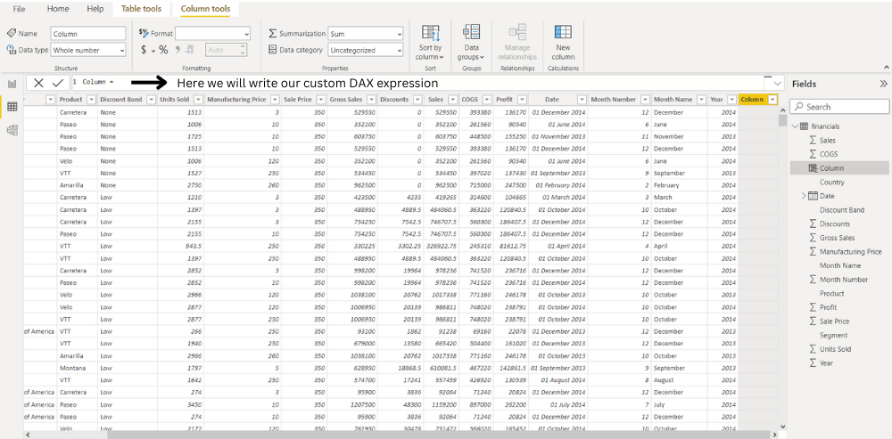
Step 2: On clicking the New Column option, an input bar will appear where we will write a simple DAX expression to create our columns.

Step 3: Data Analysis Expressions (DAX) is the native formula and query language for Microsoft PowerPivot, Power BI Desktop, and SQL Server Analysis Services Tabular models. In DAX, we can access a particular column using the following syntax - tableName[columnName], The following DAX Expression creates a new column named TotalManufacturingPrice.
TotalManufacturingPrice = financials[Manufacturing Price]*financials[Units Sold]

Step 4: Now, using this newly created column, we make our ProfitPercentage column using the below expression.
ProfitPercentage = (financials[Profit]/financials[TotalManufacturingPrice])*100

Step 5: Now, Select the Line chart from the Visualization. Drag the segment and drop to the X-axis , Again drag the ProfitPercent and drop to the Y-axis that we have created our custom columns, we can use line chart which comes out to be like this:

Creating Donut Chart in Power BI
Next, we will create another custom column called ProfitType to tell if the profit is positive, negative, or null. This can be done by using the IF function in the DAX Expression like this:
ProfitType = IF(financials[Profit]<0,"Negative",IF(financials[Profit]>0,"Positive","NULL"))
Step 1: From the top navigation bar, select the New Column option from the table tools and opportunities to create a new custom column.

Step 2: Select donut chart from the Visualization. From the field option drag the ProfitType and drop to the values and details. This newly created column can be further used to create a donut chart, as shown below:

Creating a Bar Chart in Power BI
Suppose we also want to analyze which day of the week has the most significant number of sales or profit; so for this, we can create an additional column, Weekday, by extracting the day of the week from the Date Column already provided using the DAX WEEKDAY function like this:
Weekday = WEEKDAY(financials[Date].[Date],2)
Here, the second parameter of the function refers to the return type.
- If return type = 1, week begins on Sunday (1) and ends on Saturday (7). numbered 1 through 7.
- If Return type = 2, week begins on Monday (1) and ends on Sunday (7).
- If Return type = 3, week begins on Monday (0) and ends on Sunday (6).numbered 1 through 7.
For the above function return type is 2, i.e the week begins on Monday.
Step 1: On clicking the New Column option, an input bar will appear where we will write a simple DAX expression to create our columns.

Step 2: Using this custom column, we can plot the following bar chart and conclude that we get Maximum Profits on Tuesdays ( Weekday = 2)

Similar Reads
Power BI - How to Create Calculated Columns? Power BI Desktop there are two data modification options known as Calculated Table and Calculated Column. These two options can add a whole new table referring to existing tables and a column to any existing table using existing columns of the respective table. Calculated Columns and Calculated Tabl
3 min read
Power BI - How to Format Column Chart? A column chart is a vertical chart, which could present a single bar with multiple stacks in it. We have various options to format column charts, we can change the value of the x-axis, y-axis, its title, etc. In this article, we will learn how to format a column chart in Power BI and explore its var
9 min read
Power BI - How to Create a Dashboard? Dashboards are static, in nature, and are used to just view the final reports. Dashboards are only available, in Power BI online service, and not in the Desktop mode. In this article, we will learn how to create a dashboard, in a workspace. Creating a Dashboard In a Workspace in Power BI We have a w
2 min read
Power BI - How to Add Conditional Columns? Creating insightful reports often requires data to be organized and categorized based on specific conditions. Conditional columns helps change or add values in a column based on logic you define. In this article, we’ll learn how to create conditional columns using Power Query Editor.Step 1: Open Pow
2 min read
Power BI - How to Create a Map? A map only locates the location as a data point, whether it's a continent, country, state, city, etc. Maps can also be plotted with the help of latitude and longitude. Maps can be useful, to know the current running business over different geographical locations. For example, if geeks for geeks want
3 min read