A scatter plot, also called a scatter graph or scatter chart, uses dots to describe two different numeric variables. The position of each dot on the horizontal and vertical axes indicates values for an individual data point.

It is generally used to plot the relationship between one independent variable and one dependent variable, where an independent variable is plotted on the x-axis and a dependent variable is plotted on the y-axis so that you can visualize the effect of the independent variable on the dependent variable.
Applications of Scatter Plot
As already mentioned, a scatter plot is a very useful data visualization technique. A few applications of scatter plots are listed below.
- Correlation Analysis: A scatter plot is useful in the investigation of the correlation between two different variables. It can be used to find out whether two variables have a positive correlation, negative correlation, or no correlation.
- Outlier Detection: Outliers are data points that are different from the rest of the data set. A scatter plot is used to bring out these outliers on the surface.
- Cluster Identification: In some cases, scatter plots can help identify clusters or groups within the data.
Scatter Plot Graph
A scatter plot is known by several other names; a few of them are "scatter chart," "scattergram," "scatter plot," and "XY graph." A scatter plot is used to visualize a data pair, such that each element gets its axis; generally, the independent one gets the x-axis and the dependent one gets the y-axis.
This kind of distribution makes it easier to visualize the kind of relationship the plotted pair of data is holding. So Scatter Plot is useful in situations when we have to find out the relationship between two sets of data, or in cases when we suspect that there may be some relationship between two variables and this relationship may be the root cause of some problem.
Construction of Scatter Plot
To construct a scatter plot, we have to follow the given steps.
Step 1: Identify the independent and dependent variables
Step 2: Plot the independent variable on the x-axis.
Step 3: Plot the dependent variable on the y-axis.
Step 4: Extract the meaningful relationship between the given variables.
In the following table, a data set of two variables is given.
Matches Played | 2 | 5 | 7 | 1 | 12 | 15 | 18 |
|---|---|---|---|---|---|---|---|
Goals Scored | 1 | 4 | 5 | 2 | 7 | 12 | 11 |
Now in this data set there are two variables: first is the number of matches played by a certain player, and second is the number of goals scored by that player. Suppose we aim to find out the relationship between the number of matches played by a certain player and the number of goals scored by him/her. For now, let us discard our obvious intuitive understanding that the number of goals scored is directly proportional to the number of matches played. For now, let us assume that we just have the given dataset and we have to extract the relationship between the given data pair.

As you can see in the given scatter plot, there is some kind of relationship between the number of matches played and the number of goals scored by a certain player.
Types of Scatter Plot
On the basis of the correlation of two variables, scatter plots can be classified into the following types.
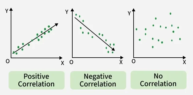
1. Scatter Plot For Positive Correlation
In this type of scatterplot, the value on the y-axis increases on moving from left to right. In more technical terms, if one variable is directly proportional to another, then the scatter plot will show positive correlation. Positive correlation can be further classified into perfect positive, high positive, and low positive.
2. Scatter Plot For Negative Correlation
In this type of scatterplot, the value on the y-axis decreases on moving from left to right. In other words, the value of one variable is decreasing with respect to the other. Positive correlation can be further classified into perfect negative, high negative, and low negative.
3. Scatter Plot For No Correlation
In this type of scatterplot, values are scattered all over the graph. Generally this kind of graph represents that there is no relationship between the two variables plotted on the scatter plot.
Scatter Plot Analysis
Scatter plot analysis involves examining the distribution of the points and interpreting the overall pattern to gain insights into the relationship between the variables. A scatter plot is used to visualize the relationship between two variables, but in real life, situations are not so ideal that we get only correlated variables. In real life there are situations when more than two variables are correlated with each other.
In such situations, we do use the Scatter Plot Matrix. For n number of variables, the scatter plot matrix will have n rows and n columns, where the scatter plot of variables xi and xj will be located at the ith row and jth column.
Also Check:
Solved Examples on Scatter Plot
Example 1: Draw a scatter plot for the given data that shows the number of IPL matches played and runs scored in each instance.
Matches Played | 10 | 12 | 14 | 16 | 18 |
|---|---|---|---|---|---|
Runs Scored | 287 | 300 | 297 | 350 | 345 |
Solution:
- X-axis: Number of Matches Played
- Y-axis: Number of Runs Scored
Graph:

Example 2: Prices (in dollars) and the ratings (out of 5 stars) of 5 different restaurants are recorded and plotted on a scatter plot. Interpret the scatter plot to determine if there is any relationship between price and rating.
Restaurant | A | B | C | D | E |
|---|---|---|---|---|---|
Prices (in dollars) | 22 | 29 | 15 | 18 | 23 |
Ratings (out of 5 stars) | 3.5 | 4.0 | 3.0 | 4.0 | 3.5 |
Solution:
- X-axis: Prices (in dollars) of restaurant
- Y-axis: Ratings (out of 5 stars)
Graph:

Practice Questions on Scatter Plot
Q1. Draw a scatter plot for the given data that shows the number of T-20 World Cup matches played and wicket taken in each instance.
Matches Played | 6 | 7 | 8 | 9 | 10 |
|---|---|---|---|---|---|
Wicket | 9 | 9 | 12 | 15 | 16 |
Q2. Heights (in cm) and weights (in kg) of five individuals are recorded and plotted on a scatter plot. Describe the relationship between height and weight based on the scatter plot.
Individuals | A | B | C | D | E |
|---|---|---|---|---|---|
Height(in cm) | 167 | 179 | 181 | 172 | 159 |
Weight (in kg) | 77 | 89 | 79 | 75 | 83 |
Q3. A student records the number of hours spent studying and the score obtained on a test for 5 subjects. Create a scatter plot showing the relationship between study hours and test scores.
Subjects | Mathematics | Physics | Chemistry | Computers | English |
|---|---|---|---|---|---|
Hours Studied | 8 | 6 | 11 | 9 | 16 |
Marks out of 50 | 35 | 33 | 45 | 39 | 48 |