Lazy Composables in Android Jetpack Compose - Columns, Rows, Grids
Last Updated :
04 Mar, 2025
In Jetpack compose we have Composables like Column and Row but when the app needs to display a large number of items in a row or columns then it's not efficient if done by Row or Column Composable. Therefore we have Lazy Composables in Jetpack Compose. Mainly we have three kinds of Lazy Composables Row, Column, and Grid. In this article, we are going to look at all three Lazy Composables. We will build a simple app that demonstrates all three composables in action.
Prerequisites
Step by Step Implementation
Below is the step-by-step implementation of the Lazy Row, Lazy Column and Lazy Grid.
Step 1 : Create a New Project
To create a new project in the Android Studio, please refer to How to Create a new Project in Android Studio with Jetpack Compose.
Note: Select Kotlin as the programming language.
Below is the File Structure of the Application:

Step 2 : Create Row and Column Items that are going to be displayed
Open MainActivity.kt and create two Composables, one for Row Item and One for Column Item
RowItem
@Composable
fun RowItem(number: Int) {
    Row(
        modifier = Modifier
            .size(100.dp)
            .background(Color.White)
            .border(2.dp, Color.Black),
        verticalAlignment = Alignment.CenterVertically,
        horizontalArrangement = Arrangement.Center

    ) {
        Text(
            text = number.toString(),
            color = Color.Black,
            textAlign = TextAlign.Center,
            modifier = Modifier.fillMaxWidth()
        )
    }
}
@Composable
fun ColumnItem(number: Int) {

    Column(
        modifier = Modifier
            .fillMaxWidth()
            .height(30.dp)
            .background(Color.White)
            .border(2.dp, Color.Black),
        verticalArrangement = Arrangement.Center,
        horizontalAlignment = Alignment.CenterHorizontally

    ) {
        Text(
            text = number.toString(),
            color = Color.Black,
            textAlign = TextAlign.Center,
            modifier = Modifier.fillMaxHeight()
        )
    }
}
Step 3 : Working with Lazy Composables
Unlike Column or Row Composable we cannot place composable inside directly inside Lazy Composables. Lazy Composables provides functions to place items in the Lazy Scope. There is mainly five overloaded functions.
1. Places one item in the Lazy Scope
item {
    RowItem(number = 0)
}
2. Places count items in the Lazy Scope
items (count = 10) {currentCount->
    RowItem(number = currentCount)
}
3. Places number of items present same as the size of Array
val number: Array<Int>
items (numbers) {arrayItem->
    RowItem(number = arrayItem)
}
4. Places number of items present same as the size of Array, and provides item(in list) and index of current Item.
val number: Array<Int>
itemsIndexed (numbers) { index: Int, item: Int ->
    RowItem(number = index)
}
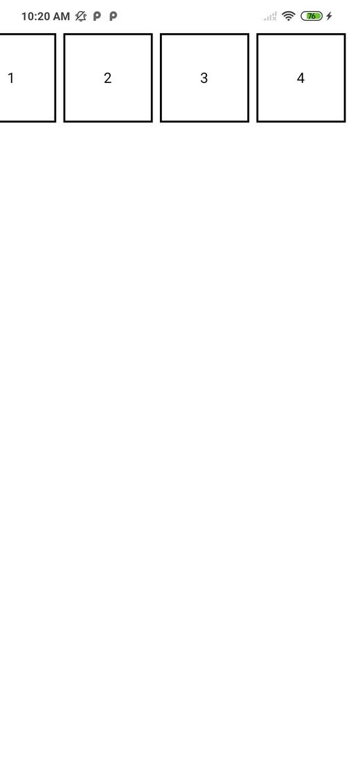
Lazy Row:
Create a Composable in MainActivity.kt, here we will place Lazy row to demonstrate Lazy Row
Kotlin
@Composable
fun LazyRowExample(numbers: Array<Int>) {
    LazyRow(
        contentPadding = PaddingValues(8.dp),
        horizontalArrangement = Arrangement.spacedBy(8.dp)
    ) {
        items(numbers) {arrayItem->
            RowItem(number = arrayItem)
        }
    }
}
Output:
LazyColumn:
Create a Composable in MainActivity.kt, here we will place Lazy Column to demonstrate Lazy Column
Kotlin
@Composable
fun LazyColumnExample(numbers: Array<Int>) {
    LazyColumn(
        contentPadding = PaddingValues(8.dp),
        verticalArrangement = Arrangement.spacedBy(8.dp)
    ) {
        items(numbers) {arrayItem->
            ColumnItem(number = arrayItem)
        }
    }
}
Output:

LazyGrid:
Create a Composable in MainActivity.kt, here we will place LazyVerticalGrid. It's almost the same as other lazy composable but it takes an extra parameter cells which is the number of grid items in one row / minimum width of one item. cells can be either GridCells.Fixed(count), It fixes the items displayed in one grid row. Another value it accepts is GridCells.Adaptive(minWidth), it sets the minWidth of each grid item.
Kotlin
@Composable
fun LazyGridExample(numbers: Array<Int>) {
    LazyVerticalGrid(
        columns = GridCells.Fixed(2),
        contentPadding = PaddingValues(8.dp)
    )
    {
        items(numbers) {
            RowItem(number = it)
        }
    }
}
Output:

Step 4 : Working with MainActivity
Navigate to app > kotlin+java > {package-name} > MainActivity.kt and paste the following code.
MainActivity.kt:
MainActivity.kt
package com.geeksforgeeks.demo

import android.os.Bundle
import androidx.activity.*
import androidx.activity.compose.*
import androidx.compose.foundation.background
import androidx.compose.foundation.border
import androidx.compose.foundation.layout.*
import androidx.compose.foundation.lazy.*
import androidx.compose.foundation.lazy.grid.GridCells
import androidx.compose.foundation.lazy.grid.LazyVerticalGrid
import androidx.compose.foundation.lazy.grid.items
import androidx.compose.material3.*
import androidx.compose.runtime.*
import androidx.compose.ui.*
import androidx.compose.ui.graphics.*
import androidx.compose.ui.text.style.TextAlign
import androidx.compose.ui.unit.*
import com.geeksforgeeks.demo.ui.theme.DemoTheme

class MainActivity : ComponentActivity() {
    override fun onCreate(savedInstanceState: Bundle?) {
        super.onCreate(savedInstanceState)
        setContent {
            DemoTheme(dynamicColor = false, darkTheme = false) {
                Surface(
                    modifier = Modifier.fillMaxSize(),
                    color = Color.White
                ) {
                    val list = mutableListOf<Int>()
                    for (i in 0..50) {
                        list.add(i)
                    }

                    Column(
                        modifier = Modifier.fillMaxSize()
                    ) {
                        Column(
                            modifier = Modifier
                                .fillMaxHeight(0.5f)
                                .fillMaxWidth()
                        ) {
                            LazyRowExample(list)
                            LazyColumnExample(list)
                        }
                        LazyGridExample(list)
                    }
                }
            }
        }
    }
}

@Composable
fun LazyGridExample(numbers: MutableList<Int>) {
    LazyVerticalGrid(
        columns = GridCells.Fixed(2),
        contentPadding = PaddingValues(8.dp)
    )
    {
        items(numbers) {
            RowItem(number = it)
        }
    }
}

@Composable
fun LazyColumnExample(numbers: MutableList<Int>) {
    LazyColumn(
        contentPadding = PaddingValues(8.dp),
        verticalArrangement = Arrangement.spacedBy(8.dp)
    ) {
        items(numbers) { arrayItem ->
            ColumnItem(number = arrayItem)
        }
    }
}

@Composable
fun LazyRowExample(numbers: MutableList<Int>) {
    LazyRow(
        contentPadding = PaddingValues(8.dp),
        horizontalArrangement = Arrangement.spacedBy(8.dp)
    ) {
        items(numbers) { arrayItem ->
            RowItem(number = arrayItem)
        }
    }
}

@Composable
fun RowItem(number: Int) {
    Row(
        modifier = Modifier
            .size(100.dp)
            .background(Color.White)
            .border(2.dp, Color.Black),
        verticalAlignment = Alignment.CenterVertically,
        horizontalArrangement = Arrangement.Center

    ) {
        Text(
            text = number.toString(),
            color = Color.Black,
            textAlign = TextAlign.Center,
            modifier = Modifier.fillMaxWidth()
        )
    }
}

@Composable
fun ColumnItem(number: Int) {
    Column(
        modifier = Modifier
            .fillMaxWidth()
            .height(30.dp)
            .background(Color.White)
            .border(2.dp, Color.Black),
        verticalArrangement = Arrangement.Center,
        horizontalAlignment = Alignment.CenterHorizontally

    ) {
        Text(
            text = number.toString(),
            color = Color.Black,
            textAlign = TextAlign.Center,
            modifier = Modifier.fillMaxHeight()
        )
    }
}
Output: