In this article, we will be learning about Labels in Bokeh. Labels are the short words or phrases that are used in order to define something in a plot.
Let us take an example that we are plotting a set of points in a graph. Now, if we're dealing with real-life statistical data, then to plot the points in the graph, we need to label the X-Axis and Y-Axis with appropriate information in order to define what we are plotting against each other. That is where the term comes into place. They help us to determine what exactly we are plotting against in X and Y-Axis. Along with that, labels have various other functionalities in a plot.
So, let us take a simple implementation of having labels on X-Axis and Y-Axis with a group of simple points. Google Colab or any other text editor can be used for implementing the above concept. But if we are using our local device, be sure to have installed python earlier. And after that, we need to install bokeh. Open the command prompt and write the following code to install :
pip install bokeh
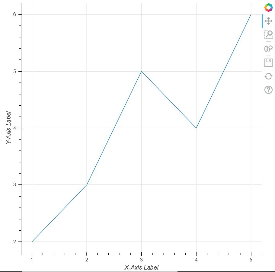
Now, let us take a simple example to have a little idea about labels in bokeh. Here we are taking a set of points and plotting them against each other with the X-Axis and Y-Axis having labels coded using bokeh.
Sample Code:
Python3
# importing show from bokeh.io
# module to show the plot
from bokeh.io import show

# importing figure from
# bokeh.plotting to create an
# empty plot
from bokeh.plotting import figure


# Creating a set of points using
# two arrays x and y
x = [1, 2, 3, 4, 5]
y = [2, 3, 5, 4, 6]

# Creating an empty figure with plot width
# and height as 600
p = figure(plot_width=600, plot_height=600)

# defining that the points should be joined
# with a line
p.line(x, y)

# Defining the X-Axis Label
p.xaxis.axis_label = "X-Axis Label"

# defining the Y-Axis Label
p.yaxis.axis_label = "Y-Axis Label"

# showing the above plot
show(p)
Output:
Now, let us dive a little deep into the topic. Apart from adding labels only in the axes in the above approach, bokeh.models.annotations provide us with a package called Labels. Labels come with various features which we are going to explore below:
In the code below, we are using labels from bokeh.models.annotations module and we are plotting a set of points on the graph. After labeling the X and the Y-Axis, we are labeling the second point in the plot. Along with that, we are also defining the position of the Label and ultimately showing the above plot.
Example:
Python3
# importing show from bokeh.io
# module to show the plot
# importing show from bokeh.io
from bokeh.io import show

# importing label from
# bokeh.models.annotations module
from bokeh.models.annotations import Label

# importing figure from bokeh.plotting
# module
from bokeh.plotting import figure


# Creating an empty figure with plot
# width and size to be 600 and 500
# respectively
p = figure(plot_width=600, plot_height=500)

# Plotting the points in the shape of
# a circle with color green and size 10
p.circle([2, 5, 8], [4, 7, 6], color="green", size=10)

# Labelling the X-Axis
p.xaxis.axis_label = "X-Axis-Label"

# Labelling the Y-Axis
p.yaxis.axis_label = "Y-Axis_Label"

# Creating a label for the point (5,7)
# where the text for the point will be
# "Second Point" alng with defining
# the position of the text
label = Label(x=5, y=7, x_offset=10, y_offset=-30, text="Second Point")

# Implementing label in our plot
p.add_layout(label)

# Showing the above plot
show(p)
Output:

Let's move to the next example:
In this example, we will be talking about another property of labels i.e LabelSet. But before going to the code, we should have a brief understanding of what is a LabelSet. Now, from the previous example, we can clearly see that with the help of labels, we are only able to label a single point in the graph i.e "Second Point". But if we want to label all the points, then there is no point in repeating the code every time. So, in such a situation, bokeh has come up with a package known as LabelSet that helps us to label multiple points in the plot without repetition.In this example, we will be using another package i.e ColumnDataSource. ColumnDataSource provides us with the mapping of column names with a sequence of values.
Now, let's move to the code to see the implementation:
Code:
Python3
# importing figure from
# Bokeh.plotting
from bokeh.plotting import figure

# importing ColumnDataSource and LabelSet
# from bokeh.models
from bokeh.models import ColumnDataSource, LabelSet

# import show from broken.io module
from bokeh.io import show


# Using ColumnDataSource we are providing
# Column names to a sequence of values
source = ColumnDataSource(data=dict(
    marks=[166, 171, 172, 168, 174, 162],
    roll_no=[0, 1, 2, 3, 4, 5],
    names=['Joey', 'Chandler', 'Monica',
           'Phoebe', 'Rachel', 'Ross']))

# Creating an empty figure
p = figure(plot_width=750, plot_height=600)

# Plotting the data in the form of triangle
p.triangle(x='roll_no', y='marks', size=8, source=source)

# Labelling the X-Axis
p.xaxis.axis_label = 'Roll_Numbers'

# Labelling the Y-Axis
p.yaxis.axis_label = 'Marks'

# Using LabelSet, we are labelling each of the
# points with names created in source
labels = LabelSet(x='roll_no', y='marks', text='names',
                  x_offset=5, y_offset=5, source=source)

Adding that label to our figure
p.add_layout(labels)

# Showing the above plot
show(p)
Output:

Last but not the least, we will be learning another annotation i.e legend_label which helps us to differentiate between multiple plots in a graph. By using the tag "legend_label" we are actually defining the name of the plot which will be shown on the upper right side of the graph.
Code:
Python3
# import numpy package
import numpy as np

# importing figure and show from
# bokeh.plotting
from bokeh.plotting import figure, show


# Creating an array of 100 numbers
# between 0 to 1 using linespace
x = np.linspace(0, 1, 100)

# Creating an array of sin
# values of x in y
y = np.sin(x)

# Creating an empty figure
p = figure(plot_width=500, plot_height=500)

# Creating the first plot with color as red and label as
# sin(x)
p.circle(x, y, legend_label="1st Plot", color="red")

# Drawing a line through all the points with the
# same color
p.line(x, y, legend_label="1st Plot", line_color="red")

# Drawing the second plot as yellow and labelling as
# the 2nd plot
p.circle(x, y**3, legend_label="2nd Plot", color="yellow")

# Drawing a line through all the points of the
# second plot
p.line(x, y**3, legend_label="2nd Plot", line_color="yellow", line_width=2)

# showing the above plot
show(p)
Output:

Similar Reads
Bokeh - Multiple Plots
Prerequisites: Introduction to Bokeh in Python In this article, we will discuss how to plot multiple plots using Bokeh in Python. We are going to use the row() method of the bokeh.layouts module, it is used in show() method of bokeh.io library as an argument to depict multiple plots in using bokeh.
4 min read
Exporting Bokeh Plots
Bokeh is an interactive data visualization library available for Python. Using Bokeh we can embed our plot in any HTML file. It internally uses HTML and JavaScript to render the plot in Web Browsers for representation. Under the hood, it converts the data source into a JSON file which is used as inp
4 min read
Hide legend in Bokeh plot
Bokeh is a Python interactive data visualization. It renders its plots using HTML and JavaScript. It targets modern web browsers for presentation providing elegant, concise construction of novel graphics with high-performance interactivity. Adding legends to your figures can help to properly describ
2 min read
Bokeh - Customising Legends
The legend of a graph reflects the data displayed in the graph’s Y-axis. In Bokeh, the legends correspond to glyphs. This article how Legends appearing in the bokeh plot can be customized. We can customize the legend with its several attributes such as location, color, line-color, font-size, font-st
3 min read
Bokeh - grid layout of plots
Bokeh includes several layout options for arranging plots and widgets. They make it possible to arrange multiple components to create interactive dashboards or data applications. The layout functions let you build a grid of plots and widgets. You can nest as many rows, columns, or grids of plots tog
5 min read
Using Custom Labels for Ticks in Bokeh
Bokeh is a versatile library that allows for creating interactive plots and visualizations with detailed customization options. One powerful feature of Bokeh is the ability to modify the appearance and labels of tick marks on the axes of your plots. By using custom labels for ticks, you can make you
5 min read
Rotating X-axis Labels in Bokeh Figure
Bokeh is a powerful visualization library in Python that allows users to create interactive plots and dashboards. One common requirement when creating plots is to adjust the orientation of axis labels to improve readability, especially when dealing with long labels or limited space. This article foc
5 min read
Bootstrap 5 Floating labels
Bootstrap 5 floating labels are form labels that float over input fields, improving UX. Wrap form controls like <input>, <label>, <textarea>, <select> inside <div> with class .form-floating. Ensure these elements precede <label> inside the floating <div>.Boo
2 min read
Adding labels to a Bokeh plot
Bokeh includes several layout options for arranging plots and widgets. They make it possible to arrange multiple components to create interactive dashboards or data applications. The layout functions let you build a grid of plots and widgets. You can nest as many rows, columns, or grids of plots tog
3 min read
Bokeh - Horizontal layout of plots
Bokeh includes several layout options for arranging plots and widgets. They make it possible to arrange multiple components to create interactive dashboards or data applications. The layout functions let you build a grid of plots and widgets. You can nest as many rows, columns, or grids of plots tog
2 min read