How to use CSS to separate content & design ?
Last Updated :
31 May, 2023
In this article, we will learn about how to separate the content from the design using CSS, along with understanding the different ways to implement it through examples.
The attractive web pages may contain some text content, images, video, audio, slides, etc, in a structure with a properly well-organized design, which can help to enhance the overall interactivity of the page. For this, we can utilize the different styling properties to make interactive web pages. These styling properties can be implemented in 3 different ways i.e.
- By specifying the properties within the element.
- By adding the properties to the <head> tag using the <style> tag.
- By defining the properties in a separate file.
Defining the CSS properties(selectors or classes) separately in different sheets can help to reduce the length of the code by grouping the various similar CSS properties, & hence discards the repetitive code. For this, managing the CSS files makes it easy, along with enhancing the overall readability of the code. This, in turn, helps to fix the bugs efficiently, in the code. Using the external sheet can provide reusability to the CSS code, along with importing it to any other HTML file.
Approach: We can separate the content & the design by using external CSS having the file extension as .css. For this, simply specify the required file path of the external file in the <link> tag inside the <head> tag in the main HTML file. This will redirect to the sheet whenever styling properties need to implement. In External CSS, we define all the required CSS properties to make our content attractive.
Syntax:
<head>
     <link rel="stylesheet"
            href="CSS File link">
</head>
It can also be done by using an import statement within the <style> tag.
<style type="text/css">
    @import url(CSS File link);
</style>
Example 1: In this example, we will use the <link> tag to utilize the CSS properties from the external style sheet.
HTML
<html>
<head>
    <title>Separating Content and Design</title>
    <link rel="stylesheet" href="style.css" />
</head>

<body>
    <div>
        <h1>GeeksforGeeks</h1>
        <h3>
            Separating the Content and Design using CSS
        </h3>
        <p class="content">
            A Computer Science portal for geeks.
            It contains well written, well thought
            and well explained computer science and
            programming articles.
        </p>
    </div>
</body>
</html>
style.css: In this file, we have implemented the various CSS properties to the different elements.
CSS
body {
    background-color: lightgrey;
}

h1 {
    color: green;
}

h3 {
    color: indigo;
}

h1,
h3 {
    text-align: center;
    font-family: sans-serif;
}

.content {
    text-align: justify;
    font-family: sans-serif;
    margin-left: 35px;
    margin-right: 35px;
    color: Tomato;
}
Explanation: In the index.html file, we have simply added the headings & the paragraph. The <p> tag has a class .content that implements some CSS properties. This stylesheet is a CSS file, which has separate content and is saved with the extension ".css".
Output:

Using Import Statement:
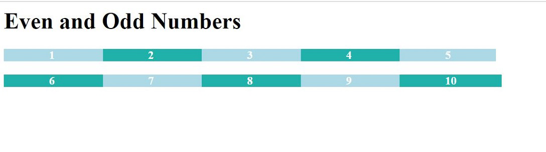
Example 2: In the below example, the even & odd numbers are displayed. CSS is provided to them in a separate file. Even numbers are displayed in a different color and odd are indifferent.
HTML
<html>
<head>
    <style type="text/css">
        @import url("SeparateContent.css");
    </style>
</head>

<body>
    <h1>Even and Odd Numbers</h1>
    <div class="odd">
        <p>1</p>
    </div>
    <div class="even">
        <p>2</p>
    </div>
    <div class="odd">
        <p>3</p>
    </div>
    <div class="even">
        <p>4</p>
    </div>
    <div class="odd">
        <p>5</p>
    </div>
    <br>
    <br>
    <div class="even">
        <p>6</p>
    </div>
    <div class="odd">
        <p>7</p>
    </div>
    <div class="even">
        <p>8</p>
    </div>
    <div class="odd">
        <p>9</p>
    </div>
    <div class="even">
        <p>10</p>
    </div>
</body>
</html>
SeparateContent.css: In this file, we will provide styling to odd and even elements.
CSS
.odd {
    color: white;
    background-color: lightblue;
    display: inline;
}

p {
    font-weight: bold;

    padding: 5%;
    display: inline;
}

.even {
    color: white;
    background-color: lightseagreen;
    display: inline;
}
Explanation: In the main HTML file, we have simply added integers under <p>. By default, <p> is black in color. Now, to provide some styling to them, we have linked a stylesheet to it. This stylesheet is a CSS file, which has separate content and is saved with the extension ".css". In this CSS file, we have defined text color as well as the background color for each class i.e. odd and even. Provided some padding and changed the display to inline.
Output:
Similar Reads
How to create a notebook design with CSS ? A notebook in web design refers to styling elements to mimic the appearance of a physical notebook, featuring lines, margins, and textures. By utilizing CSS properties like borders, backgrounds, and box shadows, you can design a realistic notebook interface, enhancing the visual appeal of web pages
2 min read
How to make div not larger than its contents using CSS? There are three ways to achieve this problem: By default case Using inline-block property Using fit-content property in width and height Default Case: In HTML div is by default fit to content inside it. The example goes like this: Example 1: html <!DOCTYPE html> <html lang = "en"
3 min read
Smart CSS Solutions For Better Web Design Before getting started with CSS solutions for better web design, let have a brief introduction to CSS. CSS stands for Cascading Style Sheet which is used to bring style to a document. It gives color, height, width, margin, alignment, and every possible feature a webpage should have in order to look
5 min read
How to Create a Text Divider with CSS? A text divider is a visual element used to separate content within a web page providing clarity and improving readability. In CSS we can create text dividers using various approaches such as horizontal lines, background images, or pseudo-elements. Below are the approaches to create a text divider wi
3 min read
Uses of an embedded style sheet in CSS CSS stylesheets define the presentation and layout of an HTML document, enhancing accessibility, flexibility, and control. They allow the specification of properties like color, layout, background, font, and borders, offering improved content presentation. CSS can be applied to an HTML document in t
2 min read
How to Create Section Counter using HTML and CSS ? Section counter is like a card and is useful for webpage footer. It contains details about the company. In this article, we will introduce some predicted data about some companies. We divide this article into two sections, in the first section we will create the normal structure then we will work on
3 min read