How to style outline buttons using CSS ?
Last Updated :
24 Apr, 2025
This article will explore how to style outline buttons using CSS. The Outline buttons give a clean visual appearance. The clear and visible border ensures the clear separation from the background and other elements and enhances readability. We can achieve the outline buttons effect in two different ways including CSS Outline Property and CSS Border Property.
Outline CSS Property
The CSS 'outline' property is used to create a visible border around an element, providing a visual emphasis without affecting the layout. It's often used for highlighting interactive elements like buttons.
Approach
- Make the basic structure of the web page using elements <h1>, <h3>, and <button>. Link the external style sheet to the HTML file for giving styles to the elements.
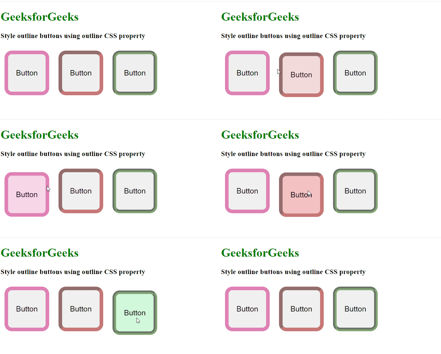
- Set the property to the first button element having a class named "mybutton1" outline to solid 10px, then set the property for the second button having a class named "mybutton2" 10px inset, and for the third button set property 10px groove.
- Give different styles to the buttons like hover effect, transform, background color, etc for making buttons to enhance the overall user experience.
Example: The example shows how to style outline buttons using the outline CSS property.
HTML
<!DOCTYPE html>
<html lang="en">

<head>
    <meta charset="UTF-8">
    <meta name="viewport" content="width=device-width,
                                   initial-scale=1.0">
    <title>
        Style outline buttons
        using CSS
    </title>
    <link rel="stylesheet" href="index.css">
</head>

<body>
    <h1>GeeksforGeeks</h1>
    <h3>
        Style outline buttons
        using outline CSS property
    </h3>
    <button class="mybutton mybutton1">
        Button
    </button>
    <button class="mybutton mybutton2">
        Button
    </button>
    <button class="mybutton mybutton3">
        Button
    </button>
</body>

</html>
.mybutton {
    width: 100px;
    height: 100px;
    font-size: 20px;
    border: none;
    margin-right: 20px;
    transition: .2s linear;
}

h1 {
    color: green;
}

.mybutton:hover {
    transform: translateY(10px);
}

.mybutton1 {
    outline: 10px solid rgba(202, 45, 131, 0.6);
    border-radius: 10px;
}

.mybutton2 {
    outline: 10px inset rgba(163, 26, 26, 0.6);
    border-radius: 10px;
}

.mybutton1:hover {
    background-color: rgba(242, 184, 216, 0.6);
}

.mybutton2:hover {
    background-color: rgba(235, 152, 153, 0.6);
}

.mybutton3 {
    outline: 10px groove rgba(47, 106, 22, 0.6);
    border-radius: 10px;
}

.mybutton3:hover {
    background-color: rgba(178, 244, 194, 0.6);
}
Output

CSS Border Property
The CSS 'border' property is used to define the border around an element, allowing control over its style, width, and color. It's widely used for shaping and emphasizing elements in web design.
Approach
- Make the basic structure of the web page using elements <h1>, <h3>, and <button>. Link the external style sheet to the HTML file for giving styles to the elements.
- Set the property to the first button element having a class named "mybutton1" border to 10px double and set the property for the second button having a class named "mybutton2" 5px dotted.
- Give different styles to the buttons like hover effect, transform, background color, etc for making buttons to enhance the overall user experience.
Example: The example shows how to style outline buttons using the border CSS property.
HTML
<!DOCTYPE html>
<html lang="en">

<head>
    <meta charset="UTF-8">
    <meta name="viewport" content="width=device-width,
                                   initial-scale=1.0">
    <title>
        Style border buttons
        using CSS
    </title>
    <link rel="stylesheet" href="style.css">

</head>

<body>
    <h1>GeeksforGeeks</h1>
    <h3>
        Style outline buttons
        using border CSS property
    </h3>
    <button class="mybutton mybutton1">
        Button
    </button>
    <button class="mybutton mybutton2">
        Button
    </button>
</body>

</html>
.mybutton {
    width: 100px;
    height: 100px;
    font-size: 20px;
    margin: 20px;
    transition: .2s linear;
}

h1 {
    color: green;
}

.mybutton:hover {
    transform: translateY(10px);
}

.mybutton1 {
    border: 10px double rgba(53, 22, 192, 0.6);
    border-radius: 10px;
}

.mybutton2 {
    border: 5px dotted rgba(163, 26, 26, 0.6);
    border-radius: 10px;
}

.mybutton1:hover {
    background-color: rgba(118, 152, 221, 0.6);
}

.mybutton2:hover {
    background-color: rgba(235, 152, 153, 0.6);
}