How to Sort Plotly Bar Chart in Descending Order
Last Updated :
13 Aug, 2024
Plotly is a powerful library for creating interactive and visually appealing data visualizations in Python. One of the common tasks when working with bar charts is sorting the bars in descending order. This article will guide you through the process of sorting a Plotly bar chart in descending order, using both Plotly Express and Plotly Graph Objects. We will explore the necessary steps, provide code examples, and discuss best practices to ensure your charts are both informative and aesthetically pleasing.
Understanding Plotly Bar Charts
Before diving into sorting, it's essential to understand the basic structure of a Plotly bar chart. Plotly offers two main interfaces for creating bar charts:
- Plotly Express: A high-level interface for creating quick and easy visualizations.
- Plotly Graph Objects: A low-level interface for more detailed and customized visualizations.
Both interfaces allow you to create bar charts, but they differ in terms of syntax and flexibility.
Sorting Bar Charts with Plotly Express
Plotly Express simplifies the process of creating bar charts with minimal code. To sort a bar chart in descending order, you can use the categoryorder attribute in the update_layout method.
Example with Plotly Express
Python
import plotly.express as px
import pandas as pd

data = {
    'Category': ['A', 'B', 'C', 'D'],
    'Values': [4, 1, 3, 2]
}
df = pd.DataFrame(data)
fig = px.bar(df, x='Category', y='Values')

# Update layout to sort bars in descending order
fig.update_layout(xaxis={'categoryorder': 'total descending'})
fig.show()
Output:
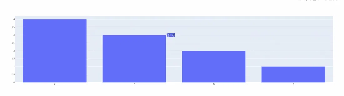
 Sorting Bar Charts with Plotly Express
In this example, the categoryorder is set to 'total descending', which sorts the bars based on their values in descending order
Sorting Bar Charts with Plotly Graph Objects
Plotly Graph Objects provide more control over the chart's appearance and behavior. Sorting a bar chart in descending order using this interface involves setting the categoryorder attribute in the layout.
Example with Plotly Graph Objects
Python
import plotly.graph_objects as go

categories = ['A', 'B', 'C', 'D']
values = [4, 1, 3, 2]

fig = go.Figure(go.Bar(x=categories, y=values))

# Update layout to sort bars in descending order
fig.update_layout(xaxis={'categoryorder': 'total descending'})
fig.show()
Output:
 Sorting Bar Charts with Plotly Graph Objects
Here, the categoryorder is again set to 'total descending', ensuring the bars are displayed from highest to lowest value.
Sorting Horizontal Bar Charts
For horizontal bar charts, the sorting logic remains the same, but you need to adjust the axis attributes accordingly.
Python
import plotly.express as px
import pandas as pd

data = {
    'Category': ['A', 'B', 'C', 'D'],
    'Values': [4, 1, 3, 2]
}

df = pd.DataFrame(data)

# Create a horizontal bar chart
fig = px.bar(df, x='Values', y='Category', orientation='h')

# Update layout to sort bars in descending order
fig.update_layout(yaxis={'categoryorder': 'total ascending'})
fig.show()
Output:
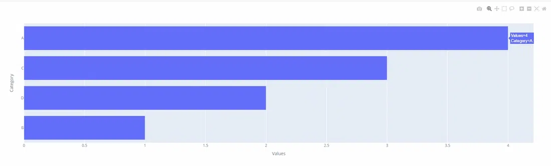 Sorting Horizontal Bar Charts
In this case, the yaxis is set to 'total ascending' to achieve descending order for a horizontal bar chart.
Best Practices for Sorting Bar Charts
- Data Preparation: Ensure your data is clean and properly formatted before creating a chart. Sorting can be performed on the data itself using libraries like Pandas, which might be more efficient for large datasets.
- Axis Configuration: Adjust the axis configuration based on the orientation of your bar chart. Use xaxis for vertical charts and yaxis for horizontal charts.
- Interactivity: Leverage Plotly's interactive features to enhance user experience. Allow users to hover over bars to see detailed information.
- Aesthetics: Customize colors, labels, and titles to make your chart visually appealing and easy to understand.
Conclusion
Sorting a Plotly bar chart in descending order is a straightforward process that enhances the readability and interpretability of your data visualizations. Whether you use Plotly Express for quick plotting or Plotly Graph Objects for more detailed customization, the categoryorder attribute is key to achieving the desired order. By following the examples and best practices outlined in this article, you can create effective and visually appealing bar charts that clearly communicate your data insights.
Similar Reads
How to group Bar Charts in Python-Plotly?
Plotly is a Python library which is used to design graphs, especially interactive graphs. It can plot various graphs and charts like histogram, barplot, boxplot, spreadplot and many more. It is mainly used in data analysis as well as financial analysis. plotly is an interactive visualization library
2 min read
How to create Stacked bar chart in Python-Plotly?
Plotly is a Python library which is used to design graphs, especially interactive graphs. It can plot various graphs and charts like histogram, barplot, boxplot, spreadplot and many more. It is mainly used in data analysis as well as financial analysis. plotly is an interactive visualization library
2 min read
PySpark - GroupBy and sort DataFrame in descending order
In this article, we will discuss how to groupby PySpark DataFrame and then sort it in descending order. Methods UsedgroupBy(): The groupBy() function in pyspark is used for identical grouping data on DataFrame while performing an aggregate function on the grouped data. Syntax: DataFrame.groupBy(*col
3 min read
How to Create Pie Chart Using Plotly in R
The pie chart is a circular graphical representation of data that is divided into some slices based on the proportion of it present in the dataset. In R programming this pie chart can be drawn using Plot_ly() function which is present in the Plotly package. In this article, we are going to plot a pi
3 min read
How to Change Subplot Titles After Creation in Plotly
When creating visualizations with Plotly, especially with subplots, you might need to modify the titles after the initial plot creation. Whether you forgot to add titles initially or simply want to adjust them later, Plotly provides flexible methods to make these changes. In this article, we will ex
4 min read
How to make Wind Rose and Polar Bar Charts in Plotly - Python?
A Plotly is a Python library that is used to design graphs, especially interactive graphs. It can plot various graphs and charts like histogram, barplot, boxplot, spreadplot, and many more. It is mainly used in data analysis as well as financial analysis. plotly is an interactive visualization libra
2 min read
How to change a color bar in Plotly in Python
In this article, we will learn how to change a color bar in Plotly Python. Different types Color-Scale names for Plotlyaggrnyl    burginferno    plasma    rdpu     ylgnbu    mattergeyseragsunset   burgyl    jet      plotly3redorylorbr    solarpiygblackbodycividismagenta    pubu
2 min read
How to make histogram bars to have different colors in Plotly in R?
In this article, we are going to discuss making histogram bars to have different colors in Plotly in R Language. The Histogram is defined as the bar graph representation of data along the x-axis. The plotly package contains plot_ly() function which is used to visualize different plots in R like scat
1 min read
How to create Grouped box plot in Plotly?
Plotly is a Python library that is used to design graphs, especially interactive graphs. It can plot various graphs and charts like histogram, barplot, boxplot, spreadplot, and many more. It is mainly used in data analysis as well as financial analysis. plotly is an interactive visualization library
2 min read
How to change the order of bars in bar chart in R ?
In this article, we will discuss how to change the order of bars in bar chart in R programming language. We can change the order of bars by using two plots ggplot and barplot. Method 1: Ggplot re-ordering Firstly create a sample dataset and plot the graph-Manual. Now let's reorder them accordingly.
4 min read