How to Show a Hierarchical Structure on the Axis Labels with ggplot2 in R?
Last Updated :
26 Sep, 2024
Visualizing data with a hierarchical structure can be a bit challenging, especially when you want to convey multiple levels of grouping or categorization within a single plot. In R, using ggplot2, we can effectively represent this hierarchical information in the axis labels, making it easier to understand the structure and relationships between different levels of data. This article will guide you through how to display hierarchical structure on the axis labels using ggplot2 in R.
What is a Hierarchical Structure?
A hierarchical structure represents data in multiple layers or levels, such as categories and subcategories, showing how data points are organized. For example, you might have sales data for different regions, and within each region, you have different product categories.
Why Display Hierarchical Structures on Axis Labels?
- Better Data Interpretation: Displaying hierarchical information helps the viewer understand the relationships between different categories.
- Detailed Analysis: It allows you to present multiple levels of grouping within a single visualization, making complex datasets more interpretable.
- Clear Presentation: A well-structured plot with hierarchical labels can effectively communicate insights and trends across different levels of data.
We will be using a combination of data manipulation and plotting techniques to display these hierarchical structures using R Programming Language.
1. Installing and Loading Required Packages
To get started, install and load the necessary packages. We'll use ggplot2 for plotting and dplyr for data manipulation.
# Install required packages if not already installed
install.packages("ggplot2")
install.packages("dplyr")

# Load the required libraries
library(ggplot2)
library(dplyr)
2. Creating a Sample Hierarchical Dataset
Let’s create a simple dataset representing sales data across multiple regions and product categories.
R
# Creating a sample dataset
sales_data <- data.frame(
  Region = c("North", "North", "North", "South", "South", "South", "East", "East", "East"),
  Category = c("Electronics", "Furniture", "Clothing", "Electronics", "Furniture", "Clothing",
               "Electronics", "Furniture", "Clothing"),
  Sales = c(15000, 12000, 8000, 17000, 13000, 9000, 16000, 14000, 8500)
)

# Display the dataset
print(sales_data)
Output:
  Region    Category Sales
1  North Electronics 15000
2  North   Furniture 12000
3  North    Clothing  8000
4  South Electronics 17000
5  South   Furniture 13000
6  South    Clothing  9000
7   East Electronics 16000
8   East   Furniture 14000
9   East    Clothing  8500
- Region: The main grouping (North, South, East)
- Category: Sub-grouping (Electronics, Furniture, Clothing)
- Sales: The sales figures
3. Combining Hierarchical Levels into One Label
To display hierarchical data on the X-axis, we need to combine the Region and Category columns into a single label. We'll use the paste() function to do this.
R
# Combine Region and Category columns to create a hierarchical label
sales_data <- sales_data %>%
  mutate(Hierarchical_Label = paste(Region, Category, sep = "\n"))

# Display the updated dataset
print(sales_data)
Output:
  Region    Category Sales Hierarchical_Label
1  North Electronics 15000 North\nElectronics
2  North   Furniture 12000   North\nFurniture
3  North    Clothing  8000    North\nClothing
4  South Electronics 17000 South\nElectronics
5  South   Furniture 13000   South\nFurniture
6  South    Clothing  9000    South\nClothing
7   East Electronics 16000  East\nElectronics
8   East   Furniture 14000    East\nFurniture
9   East    Clothing  8500     East\nClothing
The Hierarchical_Label column now contains values like "North\nElectronics", which represent the hierarchical structure.
4. Plotting the Data with ggplot2
Now that our dataset is ready, let's create a bar plot using ggplot2 and use our combined label as the X-axis.
R
# Create a bar plot with hierarchical axis labels
ggplot(sales_data, aes(x = Hierarchical_Label, y = Sales, fill = Category)) +
  geom_bar(stat = "identity") +
  labs(title = "Sales by Region and Category",
       x = "Region and Category",
       y = "Total Sales") +
  theme_minimal() +
  theme(axis.text.x = element_text(angle = 45, hjust = 1, size = 10, face = "bold"))
Output:
 Hierarchical Structure on the Axis Labels with ggplot2 in R
aes(x = Hierarchical_Label, y = Sales, fill = Category): Specifies the aesthetic mapping, where Hierarchical_Label represents the combined axis label.geom_bar(stat = "identity"): Creates a bar plot with the actual sales values.theme(axis.text.x = element_text(angle = 45, hjust = 1, size = 10, face = "bold")): Customizes the X-axis text appearance, tilting it for better readability.
Using ggplot2’s built-in facet_grid() for More Complex Structures
For datasets with more complex hierarchical structures, you might want to use facet_grid() to split both axes.
R
# Creating another hierarchical dataset with additional levels
extended_sales_data <- data.frame(
  Region = rep(c("North", "South", "East"), each = 6),
  Category = rep(c("Electronics", "Furniture", "Clothing"), 6),
  Subcategory = rep(c("Laptops", "Desktops", "Chairs", "Tables", "T-Shirts", "Jeans"), 3),
  Sales = sample(10000:20000, 18, replace = TRUE)
)

# Create a plot with facet_grid
ggplot(extended_sales_data, aes(x = Subcategory, y = Sales, fill = Category)) +
  geom_bar(stat = "identity") +
  facet_grid(Region ~ Category) +
  labs(title = "Sales by Region, Category, and Subcategory",
       x = "Product Subcategory",
       y = "Total Sales") +
  theme_minimal() +
  theme(axis.text.x = element_text(angle = 45, hjust = 1, size = 10, face = "bold"),
        strip.text = element_text(size = 10, face = "bold"))
Output:
 Using ggplot2’s built-in facet_grid() for More Complex Structures
facet_grid(Region ~ Category): Creates a matrix of plots split by both Region (rows) and Category (columns), allowing for a more comprehensive hierarchical view.
Implementing Hierarchical Visualization with Concatenation
For this example, we will use a hypothetical dataset representing sales data in different regions and sub-regions within countries. Each level of the hierarchy includes:
- Country (e.g., USA, Canada)
- Region (e.g., West, East)
- Sub-region (e.g., California, New York)
R
# Load necessary libraries
library(ggplot2)
library(dplyr)

# Create a sample dataset
data <- data.frame(
  Country = c("USA", "USA", "Canada", "Canada"),
  Region = c("West", "East", "West", "East"),
  SubRegion = c("California", "New York", "Alberta", "Ontario"),
  Sales = c(50000, 45000, 30000, 35000)
)
data
Output:
ountry	Region	SubRegion	Sales
<chr>	<chr>	<chr>	<dbl>
USA	West	California	50000
USA	East	New York	45000
Canada	West	Alberta	30000
Canada	East	Ontario	35000
In this example, Country, Region, and SubRegion represent the hierarchical structure we aim to display on the axis labels. Let’s begin by creating a simple bar plot of sales by sub-region without hierarchical axis labels.
R
# Basic bar plot
ggplot(data, aes(x = SubRegion, y = Sales)) +
  geom_bar(stat = "identity") +
  theme_minimal() +
  labs(title = "Sales by Sub-Region", x = "Sub-Region", y = "Sales")
Output:
 Hierarchical Structure on the Axis Labels with ggplot2 in R
This plot does not yet reflect the hierarchical relationship between countries, regions, and sub-regions.
Concatenating Hierarchical Labels
One of the simplest ways to represent hierarchical structures in ggplot2 is by concatenating the levels of hierarchy and displaying them as combined labels on the x-axis.In this code:
- We create a new variable HierarchicalLabel that concatenates Country, Region, and SubRegion into a single label using the paste function.
- This creates labels like USA > West > California, which clearly indicate the hierarchy. This method works well for smaller datasets or when the hierarchy is simple.
R
# Create a hierarchical label by concatenating levels
data <- data %>%
  mutate(HierarchicalLabel = paste(Country, Region, SubRegion, sep = " > "))

# Plot with hierarchical labels
ggplot(data, aes(x = HierarchicalLabel, y = Sales)) +
  geom_bar(stat = "identity") +
  theme_minimal() +
  labs(title = "Sales by Country, Region, and Sub-Region", x = "Location", y = "Sales") +
  theme(axis.text.x = element_text(angle = 45, hjust = 1))
Output:
 Hierarchical Structure on the Axis Labels with ggplot2 in R
Displaying Hierarchy Using Faceting
For larger datasets, concatenating the labels may make the plot cluttered and hard to read. An alternative approach is to use faceting in ggplot2, which splits the data into multiple plots based on a categorical variable. We can facet the plot by higher levels of the hierarchy, like Country and Region, to separate the sub-regions into individual panels.
R
# Facet plot by Country and Region
ggplot(data, aes(x = SubRegion, y = Sales)) +
  geom_bar(stat = "identity") +
  theme_minimal() +
  labs(title = "Sales by Country, Region, and Sub-Region", x = "Sub-Region", y = "Sales") +
  facet_grid(Country ~ Region) +
  theme(axis.text.x = element_text(angle = 45, hjust = 1))
Output:
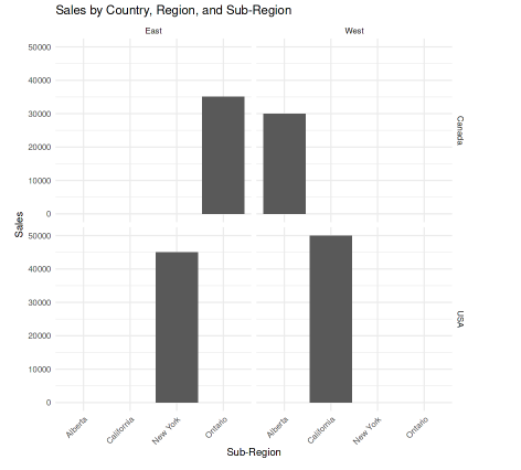 Hierarchical Structure on the Axis Labels with ggplot2 in R
In this example, facet_grid(Country ~ Region) splits the plot into panels based on Country and Region. Each panel contains the sub-regions specific to that combination. This method keeps the hierarchical structure clear without cluttering the x-axis.
Conclusion
Using ggplot2 to display hierarchical structures on axis labels can greatly enhance the readability and interpretability of your plots. By combining multiple levels of data into a single visualization, you can convey complex relationships and patterns effectively. With functions like facet_wrap() and facet_grid(), along with customized axis labels, you can create sophisticated, informative plots tailored to hierarchical datasets.
Similar Reads
How to not show all labels on ggplot axis in R?
When visualizing data using ggplot2, large datasets or wide ranges of values can result in overcrowded axis labels, making your plot difficult to read. This can happen when too many labels are shown on the X or Y axes, causing overlap or clutter. This article will cover various methods to control an
3 min read
Align axis label on the right with ggplot2 in R
When creating visualizations in R using ggplot2, you might want to adjust the position of axis labels for improved readability or to meet specific formatting requirements. By default, ggplot2 position the y-axis label in the center of the axis, but you can customize this to align it to the right. Th
3 min read
Remove Axis Labels and Ticks in ggplot2 Plot in R
In this article, we will discuss how to remove axis labels and ticks in ggplot2 in R Programming Language. The axes labels and ticks can be removed in ggplot using the theme() method. This method is basically used to modify the non-data components of the made plot. It gives the plot a good graphical
2 min read
How to draw stacked bars in ggplot2 that show percentages in R ?
In this article, we are going to see how to draw stacked bars in ggplot2 that show percentages in R programming language. The plyr package in R is used to split the data apart, perform operations with it, and then subsequently bring it back together again. It is used to perform data manipulation. Th
4 min read
Superscript and subscript axis labels in ggplot2 in R
In this article, we will see how to use Superscript and Subscript axis labels in ggplot2 in R Programming Language. First we should load ggplot2 package using library() function. To install and load the ggplot2 package, write following command to R Console. # To Install ggplot2 package # (Write thi
3 min read
How To Make Boxplots with Text as Points in R using ggplot2?
In this article, we will discuss how to make boxplots with text as points using the ggplot2 package in the R Programming language. A box plot is a chart that shows data from a five-number summary including one of the measures of central tendency. These five summary numbers are Minimum, First Quartil
3 min read
How to Change the Y-axis Title to Horizontal Using ggplot2 in R
In ggplot2, the default orientation for the y-axis title is vertical. However, in some cases, you may want to rotate the y-axis title to be horizontal to improve the readability or appearance of your plot. This article explains how to change the orientation of the y-axis title to horizontal using gg
3 min read
How to Add Labels Over Each Bar in Barplot in R?
In this article, we will see how to add labels over each bar in barplot in R Programming language. To add labels on top of each bar in Barplot in R we use the geom_text() function of the ggplot2 package. Syntax: plot+ geom_text(aes(label = value, nudge_y ) Parameters: value: value field of which la
2 min read
How to put text on different lines to ggplot2 plot in R?
ggplot2 is a plotting package in R programming language that is used to create complex plots from data specified in a data frame. It provides a more programmatic interface for specifying which variables to plot onto the graphical device, how they are displayed, and general visual properties. In thi
3 min read
How Can I Label the Points of a Quantile-Quantile Plot Composed with ggplot2?
A Quantile-Quantile (Q-Q) plot is a graphical tool used to compare the distribution of a dataset with a theoretical distribution, such as the normal distribution. When using ggplot2 to create Q-Q plots in R, it is often useful to label specific points on the plot, especially when identifying outlier
4 min read