How to Make Flexbox Items of Same Size Using CSS?
Last Updated :
19 Nov, 2024
To make Flexbox items the same size using CSS, you can use various properties to control the dimensions of the items and ensure consistency in layout. By default, Flexbox items can have different sizes based on their content, but with a few CSS changes, you can make them uniform.
1. Using Flex Property
The container div, namedflex-containerinside it, creates three divs for three items. Style the flex-container by using border, display: flex, and sets width and height. Use the flex: 1 andheight: 90% properties on Flexbox items within a container and ensure each item takes up an equal share of available space.
HTML
<div class="main">
    <h1>GeeksForGeeks</h1>
    <h2> Using Flex Property for
        same size of Flexbox items
    </h2>
    <div class="flex-container">
        <div class="flex-item">
            Item 1
        </div>
        <div class="flex-item">
            Item 2
        </div>
        <div class="flex-item align-right">
            Item 3
        </div>
    </div>
</div>
body {
    margin: 0;
    padding: 0;
    height: 100vh;
    background-color: #f0f0f0;
    display: flex;
    align-items: center;
    justify-content: center;
}

.main {
    width: 80%;
    height: 50%;
    margin: 0 auto;
}

h1 {
    text-align: center;
    font-size: 40px;
    color: green;
}

h2 {
    text-align: center;
    color: rgb(55, 0, 255);
}

.flex-container {
    border: 5px solid rgb(55, 139, 22);
    width: 100%;
    height: 75%;
    align-items: center;
    display: flex;
}

.flex-item {
    flex: 1;
    height: 90%;
    text-align: center;
    background-color: rgb(184, 233, 181);
    border: 1px solid #ccc;
    margin: 5px 10px;
}
Output
 Make Flexbox Items The Same Size Using CSS
2. Using Width Property
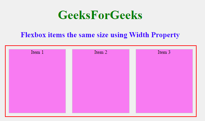
The container div, named flex-containerinside it, creates, three div for three items. Style the flex-container by using border, display: flex and sets width and height. Use the width:30% and height: 90% properties on Flexbox items within a container and ensure each item has equal same.
HTML
<div class="main">
    <h1>GeeksForGeeks</h1>
    <h2> Flexbox items the same
        size using Width Property
    </h2>
    <div class="flex-container">
        <div class="flex-item">
            Item 1
        </div>
        <div class="flex-item">
            Item 2
        </div>
        <div class="flex-item align-right">
            Item 3
        </div>
    </div>
</div>
body {
    margin: 0;
    padding: 0;
    height: 100vh;
    background-color: #f0f0f0;
    display: flex;
    align-items: center;
    justify-content: center;
}

.main {
    width: 80%;
    height: 50%;
    margin: 0 auto;
}

h1 {
    text-align: center;
    font-size: 40px;
    color: green;
}

h2 {
    text-align: center;
    color: rgb(55, 0, 255);
}

.flex-container {
    border: 2px solid red;
    width: 100%;
    height: 80%;
    align-items: center;
    display: flex;
    align-self: center;
    justify-content: center;
}

.flex-item {
    width: 30%;
    height: 90%;
    text-align: center;
    background-color: rgb(248, 123, 242);
    border: 1px solid #ccc;
    margin: 5px 10px;
}
Output
 Make Flexbox Items The Same Size Using CSS
3. Using calc() Property
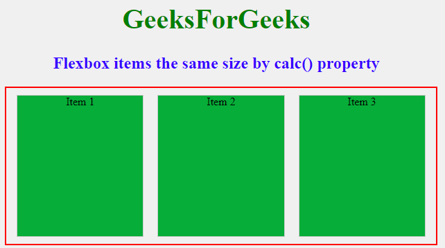
The container div, namedflex-container createsinside it, create three divs, for three items. Style the flex-containerby using border, display: flex, and sets width and height. Use thecalc(100%/3) (divide no. of items) and height:90% properties on Flexbox items within a container and ensure each item takes up an equal share of available space.
HTML
<div class="main">
    <h1>GeeksForGeeks</h1>
    <h2> Flexbox items the same
        size by calc() property
    </h2>
    <div class="flex-container">
        <div class="flex-item">
            Item 1
        </div>
        <div class="flex-item">
            Item 2
        </div>
        <div class="flex-item align-right">
            Item 3
        </div>
    </div>
</div>
body {
    margin: 0;
    padding: 0;
    height: 100vh;
    background-color: #f0f0f0;
    display: flex;
    align-items: center;
    justify-content: center;
}

.main {
    width: 80%;
    height: 50%;
    margin: 0 auto;
}

h1 {
    text-align: center;
    font-size: 40px;
    color: green;
}

h2 {
    text-align: center;
    color: rgb(55, 0, 255);
}

.flex-container {
    border: 2px solid red;
    width: 100%;
    height: 80%;
    display: flex;
    align-items: center;
    justify-content: center;
    padding: 0px 5px;
}

.flex-item {
    width: calc(100%/3);
    height: 90%;
    text-align: center;
    background-color: rgb(6, 173, 56);
    border: 1px solid #ccc;
    margin: 5px 10px;
}
Output
 Make Flexbox Items The Same Size Using CSS
4. Using Grid Property
The container div, named grid-containerinside it, createsthree divs for three items. Style the grid-container by using border, display: flex, and sets width and height. CSS Grid properties, such as grid-template-columns: repeat(3, 1fr), ensure consistent sizing of each grid item.
HTML
<div class="main">
    <h1>GeeksForGeeks</h1>
    <h2>Equal Size Items
        using Grid Property
    </h2>
    <div class="grid-container">
        <div class="grid-item">Item 1</div>
        <div class="grid-item">Item 2</div>
        <div class="grid-item">Item 3</div>
    </div>
</div>
body {
    margin: 0;
    padding: 0;
    height: 100vh;
    background-color: #f0f0f0;
    display: flex;
    align-items: center;
    justify-content: center;
}

h1 {
    text-align: center;
    font-size: 40px;
    color: green;
}

h2 {
    text-align: center;
    color: rgb(55, 0, 255);
}

.grid-container {
    display: grid;
    grid-template-columns: repeat(3, 1fr);
    gap: 10px;
    border: 3px solid blue;
    margin-top: 20px;
    padding: 10px;
    width: 80vh;
    height: 28vh;
}

.grid-item {
    height: 100%;
    text-align: center;
    background-color: #3498db;
    border: 2px solid #ccc;
}
Output
 Make Flexbox Items The Same Size Using CSS
Similar Reads
How to set the size of specific flex-item using CSS? To set the size of a specific flex item using CSS, you can use the flex property. This property allows you to specify the initial size, grow factor, and shrink factor of the item, controlling its behavior within the flex container. Flex follows pre-defined properties to change the size of the flex i
3 min read
How to Align One Item to the Right using CSS Flexbox ? Methods to Align a Single Item to the Right using CSS Flexbox:1. Using margin-left: autoApplying margin-left: auto to the specific flex item pushes it to the right, utilizing the available space.HTML<html> <head> <style> .flex-container { display: flex; background-color: #f0f0f0; p
3 min read
How to Arrange Two Items Per Row Using Flexbox? Flexbox in CSS is a powerful layout module that allows you to easily design complex layouts. It provides an efficient way to distribute space among items in a container, even when their sizes are unknown or dynamic.Below are the approaches to Arrange Two Items Per Row Using Flexbox:Table of ContentU
2 min read
How to Make One Flex Item Full-Width in CSS Flexbox? Here are the methods to make a single flex item take up the full width in CSS Flexbox:1. Using flex: 1 1 100% and orderBy setting flex: 1 1 100% on the desired item, it will occupy the full width of the container. The order property can be used to position this item within the flex container.HTML
3 min read
How to make Flexbox Children 100% Height of their Parent using CSS? Flexbox is an incredibly powerful layout model in CSS, enabling developers to create responsive designs with ease. It's especially effective—used in over 85% of modern websites—for distributing space evenly among child elements and aligning them efficiently. One common use case is when you want chil
2 min read
How to Align Images Side By Side using CSS ? Images side by side means placing multiple images in a single row next to each other. This arrangement shows images in a horizontal line, making it great for photo galleries, and comparing pictures. To align images side by side using CSS, we can use flexbox or grid for layout.Table of ContentUsing t
2 min read