How to Make a Histogram in Excel: 3 Easy Methods
Last Updated :
19 Dec, 2024
A histogram is a vital tool for analyzing and visualizing the distribution of data, allowing users to easily identify patterns, trends, and outliers. Commonly used in statistics and data-driven decision-making, histograms help present data frequency in a structured and readable format. Excel provides multiple ways to create histograms, catering to different versions and user preferences. In this guide, you’ll learn how to make a histogram in Excel using three methods: the built-in Histogram Chart for Excel 2016 and later, the Data Analysis ToolPak for earlier versions, and creating a Frequency Chart in Excel using formulas.
Disclaimer: Always double-check your data for accuracy to ensure precise and reliable results.
 How to Make a Histogram in Excel
Method 1: Using the Built-in Histogram Chart (Excel 2016 and Later)
For Excel 2016 and later versions, a Histogram Chart is available as a built-in feature. Follow the below step by step process to make a histogram chart in excel:
Step 1: Prepare Your Data
Organize your data in a single column. For example: Here we have Test scores of a Student:
 Prepare your Data
Step 2: Insert a Histogram
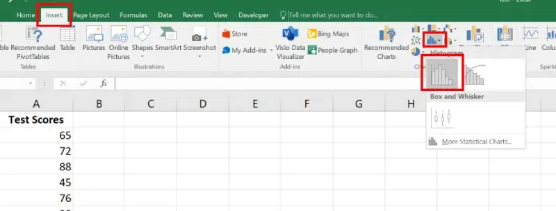
- Select the data range (e.g., A2:A8).
- Go to the Insert tab.
- In the Charts group, click Insert Statistic Chart > Histogram.
 Go to Insert Tab >> Select Static Chart Type >> Choose Histogram
Step 3: Customize the Bins
- Right-click on the X-axis (horizontal axis) and select Format Axis.
- Adjust the Bin Width, Number of Bins, or add Overflow/Underflow Bins.
 Right Click on X Axis >> Select Format Axis >>Customize the bins
- Add Data Labels by right-clicking the bars > Add Data Labels.
- Modify colors, chart title, and gridlines for better clarity.
 Add a Tittle >> and Change the Color
In older versions of Excel, or when using advanced statistical tools, you can use the Data Analysis ToolPak to create a Histogram.
- Go to the File tab > Options > Add-Ins.
- Select Excel Add-Ins and click Go.
- Check the box for Analysis ToolPak and click OK.
 Go to File >>Click on Options >>Select Add -ins >> Choose "Excel Add -ins"" >>Press GO>> Check " Analysis ToolPak Box"
Step 2: Prepare Your Data and Bins
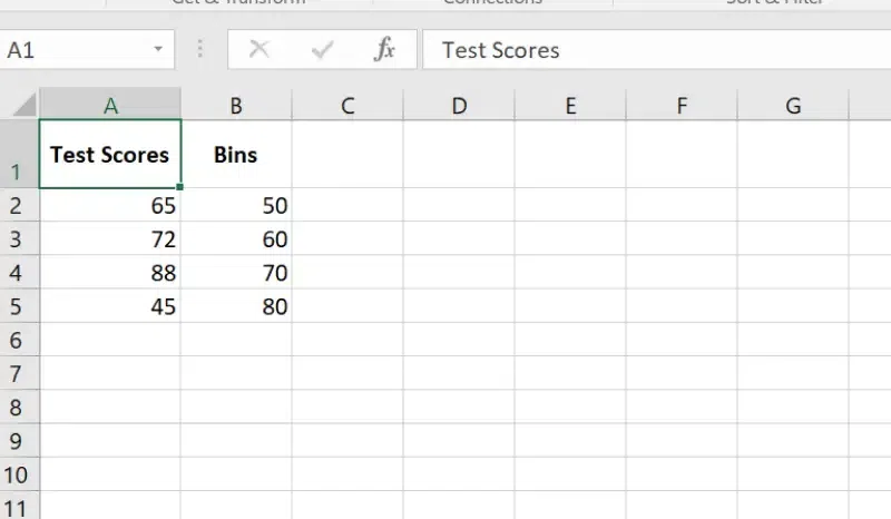
- Enter your data in one column.
- In a second column, create bins (interval ranges to group your data).
 Prepare your Data and Bins
- Go to the Data tab > Data Analysis.
- Select Histogram and click OK.
 Go to Data >> Select Data Analysis>> Select Histogram >>Press OK
In the Histogram dialog box:
- Set Input Range (data).
- Set Bin Range (intervals).
- Select Output Range or a new worksheet.
- Check Chart Output to generate the chart.
Click OK to generate the Histogram and chart.
 Preview Results
You can make an Excel histogram easily using the FREQUENCY or COUNTIFS function. It automatically updates when your data changes. Just put your data in one column and bin numbers in another. Then, use a formula to count values in each bin and create the histogram from that summary data.
Step 1: Prepare Data and Bins
Enter your data in one column and create bins in another column.
 Prepare Data and Bins
Step 2: Use the FREQUENCY Function
In an empty column, use the FREQUENCY formula:
=FREQUENCY(data_range, bin_range)
Press Ctrl + Shift + Enter to generate an array of frequencies.
 Use the Frequency Function
Step 3: Insert a Column Chart
- Select the bin values and frequencies.
- Go to the Insert tab > Choose Column Chart.
 Go to Insert Tab >>Select the Column Chart
Step 4: Customize the Chart
Add axis titles, labels, and adjust the bin width as needed.
 Customize the Chart
Also Read:
Conclusion
Histograms in Excel are an excellent way to explore and present data distributions effectively. By leveraging the built-in Histogram Chart, the Data Analysis ToolPak, or the FREQUENCY formula, you can create visually engaging charts tailored to your dataset. Whether you’re working with the latest Excel features or relying on earlier versions, this guide equips you with the tools to represent your data with precision and clarity.
Similar Reads
How to Make a Line Graph in Excel - Easy Tutorial Line graphs are a highly valuable tool in Excel, helping users analyze trends and patterns effectively over time. They are widely used for time-series analysis in Excel, allowing a clear visual representation of changes in data. In this guide, you'll learn how to create a line graph in Excel, includ
10 min read
How to make a 3 Axis Graph using Excel? 3 Axis Graphs in Excel are the graphs that have three axis. The need for a three-axis arises when the scale of the values is very different. For example, you are given an atom and you want to make a graph between its diameter, melting point, and colloidal nature. If they are plotted on the same scal
7 min read
How to Make a Bar Graph in Excel: Step by Step Guide Bar graphs are one of the most versatile tools in Excel for visualizing and comparing data. Whether you’re tracking sales, analyzing survey responses, or presenting project milestones, bar graphs offer a straightforward way to highlight key trends and differences. Learning how to create a bar graph
6 min read
How to plot a Histogram in MATLAB ? A Histogram is a diagrammatic representation of a group of data over user-specified ranges. Basically, the histogram contains several bins. Bins are non-overlapping intervals in which the data is spread. In MATLAB we have a function named hist() which allows us to plot a bar graph. Syntax: hist(X)
2 min read
How to Create a Relative Frequency Histogram in R? In this article, we will discuss how to create a Relative Frequency Histogram in the R programming language. Relative Frequency Histogram helps us to visualize the relative frequencies of values in a dataset. This shows how often a certain value is present in the dataset. A relative frequency histog
3 min read
How to Create a Chart from Multiple Sheets in Excel Creating a chart from multiple sheets in Excel is a powerful way to consolidate data and visualize it in a meaningful way. Whether you're working with different datasets on separate sheets or need to compare data across multiple tabs, knowing how to create a chart from multiple sheets in Excel can s
5 min read
How To Make An Area Chart In Excel An Area chart is like a line chart in which the area between the x-axis and the line is colored to show the volume. Data Trends, Comparison of Multiple data Series, Emphasis on cumulative Data, and Time-Based or Categorized data are some key features of the Area chart. In this article, we will see h
5 min read
How to Create an Ogive Graph in Excel? Ogive graph, the name might scare you, but believe me this is very simple to create. The ogive graph is a cumulative frequency graph. The graph is plotted between the fixed intervals vs the frequency added up before. It is a curve plotted for cumulative frequency distribution on a graph. There are t
4 min read
How to Create a Speedometer/Gauge Chart in Excel? Speedometer Chart(Gauge Chart) is the chart that has a needle and points to the desired area in that chart. It depicts a needle in a half donut chart. The needle points to the position, according to your input values. It's the same as that of a speedometer in a bike or a car. In this article, we wil
6 min read