How to Create a Gantt Chart in Excel [Free Template]
Last Updated :
23 Dec, 2024
A Gantt chart in Excel is an essential tool for organizing and visualizing project timelines and milestones. This guide will show you how to create a Gantt chart in Excel using simple steps and a free Excel Gantt chart template, making it accessible for both beginners and professionals. Whether planning a project for personal use or team collaboration, leveraging Excel project management tools allows you to create a clear project timeline in Excel for better tracking and management.
Disclaimer: Always ensure you customize charts based on your project requirements for maximum efficiency and accuracy.
 How to Create a Gantt Chart in Excel
What is a Gantt Chart in Excel
A Gantt Chart in Excel is a bar chart that visually represents a project schedule. It displays start and finish dates for project elements, aiding project managers in tracking progress and managing tasks effectively.
How to Create a Gantt chart in Excel from Scratch
When it comes to creating a Gantt chart in Excel, you can either use a predesigned template or create your own from scratch. To manually make a Gantt chart in Excel, follow the steps given below for your reference,
Step 1: Prepare your Data
This table must contain tasks, start dates, end dates, and duration. Duration can be easily calculated using a formula (END DATE - START DATE)
 Create your Project Table
- "Start Date" represents when a task starts.
- "Duration" is the number of days a task will take. It’s already calculated.
Step 2: Insert a Stacked Bar Chart
Highlight the Data:
- Select the Tasks, Start Date, and Duration columns ( Do not Select End Date).
Insert Stacked Bar Chart:
- Go to the Insert tab on the Excel ribbon.
- In the Charts group, click on the Insert Bar Chart dropdown.
- Select the Stacked Bar Chart option.
 Select the Data >> Go to Insert Tab>> Select Stacked Column Chart
Step 3: Add Data to the Chart
Right-Click on the Chart:
- Click anywhere on the bar chart.
- Right-click and choose Select Data.
Add a New Series:
- In the Select Data Source window, click the Add button.
- A small box named Edit Series will appear.
- Type "Duration" in the Series Name field.
- Click the small icon (above the OK button) in the next field to enter the data.
 Right Click >> Select Data>>Click on Add Icon>>Select Duration >> Select the Data Range >> Click ok
The Result will Look like this.
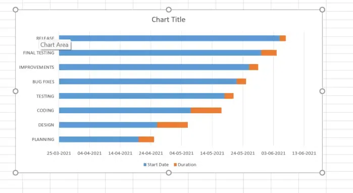 Chart Created
Remove Start Date Bars
- Click the bars representing Start Date.
- Right-click and select Format Data Series.
- Set Fill to No Fill.
 Right Click >> Format Data Series>> No Fill>>Preview Result
Reverse Task Order
- Right-click on the vertical axis (Task names).
- Select Format Axis.
- Check Categories in reverse order.
 Right Click >>Format Axis >> Select "Categories in Reverse Order >> Preview Result
Step 4: Customize the Horizontal Axis
- Right-click on the horizontal axis (dates).
- Choose Format Axis.
- Adjust the Minimum Bound and Maximum Bound to align with your project timeline.
 Right Click >> Select "Format Axis >>Set "Minimum and Maximum" Bounds
Step 5: Add Task Descriptions
- Right-click on the chart and choose Select Data.
- Select the series for Tasks and click Edit.
- Highlight the list of tasks in your data table.
 Right Click>> Click on "Select Data " >>Click on Edit
Step 6: Customize the Chart and Preview Results
Overlap Bars:
- Right-click on the bars (Duration) and select Format Data Series.
- Set Overlap to 100% and adjust the Gap Width.
Change Bar Colors:
- Right-click on the bars and customize the fill color for better visualization.
Add Chart Title:
- Click on the chart title to edit it.
 Customize the Chart and Preview Results
Tips: You can design your Excel Gantt Chart in different ways by changing the fill color, border color, shadow and even applying the 3-D format. All these options are available in the Format Data Series window.
Using Free Excel Gantt Chart Template
If you prefer not to create a Gantt chart manually, Excel offers free Gantt chart templates to simplify the process.
How to Use a Gantt Chart Template in Excel
Follow the below steps to learn how to use a gantt chart in Excel:
Step 1: Open Excel
Launch Excel on your computer.
Step 2: Click on the File menu and select New.
Go to the File Menu and Click on "New"
Step 3: Search for Gantt Chart
Type "Gantt Chart" in the search bar to find available templates.
 Go to File >> Click on "New" >> Search for Gantt Chart
Step 4: Select and Create
Choose a template that fits your needs and click Create.
Step 5: Customize the Chart
Add your project tasks, start dates, and durations to tailor the Gantt chart for your project.
Also Read:
Conclusion
Building a Gantt chart in Excel provides an efficient way to manage tasks and deadlines. By utilizing a free project tracking template in Excel, you can effectively track progress and ensure projects stay on schedule. This guide empowers you with the tools and steps to maximize the benefits of Excel project management tools for detailed and accurate project planning.
Similar Reads
How to Create a Step Chart in Excel
A step chart is used to represent data that changes irregularly between time intervals. Now, Excel doesn't have a feature to create a Step Chart like the one shown below but we can create one by making some changes in our data. What is a Step Chart in ExcelA Step chart is the same as a Line Chart. T
4 min read
How to Create a Thermometer Chart in Excel?
The Thermometer chart in Excel can be used to depict specific data based on the actual value and the target value. It can be used in a wide range of scenarios such as representing the past performance of horses in horse racing or the global temperature and it's variation throughout decades etc. In t
2 min read
How to Create a Speedometer/Gauge Chart in Excel?
Speedometer Chart(Gauge Chart) is the chart that has a needle and points to the desired area in that chart. It depicts a needle in a half donut chart. The needle points to the position, according to your input values. It's the same as that of a speedometer in a bike or a car. In this article, we wil
6 min read
How to Create a Gauge Chart in Excel?
Gauge chart is also known as a speedometer or dial chart, which use a pointer to show the readings on a dial. It is just like a speedometer with a needle, where the needle tells you a number by pointing it out on the gauge chart with different ranges. It is a Single point chart that tracks a single
2 min read
How to Create a Forest Plot in Excel?
Forest plots are an excellent way to convey a multitude of information in a single picture. Forest plots have become a recognized and well-understood technique of displaying several estimates concurrently, whether used to demonstrate various outcomes in a single research or the cumulative knowledge
4 min read
How to Make a Dynamic Gantt Chart in Excel?
The Gantt chart is named after Henry Gantt, an American mechanical engineer and management consultant who devised it in the 1910s. In Excel, a Gantt diagram displays projects or tasks as cascading horizontal bar charts. A Gantt chart depicts the project's breakdown structure by displaying start and
4 min read
How to Create a Funnel Chart In Excel
In the world of data visualization, funnel charts have become a go-to tool for illustrating stages in a process, especially when tracking sales or conversions. Learning how to create a funnel chart in Excel can give you a powerful way to visualize data that shows progression and drop-off through var
6 min read
How to Create a Goal Line on a Chart in Excel?
Excel is a powerful data visualization and management tool that can be used to store, analyze, and create reports on large data. Data can be visualized or compared using different kinds of plots in Excel such as line charts, bar charts, etc. A goal line is also called a target line. It helps show ac
2 min read
How To Create Interactive Charts in Excel?
In MS Excel, we can draw various charts, but among them today, we will see the interactive chart. By name, we can analyze that the chart, which is made up of interactive features, is known as an interactive chart. In general, this chart makes the representation in a better and more user-friendly way
9 min read
How to Create a Chart from Multiple Sheets in Excel
Creating a chart from multiple sheets in Excel is a powerful way to consolidate data and visualize it in a meaningful way. Whether you're working with different datasets on separate sheets or need to compare data across multiple tabs, knowing how to create a chart from multiple sheets in Excel can s
5 min read