How to Make a Dynamic Gantt Chart in Excel?
Last Updated :
06 Dec, 2022
The Gantt chart is named after Henry Gantt, an American mechanical engineer and management consultant who devised it in the 1910s. In Excel, a Gantt diagram displays projects or tasks as cascading horizontal bar charts. A Gantt chart depicts the project's breakdown structure by displaying start and completion dates as well as other linkages between project activities, allowing you to track tasks against their allocated time or preset milestones. A Gantt chart allows you to know at a glance which tasks are currently the greatest priority, as well as the expected completion date of the article.
Steps to Create an Excel Gantt Chart
Step 1: Create a table with columns for data such as articles, start date, and end date, as seen in the picture below.

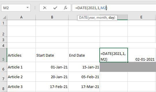
Step 2: Following that, we must build a date section by creating a timeline and inserting the date formula:
=DATE (year,month,day)

After that using the =D5+1 formula, we extend the timeline by one day till 10 Jan 2021.

Step 3: Now we are going to apply Conditional formatting by using this logical formula:
=IF(AND(D$5>=$B6, D$5<=$C6),"YES","NO")
Explanation: It will return "YES" if the D5 (01-Jan-2021) falls between B6 (01-Jan-2021) and C6 (15-Jan-2021), indicating that the article is active on that day. If the article is not active on that date, then it will return "NO".

Step 4: Select all the cells from D6 to M13. Then drag auto-fill down to get all results.

Step 5: Choose a cell from D6 to M13. Then, on the home menu, pick Conditional Formatting and then select New Rule there.

The dialogue box New formatting rule will then display. Then select to use a formula to determine which cells to determine and then enter the formula =D6="YES" in the formula tab.

After you click on format, the format cell dialogue box will display. and then pick the fill field, then choose any color, and then OK.

Step 6: As a result, then it will show a Gantt chart.

Step 7: To create a dynamic Gantt Chart, simply choose any cell. F2 cell is selected here. Pick the developer tab, then go to the insert tab, select the scroll bar, and then draw it on the F2 cell.

Step 8: It will look like this. Now, right-click on the scroll bar and select the Format Control option.

The format control dialogue box should now display. You must complete certain fields there. First, you set the maximum value field to 365 since there are 365 days in a year. Select any one empty cell in the cell link to insert the value. The M2 cell is used in this case.

Step 9: This arrow > now assists in changing the date. So, in this case, you must update the date formula that is written at the start. Replace the day with the cell M2 that you choose on the cell link in the format control box.
Step 10: When you're finished, you'll have a final Dynamic Gantt chart, now you can see by clicking on the arrow it changes accordingly.

After you've gone through this procedure with a couple of your projects, making a Gantt chart will come naturally. In less than 10 to 15 minutes, you can create a Gantt chart from your project spreadsheet.
Make an Excel Gantt Chart Template
Excel also offers free online Gantt chart designs. We'll teach you how to make an Excel online Gantt chart template in this part.
Step 1: Go to File > New. Enter "Gantt" in the search box and press the Enter key. All Excel online Gantt chart templates are now being searched. Click on one of the templates to customize it.

Step 2: Then a popup appears with a preview and introduction to the selected Gantt chart. Select the Create option.
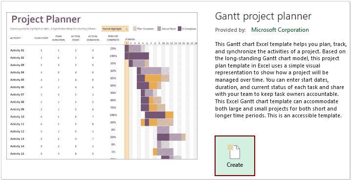
Step 3: The Gantt chart is then built into a new worksheet. To make the Gantt chart usable, just change the provided data with the data you want.
Similar Reads
How to Create a Dynamic Chart Range in Excel? A Dynamic chart range is the range of a data set which automatically updates on any modifications in the original data set. It is beneficial because at some point in time we need to add or delete data from the original data set. So, we want a method to automatically update the chart on performing an
5 min read
How to Create a Dynamic Pie Chart in Excel? In Excel, Pie-chart is a graphical representation of different sections or sectors of a circle based on the proportion, it holds from the complete quantity. Pie-charts are generally categorized into two types: Static Pie-chart: A pie-chart created with static or fixed input values is known to be a s
3 min read
How to Make a Column Chart in Excel Column Charts provide advanced options that are not available with some other chart types such as trendlines and adding a secondary axis. This tutorial will walk you through the step-by-step process of creating a column chart in Microsoft Excel. Column charts are used for making comparisons over tim
7 min read
How to Create a Gantt Chart in Excel [Free Template] A Gantt chart in Excel is an essential tool for organizing and visualizing project timelines and milestones. This guide will show you how to create a Gantt chart in Excel using simple steps and a free Excel Gantt chart template, making it accessible for both beginners and professionals. Whether plan
6 min read
How to Create Dynamic Chart Titles In Excel? Excel is a tool that is generally used by accounting professionals for financial data analysis but can be used for different purposes. It can be used for data visualization, data analysis, and data management, which uses spreadsheets for managing, storing, and visualizing large volumes of data. Cell
2 min read
How to Create a Gauge Chart in Excel? Gauge chart is also known as a speedometer or dial chart, which use a pointer to show the readings on a dial. It is just like a speedometer with a needle, where the needle tells you a number by pointing it out on the gauge chart with different ranges. It is a Single point chart that tracks a single
2 min read