How to Make a Bar Graph in Excel: Step by Step Guide
Last Updated :
12 Apr, 2025
Bar graphs are one of the most versatile tools in Excel for visualizing and comparing data. Whether you’re tracking sales, analyzing survey responses, or presenting project milestones, bar graphs offer a straightforward way to highlight key trends and differences. Learning how to create a bar graph in Excel ensures your data is not only easy to interpret but also impactful for presentations and decision-making. This step-by-step guide will walk you through the process of creating and customizing bar graphs, exploring their various types, and providing advanced tips for crafting professional visuals.
How to Create a Bar Graph in Excel
Here are the steps to create a visually appealing bar graph in Excel to represent your data effectively.
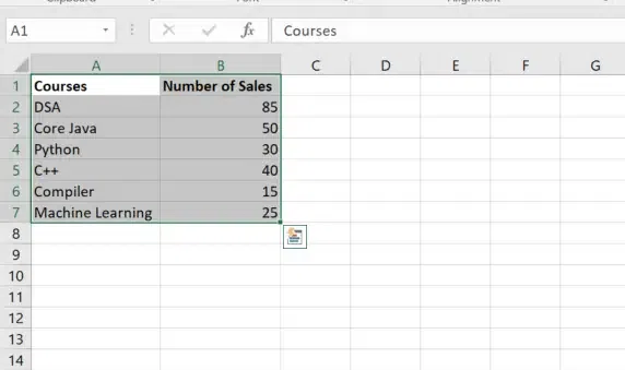
Step 1: Prepare Your Data
Ensure your data is organized in a table format. Include one column for categories and one for values.
For Example: In the below data, we have sales of courses.

Prepare your Dataset
Step 2: Select Your Data
- Highlight the entire table, including headers.
- In this case, select cells A1:B7.
Select your Data
Step 3: Insert the Bar Graph
- Go to the Insert tab on the Excel ribbon.
- In the Charts group, click on the Insert Column or Bar Chart icon.
- From the dropdown menu, under 2-D Bar, select Clustered Bar (horizontal bars).
Excel will now insert a bar graph based on your selected data.

Go to Insert Tab >> Select “Column or Bar Chart” >> Choose the 2-D Bar Chart
Step 4: Customize the Bar Graph
1. Add Chart Title
- Click on the default Chart Title at the top of the chart.
- Type a meaningful title, such as “Sales by Product”.

Customize the Bar Graph
2. Add Axis Titles
- Click on the chart to activate the Chart Elements button (the “+” icon on the top-right corner).
- Check the box for Axis Titles.
Add:
- Horizontal Axis Title: Enter “Values” or “Sales” as applicable.
- Vertical Axis Title: Enter “Products” or “Categories”.

Click on the “+” icon and Check the Axis Titles Checkbox
3. Change Bar Colors
- Click on any bar to select the entire series.
- Right-click and choose Format Data Series.
- Under Fill, choose a new color for the bars.
- To change individual bar colors: Click a specific bar twice > Right-click > Format Data Point > Fill.

Right Click and Select Format Data Series >> Choose the Color
4. Add Data Labels
- Right-click on any bar in the graph.
- Select Add Data Labels to display values on the bars.
- Move the labels to your preferred position (e.g., inside or outside the bar).

Right Click >> Select Add Data Labels >> Preview Result
5. Adjust Bar Spacing
- Right-click on any bar and choose Format Data Series.
- Under Series Options, adjust the Gap Width slider to increase or decrease the space between bars.

Adjust Bar Spacing
6. Add or Modify the Legend
- Click on the chart to activate the Chart Elements button (+).
- Check the Legend box to display it.
- Click and drag the legend to position it (e.g., top, right, bottom).

Click on the Plus Icon >> Check the “Legend” Checkbox
7. Remove Gridlines (Optional)
- Click on any gridline in the chart.
- Press Delete to remove it for a cleaner appearance.
Step 5: Save and Update the Chart
- Save the Excel file to retain your changes.
- If you update the data in the table, the bar graph will automatically update.

Save and Update the Chart
Types of Bar Graphs in Excel
Excel offers different types of bar graphs to suit your needs:
- Clustered Bar Chart: Displays categories side by side for easy comparison.
- Stacked Bar Chart: Bars are stacked on top of each other to show parts of a whole.
- 100% Stacked Bar Chart: Compares the percentage contribution of each category to the whole.
- 3D Bar Chart: Adds a three-dimensional effect to your bar graph for a more visual appeal.
Advanced Tips for Bar Graphs
When you make a bar graph in Excel, you can use these advanced tips to enhance its functionality and appearance:
1. Using Secondary Axes for Complex Datasets
- When dealing with data on different scales, add a secondary axis to your bar graph.
- Right-click on a data series, choose Format Data Series, and select Secondary Axis to display multiple scales on the same chart.
- This helps compare metrics like sales and profit simultaneously.
2. Combining Bar Graphs with Other Chart Types
- Combine bar graphs with line charts to show trends alongside categorical data.
- Use Combo Chart options in tools like Excel to overlay multiple chart types for enhanced visualization.
- This is especially useful for highlighting relationships between different variables.
3. Exporting Bar Graphs for Presentations
- Copy the chart from your tool (e.g., Excel) and paste it directly into Word or PowerPoint using Ctrl + V (Windows) or Cmd + V (Mac).
- For higher quality, save the chart as an image by right-clicking and selecting Save as Picture.
- Resize and adjust the chart in your presentation to maintain clarity and visual appeal.
These advanced tips make bar graphs more versatile and presentation-ready for professional use.
Conclusion
By mastering the process of creating and customizing bar graphs in Excel, you can transform raw data into clear and compelling visuals. Whether you’re a beginner following this step-by-step bar graph tutorial in Excel or seeking advanced customization options, bar graphs remain an essential tool for effective communication and data-driven storytelling.!
Similar Reads
How to Create a Form in Excel - A Step by Step Guide
Creating forms in Excel is an efficient way to capture and organize data, whether you’re tracking inventory, collecting survey responses, or entering client information. Excel forms are customizable and easy to use, making data entry faster and more organized, especially when handling large datasets
7 min read
How to Create a Graph in Excel: A Step-by-Step Guide for Beginners
Anyone who wants to quickly make observations and represent them graphically should know how to create graphs with Excel. Whether it is the preparation of business analysis papers, academic research documents or financial reports among other things, learning how to make graphs in Excel can significa
8 min read
How to Create a Gantt Chart in Excel: A Step-by-Step Guide
A Gantt chart in Excel is an essential tool for organizing and visualizing project timelines and milestones. This guide will show you how to create a Gantt chart in Excel using simple steps and a free Excel Gantt chart template, making it accessible for both beginners and professionals. Whether plan
6 min read
How to Insert a Checkbox in Excel: Step-by-Step Guide
How to Add Checkboxes in Excel: Quick Steps Enable the Developer Tab >>Go to Developer TabControl Group >> Click InsertSelect Checkboxes >>Place the CheckboxesLink the Checkbox to a CellCreating a checklist or adding interactive elements to your spreadsheet in Excel becomes much ea
8 min read
How to Create Flowchart in Excel: Step-by-Step Guide
A Flowchart is a valuable tool for visualizing processes, workflows, or decision-making paths, making it easier to communicate ideas and identify improvements. This article provides a clear, step-by-step guide on how to create a Flowchart in Excel, using its shapes and formatting tools to design cus
6 min read
How to Make a Pie Chart in Excel
Pie charts are an excellent way to visualize proportions and illustrate how different components contribute to a whole. Whether you're analyzing market share, budget allocation, or survey results, pie charts make complex data easily understandable at a glance. This guide will walk you through how to
6 min read
Pivot Tables in Excel - Step by Step Guide
Pivot tables are one of the most powerful features in Excel, allowing you to quickly summarize, analyze, and visualize large sets of data. Whether you’re dealing with sales data, financial reports, or any other type of complex dataset, knowing how to create pivot tables in Excel can make your data a
7 min read
How to Make a 3D Pie Chart in Excel?
A Pie Chart is a type of chart used to represent the given data in a circular representation. The given numerical data is illustrated in the form of slices of an actual pie. Now, it's really easy to create a 3D Pie Chart in Excel. Steps for making a 3D Pie Chart: Note: This article has been written
1 min read
How to Make a Dynamic Gantt Chart in Excel?
The Gantt chart is named after Henry Gantt, an American mechanical engineer and management consultant who devised it in the 1910s. In Excel, a Gantt diagram displays projects or tasks as cascading horizontal bar charts. A Gantt chart depicts the project's breakdown structure by displaying start and
4 min read
How to Make a Column Chart in Google Sheets
Column charts in Google Sheets are a powerful tool for presenting data trends and comparisons visually. This guide will provide you with a column chart tutorial to help you create, customize, and effectively use column charts to analyze your data. Whether you're looking to understand data visualizat
5 min read