How to Evaluate Google Analytics Data in Excel?
Last Updated :
14 Jun, 2023
Google Analytics tracks website traffic and provides useful data for website design, content, and marketing decisions. Analyzing and visualizing this data can be difficult. We can use Excel for analyzing and visualizing Google Analytics data. In this article, we will learn how to evaluate google analytics data in Excel.
Importing Google Analytics Data into Excel
Step 1: Log in to your Google Analytics Account. Under Reports, go to the view that contains the data you want to export. On the left side of the screen, we can view the Reports tab. Under the Reports tab, click on the Audience, then, click on the drop-down name Geo. Under, Geo, click on the Language button.

Step 2: At the bottom of the page, the Show Rows option is there. Choose the number of rows you need to export.

Step 3: Click the Export button at the top-right corner of the page and pick the format for your export. For example, csv.

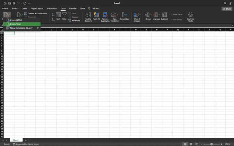
Step 4: Open Excel. Create a blank workbook in Excel. Then under the Data tab, click on Get External Data.

Step 5: Now, choose the format of the file, the imported file can either be text, HTML, etc. Here, we are selecting From Text option.
Step 6: Choose the file from your device. Text Import Wizard prompt will appear on the screen. Select the .csv file, data is usually of the type Delimited. Click on the Next button.

Step 7: Now, choose the appropriate delimiter for your data. Under Delimiters, check the comma box, and click on the Finish button.
A delimiter is the symbol or space which separates the data you wish to split.

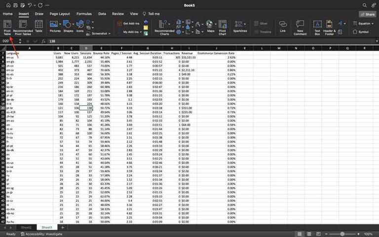
Step 8: Import Data prompt will appear on the screen. Select the Import button. The data will be imported into an Excel sheet.

Analyzing Google Analytics Data with Excel
There are several ways to analyze and visualize this data in Excel. There can be several ways to analyze data in Excel, like, charts, functions, and conditional formatting, but the most efficient one is Pivot tables.
Here, we will use Pivot Tables to analyze the data.
Note: Pivot Table is a tool to calculate, summarize, and analyze data and also lets you see comparisons, patterns, and trends in your data.
Step 1: Select the Pivot Table option under the Insert tab.
Note: Select a cell inside the table before clicking on Pivot Table option.
Step 2: Create Pivot table prompt appears on the screen. Select the table range and the location of the pivot table. Then, click on the Ok button.

Step 3: Drag the PivotTable field(s) to the Filters area. For example, drag Language to Filters.
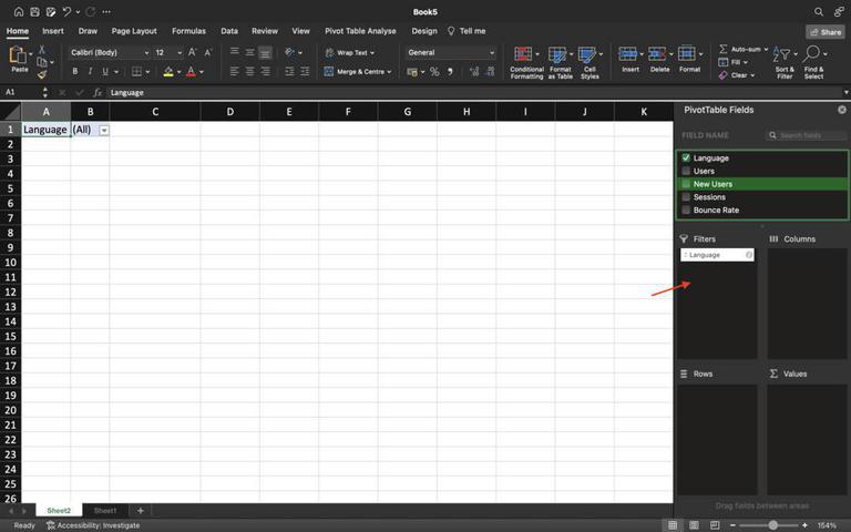
Step 4: Add other PivotTable fields by selecting the checkboxes. For example, drag Users, to Rows. Boundce, and Session sum to values, etc. A table has been formed as shown below.

Step 5: Click on the Filter button located in the first row to retrieve the desired data.
Note: Filters helps showing the required data, and hiding the rest. These, are particularly used, if user wants some specific information for a particular field.

Similar Reads
How to Create a Gauge Chart in Excel?
Gauge chart is also known as a speedometer or dial chart, which use a pointer to show the readings on a dial. It is just like a speedometer with a needle, where the needle tells you a number by pointing it out on the gauge chart with different ranges. It is a Single point chart that tracks a single
2 min read
How to add a calculated field in Google Form
Google Forms is a versatile tool widely used for data collection, but it traditionally lacks direct support for calculated fields. Understanding how to add a calculated field to your Google Form can significantly enhance its functionality, allowing you to perform real-time calculations based on user
4 min read
How to Use AI in Excel for Automated Text Analysis?
Text analysis is a machine learning technique used to automatically extract valuable insights from unstructured text data. Companies use text analysis tools to quickly digest online data and documents, and transform them into actionable insights. We can use text analysis to extract specific informat
2 min read
How to Create a Bar Chart in Excel?
To learn how to create a Column and Bar chart in Excel, let's use a simple example of marks secured by some students in Science and Maths that we want to show in a chart format. Note that a column chart is one that presents our data in vertical columns. A bar graph is extremely similar in terms of t
4 min read
How to Create a Funnel Chart In Excel
In the world of data visualization, funnel charts have become a go-to tool for illustrating stages in a process, especially when tracking sales or conversions. Learning how to create a funnel chart in Excel can give you a powerful way to visualize data that shows progression and drop-off through var
6 min read
Difference Between Google Analytics and Piwik
Google Analytics: It is a web analytics service offered by Google that tracks and reports website traffic, currently as a platform inside the Google Marketing Platform brand. Google launched the service in November 2005 after acquiring Urchin. Piwik: Matomo, formerly Piwik, is a free and open-source
2 min read
How To View Analytics On Google Forms
Google Forms is a versatile tool for gathering data, but its true power lies in its ability to analyze responses efficiently. It comes with a lot of preloaded features, which made it popular among users. It also has analytics tools built in which helps users quickly understand the summary of respons
4 min read
How to Create Advanced Charts and Graphs in Excel?
Charts, graphics, and images are excellent ways to visualize and convey data, and Excel does the same for us by generating charts automatically. We might occasionally want to go beyond the basic charts that Excel generates for us. Let's learn about advanced charts and graphs used in excel, Advanced
10 min read
How To Add Google Analytics in React?
Integrating Google Analytics into a React application enables you to monitor and analyze your website’s traffic and user behavior. This integration offers valuable insights into user interactions on your site, aiding in making informed decisions to enhance user experience and achieve business object
3 min read
How to Build an Automatic Gantt Chart in Excel?
Gantt Chart is the most commonly used chart in project management. The more general definition of the Gantt chart is that it helps to keep track of the activities against time. Anything plotted against time can be represented in the form of a Gantt chart. For example, a team manager has given differ
5 min read