How to Create and Customize Pie Charts in Google Sheets
Last Updated :
30 Dec, 2024
Pie charts are a powerful tool for visualizing data, offering a straightforward way to understand proportions and percentages at a glance. Perfect for breaking down categories in a dataset, they transform complex information into clear visuals. Google Sheets provides easy-to-use features to make a pie chart in Google Sheets, including options for 3D pie charts and a variety of customization settings to enhance clarity and effectiveness. This guide will cover everything you need to create and refine pie charts efficiently.
 How to Make a Pie Chart in Google Sheets
How to Make a Pie Chart in Google Sheets
This Google Sheets pie chart tutorial will guide you through creating and customizing a pie chart to visually represent your data. Pie charts are essential for highlighting proportions or percentages, making it easier to understand how parts contribute to a whole. Here’s how to create one:
Step 1: Open Google Sheets
Before creating a chart, ensure your data is well-organized. Open Google Sheets and either create a new sheet or use an existing one.
 Open Google Sheets
 Step 1: Prepare Your Data
Open your Google Sheets file and organize your data into two columns:
- Column 1: Categories (e.g., Products, Expenses).
- Column 2: Numerical values corresponding to each category (e.g., Sales, Amounts).
Ensure your data is complete and there are no duplicate or missing values.
 Prepare Your Data
Step 2: Highlight Your Data Range
Select the cells that include the categories and their corresponding values. Double-check that all the required fields are highlighted before proceeding.
 Highlight Your Data Range
Step 3: Insert a Chart
Go to the Insert menu at the top of the screen. Select Chart from the dropdown. A default chart will appear in your spreadsheet.
 Insert a Chart
Step 4: Select Pie Chart as the Chart Type
- Open the Chart Editor panel on the right side of the screen.
- In the Setup tab, click the dropdown menu under Chart type.
- Select Pie chart from the list. Your chart will automatically update to reflect the pie chart format.
 Select Pie Chart as the Chart Type
Step 5: Customize Your Pie Chart
Google Sheets provides various customization options to enhance your pie chart's appearance:
- Chart Title: Add a descriptive title to explain what the chart represents.
- Slice Colors: Assign specific colors to each slice for better clarity.
- Legend Placement: Adjust the legend position (e.g., top, bottom, left, or right) or hide it if unnecessary.
- Data Labels: Display values or percentages directly on the slices.
- 3D Pie Chart: Enable the 3D effect for a visually distinct look, but use sparingly as it may affect readability.
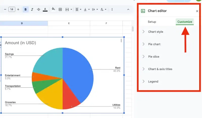 Customize Your Pie Chart
Step 6: Finalize and Insert Your Pie Chart
- Once satisfied with your customizations, click the Insert button in the Chart Editor.
- The pie chart will be added to your Google Sheet. Drag and resize the chart as needed to fit your layout.
Creating and customizing pie charts in Google Sheets helps simplify complex data and ensures clear communication in reports or presentations.
How to Make a Pie Chart from Multiple Sheets in Google Sheets
Creating pie charts in Google Sheets from multiple sheets helps you consolidate and visualize data from different sources effectively. It’s particularly useful for comparing data like sales, expenses, or survey results across multiple categories.
Step 1: Organize Data in Each Sheet
Ensure each sheet has similar categories and values organized into two columns: one for categories and one for corresponding values. Consistency is key to combining data later.
Step 2: Add a New Sheet for Consolidation
Create a new sheet to combine the data from all other sheets. This new sheet will be the base for your pie chart. Name it “Consolidated Data” to keep things organized.
Step 3: Use Formulas to Combine Data
Pull data from other sheets into your new consolidation sheet using formulas.
- Type
=Sheet1!A1:B10 to pull data from specific cells in another sheet. - Repeat for other sheets, ensuring all necessary data is included in the new sheet.
Step 4: Calculate Totals if Needed
If categories are repeated across sheets, calculate totals for each category in the consolidation sheet. Use the SUM formula, like =SUM(B2:B10), to add up values for the same category.
Step 5: Highlight the Data
Select the range of consolidated data in the new sheet. Make sure the category and value columns are included in the selection.
Step 6: Create the Pie Chart
Insert the pie chart using your highlighted data.
- Go to the Insert menu and select Chart.
- In the Chart Editor, choose Pie Chart as the chart type under the Setup tab.
Step 7: Customize the Pie Chart
Personalize your pie chart for clarity and style.
- Add a title for better understanding.
- Change slice colors to make the chart visually appealing.
- Adjust the legend placement for better readability.
Step 8: Save and Finalize
Double-check the chart to ensure it represents your data accurately. Save the file and adjust the size or position of the chart within the sheet as needed.
Pro Tip: Automate Updates with Formulas
Use dynamic formulas like IMPORTRANGE or other Google Sheets functions to ensure that your pie chart reflects real-time changes in the source sheets. This way, new data added to any sheet will automatically update the pie chart without manual effort.
By following these steps, you can efficiently consolidate data from multiple sheets into a single pie chart, providing a clear and visually compelling representation of your data.
Limitations of Pie Charts in Google Sheets
While pie charts in Google Sheets are useful, they have some limitations:
- Limited Customization: Aesthetics and design options are basic compared to dedicated visualization tools.
- Data Handling: Large datasets or multiple categories can make the pie chart cluttered and less effective.
- Mobile Challenges: Creating and editing pie charts on mobile devices can be less intuitive than on desktops.
Best Practices for Pie Charts
- Use Distinct Colors: Avoid similar shades for adjacent slices to improve readability.
- Limit Categories: Keep the number of slices manageable for clarity.
- Label Clearly: Always add meaningful titles, labels, or percentages for better understanding.
- Choose the Right Chart Type: For larger datasets or comparative analysis, consider using bar or line charts instead.
Also Read: How to Use Conditional Formatting in Google Sheets.
Conclusion
Pie charts are indispensable for presenting data proportions and percentages in a visually appealing manner. By using Google Sheets’ charting tools, including customization options and 3D pie charts, you can create compelling visuals that effectively communicate your data. Explore these features to elevate your data visualization and deliver clearer insights.
Similar Reads
How to Make a Column Chart in Google Sheets
Column charts in Google Sheets are a powerful tool for presenting data trends and comparisons visually. This guide will provide you with a column chart tutorial to help you create, customize, and effectively use column charts to analyze your data. Whether you're looking to understand data visualizat
5 min read
How to Create Charts or Graph in Google Sheets
Google Sheets is a powerful tool for organizing and analyzing data. Creating charts and graphs in Google Sheets allows you to convey information more effectively, whether you’re tracking sales, monitoring trends, or presenting data to others. In this article, explore the steps to create various type
6 min read
How to Create a Chart from Multiple Sheets in Excel
Creating a chart from multiple sheets in Excel is a powerful way to consolidate data and visualize it in a meaningful way. Whether you're working with different datasets on separate sheets or need to compare data across multiple tabs, knowing how to create a chart from multiple sheets in Excel can s
5 min read
How to Change Chart Colors in Google Sheets
Visualizing your data with charts in Google Sheets is an effective way to communicate information clearly. However, by default, the colors of the chart might not always align with your preferred aesthetic or data categorization. Changing the colors of your charts in Google Sheets can not only improv
6 min read
How to Make Bar Charts in Google Sheets
Bar charts are an excellent way to visually represent data comparisons, and Google Sheets offers intuitive tools to create and customize them. Whether you're looking to create a bar graph in Google Sheets or explore options like grouped and stacked bar charts, this guide will walk you through the st
5 min read
How to Make a Line Chart in Google Sheets
Visualizing data trends over time is made easier with line charts, and Google Sheets provides a simple yet effective way to create them. Whether you're tracking performance, analyzing trends, or presenting time-series data, learning how to make a line chart in Google Sheets can help convey your insi
4 min read
How to Add Error Bars in Google Sheets
Google Sheets is the popular online spreadsheet editor from the house of Google. It provides a simple, decluttered interface and a wide range of features. Also, you can easily create charts and graphs in Google Sheets from the entered data. In Google Sheets, adding error bars to your charts can sign
8 min read
How to Create a Pie Chart in Excel - Step by Step Guide
Pie charts are an excellent way to visualize proportions and illustrate how different components contribute to a whole. Whether you're analyzing market share, budget allocation, or survey results, pie charts make complex data easily understandable at a glance. This guide will walk you through how to
6 min read
How to Create Custom Charts in Excel?
The instructional exercise makes sense of the Excel outlines fundamentals and gives the point-by-point direction on the most proficient method to make a chart in Excel. Diagrams assist you with imagining your information in a manner that makes a most extreme effect on your crowd. Figure out how to m
2 min read
How to Create and Use Pivot Tables in Google Sheets
Pivot tables in Google Sheets are indispensable for turning raw data into meaningful insights. Whether you’re tracking sales, analyzing marketing metrics, or managing financial data, pivot tables allow users to create dynamic data summaries with ease. This tutorial covers how to use pivot tables in
7 min read