How to Create a Strip Chart in R?
Last Updated :
14 Feb, 2022
In this article, we will be throwing light on the various methodologies to create a strip chart using various functions and its arguments in the R programming language.
Method 1:Create a Strip chart of the numeric vector
In this approach to create a strip chart of the numeric vector, the user needs to simply call the stripchart() function which is an inbuilt function of the R language. Then the user needs to pass the given vector for which the strip chart is needed and further by completing these previous steps the trip chart of the given vector will be returned.
stripchart() function: This function is used to create a strip chart of the given data.
Syntax: stripchart(vector)
Parameter: vector: It is the numeric vector
Example:
In this example, we are creating a strip chart of the vector containing 1000 random numeric values using the stripchart() function in the R programming language.
R
# Create Data
x<-c(rnorm(1000))

# Create strip chart
stripchart(x)
Output:

Method 2: Create a strip chart without overlapping of points
In this method of creating the strip chart without overlapping of points, the user needs to call the stripchart() function with the data to simply create the strip chart, and further, the user also needs to use the method argument of this function and set this as "jitter" to get the resulting strip chart with none overlapping individual points.
Syntax: stripchart(data,method='jitter')
Parameters:
- Data: Data provided to create the strip chart
- method: the method to be used to separate coincident points. The default method "overplot" causes such points to be overplotted, but it is also possible to specify "jitter" to jitter the points
Example: In this example, we are creating a strip chart without overlapping the points using the stripchart() function with the method argument set to be "jitter" in the R language.
R
# Create Data
x<-c(rnorm(100))

# Create strip chart
stripchart(x,method='jitter')
Output:

Create a strip chart without overlapping points with the method argument set to stack
We can also set the method parameter to be stacked in the case if the user needs to none overlapping individual points in the stripchart, here the points will be plotted as they are in stack in the R programming language
Syntax: stripchart(data,method='stack')
Parameters:
- Data: Data provided to create the strip chart
- method: the method to be used to separate coincident points.
Example: In this example, we are creating a strip chat without overlapping the points using the stripchart() function with the method argument set to be "stack" of the iris sepal width data in the R language.
R
# Create Data
x<-Orange$age

# Create strip chart
stripchart(x,method='stack')
Output:

Method 3: Create a vertical strip chart
Under this method to create a vertical strip chart, the user needs to call the stripchart() function with its vertical argument, where the vertical argument should be initialized to true as by default if the value is false to get the resulting strip chart as a vertical strip chart of the given data in R language.
Syntax: stripchart(data,method,vertical=TRUE)
Parameters:
- Data: Data provided to create the strip chart
- method: the method to be used to separate coincident points.
- vertical: when vertical is TRUE the plots are drawn vertically rather than the default horizontal.
Example: In this example, we are creating a vertical strip chart using the vertical argument of the stripchart() function of the given data in the R programming language.
R
# Create Data
x<-c(rnorm(100))

# Create strip chart
stripchart(x,method='jitter',vertical = TRUE)
Output:

Method 4: Create strip chart for multiple data
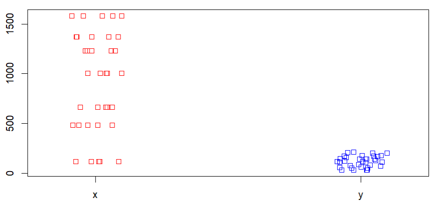
In this approach to create the strip chart of the multiple data, the user simply has to create a list of the multiple data together in a single variable and then pass that variable as the parameter of the stripchart() function to get the strip chart of the all the provided data in R language.
Example: In this example, we are creating a strip chart of the multiple data provided in the method jitter and in the vertical form using the stripchart() function in the R language.
R
# Create Data
gfg<-list(x=Orange$age,y=Orange$circumference)

# Create strip chart
stripchart(gfg,method='jitter',
           col=c('red','blue'),
           vertical = TRUE)
Output:
Similar Reads
How to Create Radar Charts in R?
In this article, we are going to see how to create Radar Charts in R Programming Language. Radar charts are also known as Spider or Web or Polar charts. It is a graphical graph to display multivariate data in form of 2D charts of three or more quantitative variables which are represented on axes sta
4 min read
Power BI - How to Create a Scatter Chart?
A Scatter chart is a chart, representing data points, spread on a graph, to show the column values. It helps us analyze and summarise the data very efficiently. We can also add legends, bubble sizes, and animations to this chart. This graph is widely used because it can show better visualizations in
4 min read
How to Create a Thermometer Chart in Excel?
The Thermometer chart in Excel can be used to depict specific data based on the actual value and the target value. It can be used in a wide range of scenarios such as representing the past performance of horses in horse racing or the global temperature and it's variation throughout decades etc. In t
2 min read
How To Create a Tornado Chart In Excel?
Tornado charts are a special type of Bar Charts. They are used for comparing different types of data using horizontal side-by-side bar graphs. They are arranged in decreasing order with the longest graph placed on top. This makes it look like a 2-D tornado and hence the name. Creating a Tornado Char
2 min read
How to Create a Bar Chart in Excel?
To learn how to create a Column and Bar chart in Excel, let's use a simple example of marks secured by some students in Science and Maths that we want to show in a chart format. Note that a column chart is one that presents our data in vertical columns. A bar graph is extremely similar in terms of t
4 min read
How to create stacked bar chart using ggvis in R
In this article, we will be looking at the approach for creating a stacked bar chart using ggvis in the R programming language. Create the stacked bar chart with the layer_bars function of ggvis package In this approach to create the stacked bar chart with layer_bars function from the ggvis package,
3 min read
How to Create a Grouped Barplot in R?
In this article, we will discuss how to create a grouped barplot in the R programming language. Method 1: Creating A Grouped Barplot In Base R In this method of creating a grouped barplot, the user needs just use the base functionalities of the R language. The user needs to first modify the data use
4 min read
How To Create Interactive Charts in Excel?
In MS Excel, we can draw various charts, but among them today, we will see the interactive chart. By name, we can analyze that the chart, which is made up of interactive features, is known as an interactive chart. In general, this chart makes the representation in a better and more user-friendly way
9 min read
How to Create Pie Chart Using Plotly in R
The pie chart is a circular graphical representation of data that is divided into some slices based on the proportion of it present in the dataset. In R programming this pie chart can be drawn using Plot_ly() function which is present in the Plotly package. In this article, we are going to plot a pi
3 min read
How to Change Chart Style in Excel?
Chart styles are like a handy toolkit for making your charts look awesome. They give you a bunch of cool styles with colors, patterns, labels, and titles. Basically, all the things that make your chart easy on the eyes and extra useful for understanding data trends. These styles also supercharge you
5 min read