How to Create a Scatter Plot with Lines in Google Sheets: Step-by-Step Guide
Last Updated :
29 Aug, 2024
Google Sheets is a powerful tool for data analysis and visualization, providing various features to help you understand your data better. One of these features is the ability to create scatter plots, which can visualize the relationship between two data sets. Sometimes, you may want to add a line of best fit or a trendline to make the data patterns clearer.
In this article, you are going to learn about how to create a scatter plot in Google Sheets and add a line for a deeper data analysis.

How to Create a Scatter Plot in Google Sheets
Follow these steps to create a scatter plot in Google Sheets quickly and easily.
Step 1: Insert your Data
Before you can create a scatter plot with a line in Google Sheets, you need to have your data ready. Make sure you have two columns of data in your spreadsheet, one for the x-axis (independent variable) and one for the y-axis (dependent variable).
In our example, we'll use a Salary dataset of x and y values.
 Overview of the dataset
Step 2: Create a Scatter Plot
Select Your Data: Highlight the data you want to include in your scatter plot. In our case, select both columns (X for 'Years of Experience' and Y for 'Salary').
.webp) Create a Scatter Plot
Create a Scatter PlotStep 3: Go to the Insert Tab and Select Chart
Click on the "Insert" menu at the top of Google Sheets and Choose the Chart from the displayed drop-down menu.
 Click on Insert> Chart
 Step 4: Select Scatter Chart
Select the option of Scatter Chart from those.
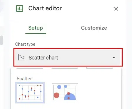 Select Scatter Chart
 Step 5: Preview the Scatter Plot
Your scatter plot will now be displayed in your Google Sheets document.
.webp) Preview the Scatter Chart
Preview the Scatter Chart How to Add a Trendline to a Scatter Chart in Google Sheet
Adding a trendline can help you understand the direction or pattern in your data. Here’s how to do it:
Step 1: Click on the Scatter Plot and Open the Chart Editor
Select the Scatter Plot by Clicking on it and then Customize Your Chart. In the Chart Editor panel on the right, click on the "Customize" tab then click "Series".
 Click on Scatter Plot> Customize > Choose Series
Step 2: Select the Trendline Type and Customize it
Scroll down until you see the "Trendline" section. Check the box next to "Trendline." Select the type of trendline you want to add. Options include Linear, Exponential, Polynomial, or Moving Average. Further customize your trendline by adjusting options like line color, opacity, and label.
.webp) Select the Trendline Type
Select the Trendline Type Step 3: Preview Your Scatter Plot with a Trendline
With the trendline added to your scatter plot, you can now analyze the relationship between your data points more effectively. The trendline provides a visual representation of the general direction or pattern in your data. For example, a linear trendline can show if the Salary is higher with higher Years of Experience.
.webp) Preview your Chart with Trendline
Preview your Chart with Trendline How to Edit Scatter Plots in Google Sheets
If you need to make changes to your scatter plot, follow these steps:
Step 1: Select the Scatter Plot and Open the Chart Editor
Click on the scatter plot you want to edit, then right-click and select Edit chart. The Chart Editor will appear on the right side of your Google Sheets document.
 Select the Scatter Plot, Click on Edit
Step 2: Customize Your Chart Elements
Under the Customize tab, use the drop-down menu to edit different chart elements such as axes, series, or titles. Adjust the appearance, style, and content as needed.
 Open the Chart Editor
Step 3: Preview Changes and Save
As you make edits, your scatter plot will update in real-time. Once you are satisfied with the changes, click Close to save your edits..
 Customize Chart Elements
Step 3: Adjust Chart Elements
After selecting a chart element, you can make adjustments to its appearance, style, and content in the Chart editor. For example, you can change axis labels, modify the trendline, or adjust data series properties.

Step 4: Preview Changes and Save Your Edits
As you make edits, your scatter plot will update in real time. Preview how your changes affect the chart's appearance and functionality. Once you're satisfied with your edits, click the Close icon on the Right side of the Chart editor to save your changes to the scatter plot.

How to Remove Scatter Plots in Google Sheets
If you no longer need a scatter plot, you can easily remove it:
Step 1: Select the Scatter Plot
To remove a scatter plot, start by clicking on the scatter plot you want to delete within your Google Sheets document. Ensure the chart is selected.
Step 2: Delete the Scatter Plot
Under the "Edit Chart" section click on the "Delete Chart" option to delete the selected scatter plot from your document.

Step 3: Scatter Plot Removed
After confirming the deletion, the scatter plot will be removed from your Google Sheets document, leaving the rest of your data intact. Following these steps, you can easily edit and remove scatter plots in Google Sheets, allowing you to fine-tune your visualizations and manage your charts effectively.
Conclusion
Knowing how to create and customize scatter plots with lines in Google Sheets is a valuable skill for anyone involved in data analysis. Adding lines, such as trendlines or regression lines, turns a simple scatter plot into a powerful tool for identifying trends and making informed decisions. Whether you're analyzing academic data or business metrics, mastering these features will help you better understand and present your data.
Similar Reads
How to Create a Scatter Plot In Excel: Step by Step Guide
A scatter plot in Excel is a powerful visualization tool for identifying trends, relationships, and patterns between two variables. By plotting data points on an Excel XY scatter plot, you can gain insights into correlations and outliers, making it an essential tool for data analysis. Whether you’re
8 min read
How to Make a Line Chart in Google Sheets
Visualizing data trends over time is made easier with line charts, and Google Sheets provides a simple yet effective way to create them. Whether you're tracking performance, analyzing trends, or presenting time-series data, learning how to make a line chart in Google Sheets can help convey your insi
4 min read
How to Create a geom Line Plot with Single geom Point at the End with Legend in R
The combination of a geom_line plot with a single geom_point at the end is a highly effective visualization technique. It highlights the endpoint of each series in a plot, making it easier to compare trends across categories or groups in time-series data or other continuous datasets. This article wi
5 min read
How to Create a Scatterplot with a Regression Line in R?
A scatter plot uses dots to represent values for two different numeric variables. Scatter plots are used to observe relationships between variables. A linear regression is a straight line representation of relationship between an independent and dependent variable. In this article, we will discuss h
3 min read
How to Make a Table in Google Sheets: A Complete Guide for 2024
Creating well-organized tables in Google Sheets is essential for managing and presenting your data effectively. Whether you're working on a project, preparing a report, or simply improving your spreadsheet skills, this guide will walk you through the steps to create and format tables in Google Sheet
7 min read
Create a Scatter Plot with Multiple Groups using ggplot2 in R
In this article, we will discuss how to create a scatter plot with multiple groups in R Programming Language. Geoms can be added to the plot to compute various graphical representations of the data in the plot (points, lines, bars). The geom_point() method is used to create scatter plots in R. The g
2 min read
How to Create Charts or Graph in Google Sheets
Google Sheets is a powerful tool for organizing and analyzing data. Creating charts and graphs in Google Sheets allows you to convey information more effectively, whether you’re tracking sales, monitoring trends, or presenting data to others. In this article, explore the steps to create various type
6 min read
How to create a plot using ggplot2 with Multiple Lines in R ?
In this article, we will discuss how to create a plot using ggplot2 with multiple lines in the R programming language. Method 1: Using geom_line() function In this approach to create a ggplot with multiple lines, the user need to first install and import the ggplot2 package in the R console and then
3 min read
How to Create an X-Y Scatter Plot in Excel?
Excel is powerful data visualization and data management tool which can be used to store, analyze, and create reports on large data. It can be used to visualize and compare data using a graph plot. In excel we can plot different kinds of graphs like line graphs, bar graphs, etc. to visualize or anal
2 min read
How to Make a Bar Graph in Excel: Step by Step Guide
Bar graphs are one of the most versatile tools in Excel for visualizing and comparing data. Whether you’re tracking sales, analyzing survey responses, or presenting project milestones, bar graphs offer a straightforward way to highlight key trends and differences. Learning how to create a bar graph
6 min read