How to change the order of bars in bar chart in R ?
Last Updated :
29 Jun, 2021
In this article, we will discuss how to change the order of bars in bar chart in R programming language. We can change the order of bars by using two plots ggplot and barplot.
Method 1: Ggplot re-ordering
Firstly create a sample dataset and plot the graph-Manual. Now let's reorder them accordingly.
Dataset in Use:
 Employee Salary Details
Reordering in ggplot is done using theme() function. Within this, we use axis.text.x with the appropriate value to re-order accordingly. By default, geom_bar uses stat="bin". This makes the height of each bar equal to the number of cases in each group, If you want the heights of the bars to represent values in the data, use stat="identity" and map a value to the y aesthetic.
- geom_bar() : Use for the Bar charts
Syntax:
geom_bar( mapping = NULL, data = NULL, stat = "count", color='blue'; fill='yellow' width = NULL, na.rm = FALSE, orientation = NA, show.legend = NA,...,)
- Theme: Themes can be used to give plots a consistent customized look.
Syntax:
theme( line, rect, text, title, aspect.ratio, axis.text.x, axis.text.x.top, axis.text.x.bottom,)
Parameter:
- line : all line elements (element_line())
- rect :all rectangular elements (element_rect())
- text : all text elements (element_text())
- title :all title elements: plot, axes, legends (element_text(); inherits from text)
- aspect.ratio :aspect ratio of the panel.
- axis.text.x : labels along with axes (element_text()). Specify all axis labels (axis.text), labels
Manually Order
To reorder bars manually, you have to pass stat="identity" in the geom_bar() function.
Example:
R
library(ggplot2)

# Create the data frame.
gfg.data <- data.frame(
  GFG_Id = c (1:7),
  GFG_Name = c("Damon","Joe","Jen","Ryan","Bonnie","Stefan","William"),
  GFG_Sal = c(6200,5152,6110,7290,8485,7654,2341))
print(gfg.data)

# GGPLOT
x <- ggplot(gfg.data, aes(x = GFG_Name, y = GFG_Sal))

x <- x + geom_bar(stat="identity", color='lightgreen',fill='lightgreen')

x <- x + theme(axis.text.x=element_text(angle=45, hjust=0.9))
x
Output:

Re-ordering the in ascending and descending order
The reorder function is used here to change the order of the graphs.
Syntax :
ggplot(dataframe name, aes(x=reorder(column1,±column2),y=column2)
Here if you want ascending order then you'll use '+' plus sign, if you want in descending order then you should use '-' minus sign.
Note: Column2 must be the column with numeric data.
Example: Let us first show the same bar plot in ascending order.
R
library(ggplot2)

# Create the data frame.
gfg.data <- data.frame(
  GFG_Id = c (1:7),
  GFG_Name = c("Damon","Joe","Jen","Ryan","Bonnie","Stefan","William"),
  GFG_Sal = c(6200,5152,6110,7290,8485,7654,2341))

print(gfg.data)

# GGPLOT
x <- ggplot(gfg.data, aes(x = reorder(GFG_Name, +GFG_Sal), y = GFG_Sal))

x <- x + geom_bar(stat="identity", color='red',fill='red')

x <- x + theme(axis.text.x=element_text(angle=45, hjust=0.9))
x
Output:

Example: Now let's look at descending ordered plot
R
library(ggplot2)

# Create the data frame.
gfg.data <- data.frame(
  GFG_Id = c (1:7),
  GFG_Name = c("Damon","Joe","Jen","Ryan","Bonnie","Stefan","William"),
  GFG_Sal = c(6200,5152,6110,7290,8485,7654,2341))

print(gfg.data)

# GGPLOT
x <- ggplot(gfg.data, aes(x = reorder(GFG_Name, -GFG_Sal), y = GFG_Sal))

x <- x + geom_bar(stat="identity", color='violet',fill='violet')

x <- x + theme(axis.text.x=element_text(angle=45, hjust=0.9))
x
Output:

Method 2: Using Barplot re-ordering
Firstly create a sample dataset and plot the graph. Now let us look at the reordering of the bars.
Dataframe in use:
In R, barplot() function
Syntax:
barplot(height, name.args = NULL, col = NULL, main = NULL)
Parameter:
- height: You can specify either a Vector or a Matrix of values.
- name.args :a Vector of names you want to plot below each bar or group of bars in an R bar chart.
Manually Ordering
For manual ordering pass the order to the x-axis while creating the dataframe.
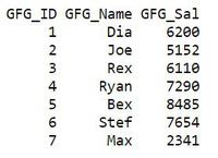
Example:
R
# Create the data for the chart
GFG_ID   <- c(1:7)
GFG_Sal  <- c(6200,5152,6110,7290,8485,7654,2341)
GFG_Name <- c("Dia","Joe","Rex","Ryan","Bex","Stef","Max")
X <- data.frame(GFG_ID,GFG_Name,GFG_Sal)
X

# Give the chart file a name
png(file = "barchart_months_salary.png")

# Plot the bar chart
barplot(GFG_Sal,names.arg=GFG_Name,xlab="Employee Name",
        ylab="Salary Range",col="black",
main="Salary chart",border="Red")

# Save the file
dev.off()
Output

Re-ordering the graph in ascending and descending order
The function used here is the order (order returns a permutation that rearranges its first argument into ascending or descending order)
Syntax -
order(…, na.last = TRUE, decreasing = FALSE)
Parameter:
na.last: for controlling the treatment of NAs
Let us first look at the ascending ordered plot.
Example:
R
GFG_ID  <- (LETTERS[1:7])
GFG_Sal  <- c(6200,5152,6110,7290,8485,7654,2341)

data <- data.frame(GFG_Sal, GFG_ID)

barplot(data[order(data[,1],decreasing=FALSE),
        ][,1],names.arg=data[order(data[,1],decreasing=FALSE),]
        [,2],col="blue",xlab="Employee Name Initial Letter",
        ylab="Salary Range",main="Salary chart",border="black")
Output

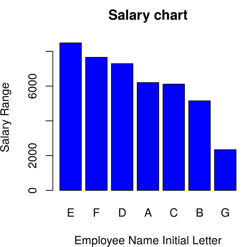
Now let us look at the descending ordered plot.
Example:
R
GFG_ID  <- (LETTERS[1:7])
GFG_Sal  <- c(6200,5152,6110,7290,8485,7654,2341)

data <- data.frame(GFG_Sal, GFG_ID)

barplot(data[order(data[,1],decreasing=TRUE),
        ][,1],names.arg=data[order(data[,1],decreasing=TRUE),
        ][,2],col="blue",xlab="Employee Name Initial Letter",
        ylab="Salary Range",main="Salary chart",border="black")
Output
Similar Reads
How to customize the axis of a Bar Plot in R Barplots in R programming language can be created using the barplot() method. It takes as input a matrix or vector of values. The bar heights are equivalent to the values contained in the vector. Syntax: barplot(H, xlab, ylab, main, names.arg, col) Labeling the X-axis of the bar plot The names.args
4 min read
How to Add Labels Over Each Bar in Barplot in R? In this article, we will see how to add labels over each bar in barplot in R Programming language. To add labels on top of each bar in Barplot in R we use the geom_text() function of the ggplot2 package. Syntax: plot+ geom_text(aes(label = value, nudge_y ) Parameters: value: value field of which la
2 min read
Change Color of Bars in Barchart using ggplot2 in R In this article, we are going to see various methods to change the color of a bar chart using ggplot2 in the R programming language. For creating a simple bar plot we will use the function geom_bar( ). Syntax: geom_bar(stat, fill, color, width) Parameters : Â stat : Set the stat parameter to identif
4 min read
How to Change Number of Bins in Histogram in R? In this article, we will discuss how to change the number of bins in the histogram in the R Programming Language. A Histogram is a variation of a bar chart in which data values are grouped together and put into different classes. This grouping enables us to see how frequently data in each class occu
2 min read
Change Space and Width of Bars in ggplot2 Barplot in R In this article, we will see how to change the Space and width of bars in ggplot2 barplot in R. For Create a simple Barplot using ggplot2, first we have to load the ggplot2 package using the library() function. If you have not already installed then you can install it by writing the below command i
4 min read
How to Auto Adjust Text in the Middle of a Bar Plot? Bar plots are widely used in data visualization to represent categorical data with rectangular bars. A critical aspect of enhancing the readability and informativeness of bar plots is the proper positioning of text labels. While adding text labels to bar plots is common, manually adjusting their pos
3 min read