How to Change Axis Intervals in R Plots?
Last Updated :
19 Dec, 2021
In this article, we will be looking at the different approaches to change axis intervals in the R programming language.
Method 1: Using xlim() and ylim() functions in base R
In this method of changing the axis intervals, the user needs to call the xlim() and ylim() functions, passing the arguments of the range of the axis intervals required by the user in form of the vector, this will be changing the axis intervals of the plot as per the specified parameters by the user in the R programming language.
xlim() and ylim() functions are used to limit the x-axis and the y-axis.
Syntax:
xlim(...)
ylim(...)
Parameters:
...: If numeric, will create a continuous scale, if factor or character, will create a discrete scale.
Syntax:
barplot(data,xlim=c(),ylim=c())
Example: Initial plot
R
gfg<-c(8,9,6,5,8,5,1,7,3,5)
barplot(gfg)
Output:

Example: Change axis intervals
R
gfg<-c(8,9,6,5,8,5,1,7,3,5)
barplot(gfg,xlim=c(0,20), ylim=c(0,15))
Output:

Method 2: Using log argument in base R
In this method to change the axis intervals of the given plot, the user needs to use the log arguments with the plot function to transform one of the axes into a log scale, this will be changing the axis defined by the user to the logarithm axis in the R programming language.
Syntax:
barplot(data,log='x/y')
Example: Initial plot
R
gfg<-c(8,9,6,5,8,5,1,7,3,5)
barplot(gfg)
Output:
Example: Change axis intervals
R
gfg<-c(8,9,6,5,8,5,1,7,3,5)
barplot(gfg,log='y')
Output:

Method 3: Using xlim() and ylim() functions with ggplot2
In this approach to change the axis intervals of the given plot, the user needs to install and import the ggplot2 package in the working console of the R programming language, here the ggplot2 package is responsible for creating the plots, then the user needs to call the xlim() and the ylim() function with the required parameters as per the user to change the axis intervals as required by the user, these functions will be called with the plot created with ggplot2 and this will be leading to the change in the plot axis intervals as defined by the users.
Example: Initial plot
R
gfg<-c(8,9,6,5,8,5,1,7,3,5)
barplot(gfg)
Output:

Example: Change axis intervals
R
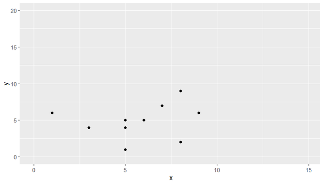
library(ggplot2)

gfg<-data.frame(x=c(8,9,6,5,8,5,1,7,3,5),
                y=c(9,6,5,4,2,5,6,7,4,1))

ggplot(data=gfg,aes(x=x, y=y)) + geom_point()+
xlim(0,15)+ylim(0,20)
Output:
Method 4:Using scale_x_continuous() and scale_y_continuous() functions with ggplot2
In this method to change the axis interval, the user needs to install and import the ggplot2 package in the working R console, this package will be responsible for the plotting of the plot and for using some of the functionality. Then the user needs to call the scale_x_continous() /scale_x_continous() function with the plotted ggplot2 plot with the required parameters to change the axis intervals to a log scale in the R programming language.
scale_x_continuous() / scale_y_continuous() functions are used to for continuous position scales (x & y).
Syntax:
scale_x_continuous(..., expand = waiver())
scale_y_continuous(..., expand = waiver())
Parameters:
- ...: common continuous scale parameters: name, breaks, labels, na.value, limits and trans.
- expand: a numeric vector of length two giving multiplicative and additive expansion constants.
Example: Initial plot
R
library(ggplot2)

gfg<-data.frame(x=c(8,9,6,5,8,5,1,7,3,5),
                y=c(9,6,5,4,2,5,6,7,4,1))

ggplot(data=gfg,aes(x=x, y=y)) + geom_point()
Output:

Example: Change axis intervals
R
library(ggplot2)

gfg<-data.frame(x=c(8,9,6,5,8,5,1,7,3,5),
                y=c(9,6,5,4,2,5,6,7,4,1))

ggplot(data=gfg,aes(x=x, y=y)) + geom_point()+
scale_y_continuous(trans = 'log10')
Output:

Similar Reads
How to Plot a Confidence Interval in R? In this article, we will discuss how to plot confidence intervals in the R programming language. Method 1: Plotting the confidence Interval using geom_point and geom_errorbar In this method to plot a confidence interval, the user needs to install and import the ggplot2 package in the working r conso
4 min read
How to Change Axis Scales in R Plots? In this article, we will learn how to change Axis Scales in the R Programming Language. Method 1: Change Axis Scales in Base R To change the axis scales on a plot in base R Language, we can use the xlim() and ylim() functions. The xlim() and ylim() functions are convenience functions that set the li
4 min read
How to increase font size in Base R Plot ? The plot() method in the R programming language is used to plot a series of points in the graph and visualize them using curves and scatter that they follow. Syntax: plot(x, y, main="title", sub="subtitle") The cex attribute is the integer which is an indicator of the scale factor, which describes
4 min read
How to Change Number of Bins in Histogram in R? In this article, we will discuss how to change the number of bins in the histogram in the R Programming Language. A Histogram is a variation of a bar chart in which data values are grouped together and put into different classes. This grouping enables us to see how frequently data in each class occu
2 min read
How to Overlay Plots in R? In this article, we will discuss how to overlay plots in the R Programming Language. Overlaying is a technique that is used to draw multiple plots on a single frame. To draw multiple plots in the R Language, we draw a basic plot and add an overlay line plot or scatter plot by using the lines() and t
3 min read
How to Put X-Axis in Order (Month) in R Visualizing time-series data is a common task in data analysis, especially when working with months. One common issue users face is ordering the x-axis by months in a logical sequence when using R. By default, R may display months in alphabetical order, but we can fix this by converting month names
4 min read