How to Build an Interactive Map in Excel?
Last Updated :
29 Oct, 2022
An interactive map is a valuable tool for vendors, marketers, and customers. It's a map on the internet with clickable points. When you click one of the points, an informational box about that point appears. Typically, it is charts or other pertinent data. It is not only effective at executing a location's advertising data. However, it also has the ability to keep audiences engaged. The interactive map chart in Excel is all about picking what to display on the map. It is preferable to ensure that the data can be laid out on the map.
How to Build an Interactive Map in Excel?
Step 1: Click the File tab at the top of Microsoft Excel.

Step 2: Select the Options tab.

Step 3: Select the Add-Ins tab.

Step 4: A dialog box will open after you click the Add-ins button. Go to the bottom of the options window and select COM Add-Ins from the drop-down menu at the Manage option. Then click the Go tab:

Step 5: Check the boxes next to Microsoft Power Pivot for Excel, Microsoft Power Map for Excel, and Microsoft Power View for Excel. Then click OK.

Step 6: Click on the insert tab and select the Table option.

Step 7: Then select the Data range or highlight it from the Data Table, and if your data has a header box, select the box to check it. Then click on OK.

Step 8: Select the Insert tab.

Step 9: Navigate to the Map option, then select the Map from the drop-down menu.

Step 10: The Map Interface would be as follows,

Step 11: Make any necessary changes by selecting the Design option. You might add a title, legend, label the data, and even a background to the map.

Step 12: You may Add Chart Elements, Change Map Layout, Change Colors, and Change Chart Styles using the following options.

Step 13: Change the Chart Styles by selecting one of the options below.

Step 14: By selecting the Fourth style, your Map will look like this,

Step 15: To add your desired Chart Title format, click the drop-down menu and select Chart Title:

Step 16: Select the Data Labels option to add your selected Data Labels format.

Step 17: To add your desired Legend format, select Legend.

Step 18: To change the layout of your map, select Quick Layout.

Step 19: To add your desired color to your map, select the Change Colors option.
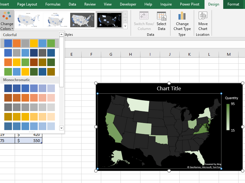
Step 20: For instance, if you choose Layout 3 in the Quick Layout option and Colorful Palette 4 in the Change Color option, your map will appear like this,

Similar Reads
How To Create Interactive Charts in Excel?
In MS Excel, we can draw various charts, but among them today, we will see the interactive chart. By name, we can analyze that the chart, which is made up of interactive features, is known as an interactive chart. In general, this chart makes the representation in a better and more user-friendly way
9 min read
How to Insert and Run VBA Code in Excel?
In Excel VBA stands for (Visual Basic for Application Code) where we can automate our task with help of codes and codes that will manipulate(like inserting, creating, or deleting a row, column, or graph) the data in a worksheet or workbook. With the help of VBA, we can also automate the task in exce
2 min read
How Can I Enable Python in Excel?
Excel and Python are a dynamic combination that may help anyone improve their automation and data analysis skills. Not only can Python help you become more proficient with spreadsheets, but it can also revolutionize efficiency and insight. This is how to easily enable Python in Excel to open up a pl
3 min read
How to Insert a Picture in a Cell in MS Excel?
Every day in business or any other field lots of information are there that are required to store for future use. For anyone, it is very difficult to remember that information for a long time. Earlier data and information are stored in a form of a register, file, or by paperwork but finding it may b
4 min read
How To Create A Pictograph In Excel?
The Pictograph is the record consisting of pictorial symbols. Generally, in mathematics, it is represented by the help of graphs with pictures or icons representing certain quantities or numbers of people, books, etc. It is also known as pictogram, pictogramme, pictorial chart, picture graph, or sim
3 min read
How to Show Percentage in Pie Chart in Excel?
Pie charts are mostly used as it is more appealing and easy to understand for any type of audience. It is divided into various parts and each part of pie charts denotes a subcategory of the original data set. This sub-category data is sometimes shown using the original values or sometimes using perc
2 min read
How To Make Address Labels in Excel
Creating address labels in Excel might sound like a complicated task, but it’s surprisingly simple and efficient when paired with Word’s Mail Merge feature. Whether you’re sending invitations, managing business mailings, or organizing personal projects, learning how to make mailing labels in Excel c
4 min read
Interactive maps with Bokeh
Interactive maps are used to visualize the data based on the geo-location category. any large dataset which contains a lot of geo-location data like cities, states, countries, etc can be plotted easily. Â bokeh is an open-source package, which uses the Bokeh visualization tool. It gives a flexible de
4 min read
How To Represent Excel Data as Pie Chart in ReactJS?
In today's data-driven world, visualizing information is crucial for understanding trends and making informed decisions. Pie charts are a powerful tool for displaying the proportions of a whole, making them ideal for presenting Excel data in a clear and intuitive manner within a ReactJS application.
4 min read
How to Create a Power PivotTable in Excel?
When we have to compare the data (such as name/product/items, etc.) between any of the columns in excel then we can easily do with the help of Pivot table and pivot charts. But it fails when it comes to comparing those data which are in two different datasets, at that time Power Pivot comes into rol
4 min read