How to Build a Card component using Tailwind CSS ?
Last Updated :
26 Apr, 2025
In this article, we will learn about how to Build a card component using Tailwind CSS, Tailwind CSS is a CSS framework that helps in building rapid custom UI. It is a highly customizable, low-level CSS framework that gives you all of the building blocks that you need. Tailwind CSS creates small utilities with a defined set of options enabling easy integration of existing classes directly into the HTML code. In this article, we will see how to build the card component using the Tailwind CSS.
A Card Component is like a container used to group some related information. The card usually shows information in an appealing way and can be a blog post, a user profile, etc. We may use these card components to show our data and information to your users in multiple forms and contexts.
Syntax:
<div class="block p-6 max-w-sm bg-green-600
            rounded-lg border border-gray-200">
    <h1 class="mb-2 text-3xl font-bold text-gray-900>
        ...
    </h1>
    <p class=" font-normal text-white">
        ...
        </p>
</div>
Tailwind CSS Classes: To create a card component, we have used some utility classes of tailwind CSS.
- block: It is used to create a block-level element by using the .block class.
- p-6: It is used to give the padding of 6 from all sides.
- max-w-sm: It is used to set the max width of the component as small.
- rounded-lg: It is used to set the rounded corners as large.
- border border-gray-200: It is used to add a border of a grey color.
- shadow-md: It is used to add shadows of medium size.
- mb-2: It adds the margin-bottom of 1 rem.
- text-3xl: It makes the font size 1.875rem.
- font-bold: It makes the font size bold.
- text-gray-900: It makes the text color gray.
- text-white: It makes the text color white.
Tailwind CSS Installation: There are 2 ways through which the Tailwind CSS can be used:
- Using the MPM installation
- Using the CDN link
We will understand both approaches for utilizing the Tailwind CSS. The following step will be followed for the Tailwind CSS Installation, is described below:
- Install the package available on npm using the following command:
npm install tailwindcss
- After that create an ad Tailwind configuration file using the following command:
npm tailwind init {name of file}Using Tailwind CSS CDN Link:
- Add the CDN script tag to the <head> of the HTML file and start using Tailwind’s utility classes to style the content:
<script src="https://cdn.tailwindcss.com"></script>
- Adding Tailwind to your project:
<!DOCTYPE html>
<html lang="en">
<head>
    <meta charset="utf-8" />
    <title>GeeksforGeeks</title>
    <script src=
"https://cdn.tailwindcss.com"></script>
</head>

<body>
    ...
</body>
</html><div class="block p-6 max-w-sm
bg-green-600 rounded-lg
border border-grey-200 shadow-md">
...
</div>- Add Headers and main content:
<h1 class="mb-2 text-3xl font-bold text-gray-900">
    Header
</h1>
<p class="text-white">
    content goes here...
</p>
Example 1: Below example demonstrates the basic card component created using Tailwind CSS.
HTML
<!DOCTYPE html>
<html lang="en">
<head>
    <meta charset="utf-8" />
    <title>Card Component In Tailwind CSS</title>
    <script src=
"https://cdn.tailwindcss.com">
    </script>
</head>

<body>
    <div style="text-align: center">
        <h1 class="text-green-600
                   text-3xl font-bold">
            GeeksforGeeks
        </h1>
        <h3 class="text-xl">
            Card in Tailwind CSS
        </h3>
    </div>
    <div class="py-4 flex justify-center">
        <div class="block p-6 max-w-sm
                    bg-green-600
                    rounded-lg border
                    border-gray-200 shadow-md">
            <h1 class="mb-2 text-3xl
                       font-bold
                       text-gray-900
                       dark:text-white">
                GeeksforGeeks
            </h1>
            <p class="font-normal text-white">
                GeeksforGeeks aka GFG is an online platform
                that provides Free Tutorials, Millions of
                Articles, Live, Online and Classroom Courses,
                Frequent Coding Competitions ,Webinars by
                Industry Experts, Internship opportunities
                and Job Opportunities.
            </p>
        </div>
    </div>
</body>
</html>
Output:

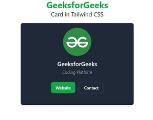
Example 2: Below example demonstrates the card component with the image using Tailwind CSS.
HTML
<!DOCTYPE html>
<html lang="en">
<head>
    <meta charset="utf-8" />
    <title>GeeksforGeeks</title>
    <script src=
"https://cdn.tailwindcss.com">
    </script>
</head>

<body>
    <div style="text-align: center">
        <h1 class="text-green-600
                   text-3xl font-bold">
            GeeksforGeeks
        </h1>
        <h3 class="text-xl">
            Card in Tailwind CSS
        </h3>
    </div>
    <div class="py-4
                flex justify-center">
        <div class="w-full
                    max-w-sm
                    bg-gray-800
                    rounded-lg
                    border border-gray-200
                    shadow-md">
            <div class="flex flex-col
                        items-center pt-4 pb-10">
                <img class="mb-3 w-24 h-24
                            rounded-full shadow-lg"
                     src=
"https://media.geeksforgeeks.org/wp-content/uploads/20220221132017/download.png"
                     alt="gfg" />
                <h5 class="mb-1 text-xl
                           font-medium
                           text-gray-900
                           dark:text-white">
                    GeeksforGeeks
                </h5>
                <span class="text-sm
                             text-gray-500
                             dark:text-gray-400">
                    Coding Platform
                </span>
                <div class="flex mt-4 space-x-3 md:mt-6">
                    <a href="https://www.geeksforgeeks.org"
                       class="inline-flex items-center py-2 px-4
                              text-sm font-medium text-center
                              text-white bg-green-600 rounded-lg
                              hover:bg-green-700 focus:ring-4
                              focus:outline-none focus:ring-blue-300">
                        Website
                    </a>
                    <a href="#"
                       class="inline-flex items-center py-2 px-4
                              text-sm font-medium text-center
                              text-gray-900 bg-white rounded-lg
                              border border-gray-300 hover:bg-gray-100
                              focus:ring-4 focus:outline-none
                              focus:ring-gray-200 dark:bg-gray-800
                              dark:text-white dark:border-gray-600
                              dark:hover:bg-gray-700
                              dark:hover:border-gray-700
                              dark:focus:ring-gray-700">
                        Contact
                    </a>
                </div>
            </div>
        </div>
    </div>
</body>
</html>
Output:
Similar Reads
How to create a Chevron using Tailwind CSS ?
A Chevron is a basic geometric shape that is used in websites to indicate directional movements or navigation. By utilizing specific border properties and transformations, a chevron shape can be achieved without the need for custom CSS. Tailwind's utility-first approach allows for a straightforward
3 min read
How to centre an Element using Tailwind CSS ?
Tailwind CSS follows a utility-first approach, which means that instead of writing custom CSS for each component, we can utilize pre-defined classes that apply specific styles directly to HTML elements. We can center an element by using the utility classes of "margin" and "flex". This article will g
3 min read
How to create NPV Calculator Card using JavaScript & Tailwind CSS ?
A Net Present Value (NPV) Calculator is a web-based tool that helps users calculate the net present value of an investment. It typically includes input fields for the initial investment amount, the discount rate, and the expected cash flows. The calculator then calculates the NPV based on these inpu
3 min read
Onsen UI CSS Component Basic Card
Onsen UI CSS is used to create beautiful HTML components. It is one of the most efficient ways to create HTML5 hybrid components that are compatible with both mobile and desktop. In this article, we are going to implement the Onsen UI CSS Component Basic Card component. A card is an HTML component u
2 min read
How to Create Animated Loading Button using Tailwind CSS?
An Animated Loading Button is a button that displays a loading spinner or animation to indicate an ongoing process, such as form submission. Using Tailwind CSS, you can create this by combining utility classes for styling and animations to visually enhance the button during loading. Table of Content
2 min read
How to set a background color to full page using Tailwind CSS ?
Setting a full-page background color using Tailwind CSS means styling the entire viewport with a consistent background, regardless of content size. This is achieved by using classes like h-screen to cover the full height and bg-color or gradient classes to apply the desired color.Here are some commo
2 min read
How to Create a Rounded Card in Tailwind CSS ?
A rounded card is a design used in web development, featuring rounded corners and typically containing content or information within a defined boundary. To create a rounded card in Tailwind CSS, use the rounded utility class along with the bg-white and shadow-md classes for a clean, rounded look. Sy
2 min read
How to Create a Transparent or Blurred Card using CSS?
Making a transparent or blurred card with CSS can give your website a modern look. This effect allows your content to shine while still showing some of the background. By using properties like backdrop-filter and light colors, you can create a card that looks great and adds style to your page.Approa
2 min read
How to Add Dark Mode in ReactJS using Tailwind CSS ?
Tailwind CSS is a CSS framework that helps in building rapid custom UI. It is a highly customizable, low-level CSS framework that gives you all of the building blocks that you need. Tailwind CSS creates small utilities with a defined set of options enabling easy integration of existing classes direc
3 min read
How to Add New Colors in Tailwind CSS ?
Tailwind CSS is a popular utility-first CSS framework that offers a wide range of pre-designed styles and classes to simplify the process of styling web applications. However, the default set of colors provided by Tailwind may not always meet the requirements of your project. In such cases, you may
4 min read