How to Add Trendline to a Bar Chart Using Plotly
Last Updated :
18 Jun, 2024
Plotly is a versatile Python library that helps for the development of interactive graphs suitable for publication. Bar charts are one of the most basic ways to display categorical data among the many different kinds of visualizations it allows. Adding trendlines to these charts can improve their clarity and show longer-term patterns and trends in the data.
Introduction to Plotly
Plotly is an open-source graphing library that makes interactive, publication-quality graphs online. It supports a wide range of chart types, including bar charts, line charts, scatter plots, and more. Plotly is particularly popular in the data science community due to its ease of use and the ability to create interactive visualizations.
Key Features of Plotly:
- Interactivity: Plotly charts are interactive by default, allowing users to zoom, pan, and hover over data points.
- Customization: Plotly provides extensive customization options for styling charts.
- Integration: Plotly integrates well with popular data science libraries like Pandas and NumPy.
- Export Options: Charts can be exported to various formats, including PNG, PDF, and HTML.
How Trendlines add Significance to a Bar Chart?
In data visualization, trendlines are crucial because they support the following :
- Identify patterns and trends in data.
- To show the underlying direction, reduce the noise in data points.
- Based on the present trend, predict the data points for the future.
- For helping in statistical analysis and hypothesis testing, provide visualization help.
Implementing Trendline to a Bar Chart in Plotly
Plotly does not provide direct support for adding trendlines to bar charts. However, we can accomplish this by calculating the trendline data with statistical libraries like as NumPy or SciPy and then plotting it with the bar chart.
Setting Up the Environment
Before we start creating charts with Plotly, we need to set up our Python environment. Ensure you have Python installed on your system. You can install Plotly using pip:
pip install plotly
Explanation of Implementation:
- Firstly we create sample data and convert it into a pandas Dataframe.
- We use NumPy's ' polyfit ' function to calculate the coefficients of a linear trendline. The ' poly1d ' function then generates a polynomial object that could be used to calculate trendline values.
- We produce the bar chart and trendline separately as Plotly traces before combining them into a single figure. The ' go.Bar ' function creates the bar chart, and the ' go.Scatter ' function creates the trendline.
1. Creating a Bar Chart in Numpy
Let's start by creating a simple bar chart. We will use a sample dataset to demonstrate this.
Python
import plotly.graph_objects as go
import numpy as np
import pandas as pd

categories = ['A', 'B', 'C', 'D', 'E']
values = [10, 15, 13, 17, 22]
df = pd.DataFrame({'Category': categories, 'Value': values})
2. Calculate the linear trendline
Python
x = np.arange(len(categories))
z = np.polyfit(x, values, 1)
p = np.poly1d(z)
3. Creating the Bar Chart
Python
# Create bar chart with help of above values
bar_chart = go.Bar(x=df['Category'], y=df['Value'], name='Values')
# Create trendline
trendline = go.Scatter(x=df['Category'], y=p(
    x), mode='lines', name='Trendline')
4. Adding the Trendline to the Bar Chart
Python
# Combine both
fig = go.Figure(data=[bar_chart, trendline])
fig.update_layout(title='Bar Chart with Trendline',
                  xaxis_title='Category', yaxis_title='Value')
fig.show()
Output:
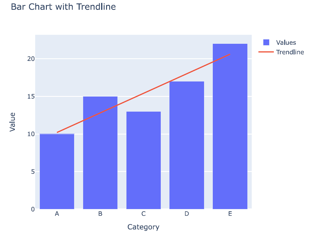 Trendline to the Bar Chart
Customizing the Trendline in a Bar Chart
- Changing Line Style: You can change the line style of the trendline by modifying the
line parameter in the go.Scatter object. The dash attribute allows you to set different line styles such as 'solid', 'dash', 'dot', etc. - Changing Line Width: To change the width of the trendline, you can set the
width attribute in the line dictionary. - Adding Annotations: Annotations can be added to highlight specific points on the chart. Use the add_annotation method to add text annotations.
- Updating Layout: You can update the layout to improve the overall appearance of the chart. This includes setting the title, axis labels, legend title, and applying a template.
Python
# Create customized trendline
trendline = go.Scatter(
    x=df['Category'],
    y=p(x),
    mode='lines',
    name='Trendline',
    line=dict(color='red', dash='dash', width=2)  # Customizations
)

# Add annotation
fig.add_annotation(
    x='C',
    y=p(2),  # Corresponding y-value for category 'C'
    text='Important Point',
    showarrow=True,
    arrowhead=1
)

# Update layout
fig.update_layout(
    title='Bar Chart with Customized Trendline',
    xaxis_title='Category',
    yaxis_title='Value',
    legend_title='Legend',
    template='plotly_dark'  # Apply a dark theme
)
fig.show()
Output:
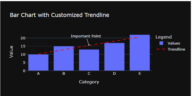 Customizing Trendline in a Bar Chart
In the visualization,
- Line Style: Changed to dashed line.
- Line Color: Set to red.
- Line Width: Increased to 2.
- Annotations: Added an annotation to highlight an important point.
- Layout: Updated the layout with a title, axis labels, legend title, and applied a dark theme.
Conclusion
Adding trendlines to bar charts in Plotly improves the visualization by highlighting data trends and patterns. While Plotly does not directly support trendlines in bar charts, we can achieve this capability by leveraging statistical libraries such as NumPy. This technique can be used on a variety of datasets to increase the clarity and interpretability of visual data representations.
Similar Reads
How to add a horizontal line above a bar chart using ggplot? Adding horizontal lines to a bar chart in ggplot2 is a useful way to highlight specific values such as averages, thresholds, or any other reference lines. This article provides a comprehensive guide on how to add horizontal lines above bar charts in R using ggplot2, along with detailed examples and
4 min read
How to Add Trendline in Excel Chart Add Trendline in Excel Chart - A Trendline is an additional line that indicates the slope (or trend) in a particular data series and is also known as a line of best fit. Trendlines can be helpful when you are analyzing data because they can forecast future values based on your current data. Not all
3 min read
3D Bubble chart using Plotly in Python Plotly is a Python library that is used to design graphs, especially interactive graphs. It can plot various graphs and charts like histogram, barplot, boxplot, spreadplot, and many more. It is mainly used in data analysis as well as financial analysis. plotly is an interactive visualization library
2 min read
How to Set Plotly Chart to Have a Transparent Background in R? Plotly is a powerful and versatile graphing library that allows for interactive and dynamic visualizations. Customizations like changing the chart's background, including setting it to be transparent, can significantly enhance its visual appeal and utility. This article will focus on guiding you thr
5 min read
How to Create Pie Chart Using Plotly in R The pie chart is a circular graphical representation of data that is divided into some slices based on the proportion of it present in the dataset. In R programming this pie chart can be drawn using Plot_ly() function which is present in the Plotly package. In this article, we are going to plot a pi
3 min read