How to Add Auto-Complete Search Box in ReactJS?
Last Updated :
27 May, 2024
An autocomplete search box is a user interface feature that offers suggestions as users type their queries. It enhances the user experience by providing real-time suggestions and help users find what they're looking for more quickly. In this article, we will explore how to implement an autocomplete search box in ReactJS.
We will discuss two approaches to add auto-complete search box in reactjs
Prerequisites:
Steps to Setup ReactJS Application and Installing Required Modules
Step 1: Create a reactJS application by using the below command
npx create-react-app my-app
Step 2: Navigate to the Project folder
cd my-app
Step 3: Install the necessary packages/libraries in your project using the following commands
npm install react-suggest
Project structure:
.png)
The updated dependencies in package.json file will look like:
"dependencies": {
    "@testing-library/jest-dom": "^5.17.0",
    "@testing-library/react": "^13.4.0",
    "@testing-library/user-event": "^13.5.0",
    "react": "^18.3.1",
    "react-autosuggest": "^10.1.0",
    "react-dom": "^18.3.1",
    "react-scripts": "5.0.1",
    "web-vitals": "^2.1.4"
},
Using Basic Filtering
In this approach we maintain a static list of suggestions and filter these suggestions based on the user's input. It uses the useState hook to manage the input value and filtered suggestions. When the user types in the input box, the list of suggestions is filtered in real-time to match the input.
Example: This example utilizes basic filtering to add auto complete search box.
CSS
/* style.css */
* {
    box-sizing: border-box;
  }

  body {
    display: flex;
    justify-content: center;
    align-items: center;
    height: 100vh;
    margin: 0;
    font-family: Arial, sans-serif;
    background-color: #f5f5f5;
  }

  .autocomplete-container {
    position: relative;
    width: 100%;
    max-width: 400px;
    margin: 0 20px;
  }

  .autocomplete-input {
    width: 100%;
    padding: 10px;
    border: 1px solid #ccc;
    border-radius: 5px;
    font-size: 16px;
    outline: none;
  }

  .autocomplete-suggestions {
    position: absolute;
    top: 100%;
    left: 0;
    width: 100%;
    background-color: #fff;
    border: 1px solid #ccc;
    border-top: none;
    border-radius: 0 0 5px 5px;
    box-shadow: 0 2px 4px rgba(0, 0, 0, 0.1);
    list-style: none;
    padding: 0;
    margin: 0;
    z-index: 1000;
  }

  .autocomplete-suggestion {
    padding: 10px;
    cursor: pointer;
    transition: background-color 0.3s;
  }

  .autocomplete-suggestion:hover {
    background-color: #f0f0f0;
  }
// App.js
import React from 'react';
import Autocomplete from './Autocomplete';

const App = () => {
  const suggestions = ['Apple', 'Banana', 'Orange', 'Pineapple', 'Grapes'];

  return (
    <div>
      <h1>Autocomplete Example</h1>
      <Autocomplete suggestions={suggestions} />
    </div>
  );
};

export default App;
// Autocomplete.js
import React, { useState } from 'react';
import './style.css';

const Autocomplete = ({ suggestions }) => {
  const [filteredSuggestions, setFilteredSuggestions] = useState([]);
  const [inputValue, setInputValue] = useState('');

  const handleChange = (event) => {
    const inputValue = event.target.value;
    setInputValue(inputValue);

    // Filter suggestions based on input value
    const filteredSuggestions = suggestions.filter(suggestion =>
      suggestion.toLowerCase().includes(inputValue.toLowerCase())
    );
    setFilteredSuggestions(filteredSuggestions);
  };

  const handleSelect = (value) => {
    setInputValue(value);
    setFilteredSuggestions([]);
  };

  return (
    <div className="autocomplete-container">
      <input
        className="autocomplete-input"
        type="text"
        value={inputValue}
        onChange={handleChange}
        placeholder="Type to search..."
      />
      <ul className="autocomplete-suggestions">
        {filteredSuggestions.map((suggestion, index) => (
          <li key={index} className="autocomplete-suggestion" onClick={() => handleSelect(suggestion)}>
            {suggestion}
          </li>
        ))}
      </ul>
    </div>
  );
};

export default Autocomplete;
Step to Run Application: Run the application using the following command from the root directory of the project
npm start
Output:

Using react-autosuggest library
In this approach we will use a third-party library react-autosuggest. We have to configure the Autocomplete component with essential props like getItemValue, items, renderItem, value, onChange, onSelect, and inputProps.
Example: This example utilizes react-autosuggest library to add auto complete search box.
CSS
/* style.css */
.autocomplete-container {
    position: relative;
  }

  .suggestions-container {
    position: absolute;
    top: 100%;
    left: 0;
    width: 100%;
    background-color: #fff;
    border: 1px solid #ccc;
    border-top: none;
    box-shadow: 0 2px 4px rgba(0, 0, 0, 0.1);
    z-index: 10;
  }

  .suggestion {
    padding: 10px;
    cursor: pointer;
  }

  .suggestion:hover {
    background-color: #f0f0f0;
  }

  .suggestion-highlighted {
    background-color: #f0f0f0;
  }

  .autocomplete-input {
    width: 90%;
    padding: 10px;
    font-size: 16px;
    border: 1px solid #ccc;
  }
// App.js
import React from 'react';
import AutocompleteSearch from './AutocompleteSearch';
const App = () => {
return (
<div>
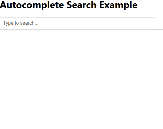
<h1>Autocomplete Search Example</h1>
<AutocompleteSearch />
</div>
);
};
export default App;
// AutocompleteSearch.js
import React, { useState } from 'react';
import Autosuggest from 'react-autosuggest';
import './style.css'; // Import CSS file for custom styling

const AutocompleteSearch = () => {
  const [value, setValue] = useState('');
  const [suggestions, setSuggestions] = useState([]);

  // Mock data for suggestions
  const languages = [
    'React',
    'Angular',
    'Vue.js',
    'Ember.js',
    'Backbone.js',
    'Svelte',
    'Express.js',
    'Meteor.js',
    'Next.js',
    'Nuxt.js'
  ];

  const getSuggestions = (inputValue) => {
    const regex = new RegExp(inputValue.trim(), 'i');
    return languages.filter((language) => regex.test(language));
  };

  const onSuggestionsFetchRequested = ({ value }) => {
    setSuggestions(getSuggestions(value));
  };

  const onSuggestionsClearRequested = () => {
    setSuggestions([]);
  };

  const onChange = (event, { newValue }) => {
    setValue(newValue);
  };

  const getSuggestionValue = (suggestion) => suggestion;

  const renderSuggestion = (suggestion) => <div>{suggestion}</div>;

  const inputProps = {
    placeholder: 'Type to search...',
    value,
    onChange
  };

  // Custom theme for styling
  const theme = {
    container: 'autocomplete-container',
    suggestionsContainer: 'suggestions-container',
    suggestion: 'suggestion',
    suggestionHighlighted: 'suggestion-highlighted',
    input: 'autocomplete-input'
  };

  return (
    <Autosuggest
      suggestions={suggestions}
      onSuggestionsFetchRequested={onSuggestionsFetchRequested}
      onSuggestionsClearRequested={onSuggestionsClearRequested}
      getSuggestionValue={getSuggestionValue}
      renderSuggestion={renderSuggestion}
      inputProps={inputProps}
      theme={theme} // Apply custom theme for styling
    />
  );
};

export default AutocompleteSearch;
Step to Run Application: Run the application using the following command from the root directory of the project
npm start
Output: