How to add a horizontal line above a bar chart using ggplot?
Last Updated :
02 Jul, 2024
Adding horizontal lines to a bar chart in ggplot2 is a useful way to highlight specific values such as averages, thresholds, or any other reference lines. This article provides a comprehensive guide on how to add horizontal lines above bar charts in R using ggplot2, along with detailed examples and explanations.
ggplot2 Basics
ggplot2 is a powerful R package for creating a wide variety of static and interactive graphs. The package is based on the "grammar of graphics," which provides a structured approach to describing and building plots. The basic building blocks of ggplot2 include:
- Data: The dataset used for plotting.
- Aesthetics (aes): Mappings between variables in the data and visual properties such as position, color, size, etc.
- Geometries (geom): The type of plot or chart (e.g., points, lines, bars).
- ggplot(): Initializes the plotting system.
- geom_bar(): Creates a bar chart.
- geom_hline(): Adds a horizontal line to the plot.
- labs(): Adds titles and labels to the plot.
- theme_minimal(): Applies a minimal theme to the plot for a clean appearance.
Now we will discuss step by step How to add a horizontal line above a bar chart using ggplot in R Programming Language.
Step 1: Install and Load Necessary Packages
First, ensure you have ggplot2 installed and then load it:
R
install.packages("ggplot2")
library(ggplot2)
Step 2: Create Sample Data
Let's create a sample dataset for our bar chart:
R
# Sample data
data <- data.frame(
  category = c("A", "B", "C", "D", "E"),
  value = c(10, 15, 8, 12, 7)
)

# Display the data
print(data)
Output:
  category value
1        A    10
2        B    15
3        C     8
4        D    12
5        E     7
Step 3: Basic Bar Chart
We will start by creating a basic bar chart using ggplot2:
R
# Basic bar chart
ggplot(data, aes(x = category, y = value)) +
  geom_bar(stat = "identity") +
  labs(title = "Basic Bar Chart", x = "Category", y = "Value") +
  theme_minimal()
Output:
 How to add a horizontal line above a bar chart using ggplot
Step 4: Adding a Horizontal Line
To add a horizontal line to the bar chart, use the geom_hline() function. Let's add a horizontal line at y = 10:
R
# Bar chart with horizontal line
ggplot(data, aes(x = category, y = value)) +
  geom_bar(stat = "identity") +
  geom_hline(yintercept = 10, color = "red", linetype = "dashed", size = 1) +
  labs(title = "Bar Chart with Horizontal Line", x = "Category", y = "Value") +
  theme_minimal()
Output:
 Add a horizontal line above a bar chart using ggplot
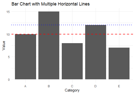
Step 5: Adding Multiple Horizontal Lines
You can also add multiple horizontal lines to indicate different reference points. For example, let's add lines at y = 10 and y = 12:
R
# Bar chart with multiple horizontal lines
ggplot(data, aes(x = category, y = value)) +
  geom_bar(stat = "identity") +
  geom_hline(yintercept = 10, color = "red", linetype = "dashed", size = 1) +
  geom_hline(yintercept = 12, color = "blue", linetype = "dotted", size = 1) +
  labs(title = "Bar Chart with Multiple Horizontal Lines", x = "Category", y = "Value") +
  theme_minimal()
Output:
 Add a horizontal line above a bar chart using ggplot
Step 6: Dynamic Horizontal Line Based on Data
You can add a horizontal line based on a computed value, such as the mean of the value column:
R
# Calculate the mean value
mean_value <- mean(data$value)

# Bar chart with horizontal line at mean value
ggplot(data, aes(x = category, y = value)) +
  geom_bar(stat = "identity") +
  geom_hline(yintercept = mean_value, color = "green", linetype = "solid", size = 1) +
  labs(title = "Bar Chart with Horizontal Line at Mean Value",
       x = "Category", y = "Value") +
  theme_minimal()
Output:
 Add a horizontal line above a bar chart using ggplot
This chart includes a solid green line at the mean value of the value column. This line provides a reference for the average value across all categories.
Conclusion
Adding horizontal lines to a bar chart in ggplot2 is a simple yet powerful way to enhance your visualizations by highlighting specific values or thresholds. By using geom_hline(), you can easily add single or multiple horizontal lines, and even dynamic lines based on computed values. This technique is invaluable for making your plots more informative and easier to interpret.
Similar Reads
How to Add a Horizontal Line in a Chart in Excel?
Excel bar graphs or charts are a great way to graphically represent mathematical data. On top of that, sometimes, the values included in the charts are required to be compared with a target or a base value. Have you ever wondered if there is a way to graphically represent this target value? Well, in
4 min read
How to create horizontal stacked bar chart using ggvis in R?
In this article, we are going to learn how to create a horizontal stacked bar chart using ggvis in R programming language. ggvis package A ggvis package is a tool used for data visualization in R. It is used to create visual interactive graphics tools for data plotting and representation. The packag
3 min read
How to Change the Y-axis Title to Horizontal Using ggplot2 in R
In ggplot2, the default orientation for the y-axis title is vertical. However, in some cases, you may want to rotate the y-axis title to be horizontal to improve the readability or appearance of your plot. This article explains how to change the orientation of the y-axis title to horizontal using gg
3 min read
How to Add Trendline to a Bar Chart Using Plotly
Plotly is a versatile Python library that helps for the development of interactive graphs suitable for publication. Bar charts are one of the most basic ways to display categorical data among the many different kinds of visualizations it allows. Adding trendlines to these charts can improve their cl
4 min read
How to create a faceted line-graph using ggplot2 in R ?
A potent visualization tool that enables us to investigate the relationship between two variables at various levels of a third-category variable is the faceted line graph. The ggplot2 tool in R offers a simple and versatile method for making faceted line graphs. This visual depiction improves our co
6 min read
How to Draw a Horizontal Barplot in R
A barplot is a representation of data in form of the bar the height of bar represents the number of values. In this article, we will discuss How to Draw a Horizontal Barplot in R programming language. R language supports two ways to plot a bar plot, and we will discuss how this can be modified to b
2 min read
How to highlight text inside a plot created by ggplot2 using a box in R?
In this article, we will discuss how to highlight text inside a plot created by ggplot2 using a box in R programming language. There are many ways to do this, but we will be focusing on one of the ways. We will be using the geom_label function present in the ggplot2 package in R. This function allo
3 min read
How to Create Grouped Line Chart Using ggplot and plotly in R
Creating grouped line charts in R allows you to visualize multiple trends or series in the same plot. By using the combination of ggplot2 plotting and plotly for interactivity, you can create rich, dynamic visualizations that let you explore your data in depth. In this article, we will explore how t
4 min read
How to Add a Diagonal Line to a Plot Using R
Creating plots is a fundamental aspect of data visualization in R Programing Language. Sometimes, it's useful to add reference lines, such as diagonal lines, to the plots for better interpretation of the data. Here, we will explore how to add a diagonal line to a plot using R. Importance of Diagonal
3 min read
Add Vertical and Horizontal Lines to ggplot2 Plot in R
In this article, we will see how to add Vertical and Horizontal lines to the plot using ggplot2 in R Programming Language. Adding Vertical Line To R Plot using geom_vline() For adding the Vertical line to the R plot, geom_vline() draws a vertical line at a specified position. Syntax: geom_vline(xint
4 min read