Data Visualization using Turicreate in Python
Last Updated :
23 May, 2024
In Machine Learning, Data Visualization is a very important phase. In order to correctly understand the behavior and features of your data one needs to visualize it perfectly. So here I am with my post on how to efficiently and at the same time easily visualize your data to extract most out of it.
Before going in detail about how to visualize data first understand some terminologies.
- Turicreate - Turi Create is an open-source toolset for creating Core ML models, for tasks such as image classification, object detection, style transfers, recommendations, and more. Learn how you can use Turi Create to build models for your apps.
- SFrame - SFrame means scalable data frame. A tabular, column-mutable dataframe object that can scale to big data. The data in SFrame is stored column-wise.
- Sarray - Each column in an SFrame is termed as Sarray.
Why Turicreate? : By this time you all should be guessing that why am I choosing turicreate for data visualization when there is Pandas which is very much ease to use. So I will highlight some points in which turicreate is better than pandas :
- Pandas is an in-memory data structure. This means you can usually not store data frames bigger than the main memory (eg. RAM) on your machine whereas SFrame is an out-of-core data structure. This means you can virtually store any size dataframe as long as you do not run out of both disk space(eg. Hard Drives) and memory(eg. RAM).
- In turicreate you can make use of the built-in visualization feature to visualize your data but in case of pandas you need to use other tools for data visualization(such as matplotlib, seaborn, etc).
So let's get started with the actual content :
Before visualizing the data we first need to install the required libraries :
pip install turicreate
So, we now have our complete setup. So let's get started by importing the dataset.
python3
# importing turicreate
import turicreate

# loading the dataset
training_data = turicreate.SFrame.read_csv("Url of the dataset").

# print the first 10 rows of your training data set
training_data.head()
 Output
Now comes the data visualization part :
Bar Plot :
python3
# for data plotting
training_data['OverallCond'].plot(title = "Overall Condition of the house",
                                  xlabel = "Rating",
                                  ylabel = "No. of Houses")
Output :
 Output for Bar Plot
Scatter Plot :
python3
Output for Bar Plot
Scatter Plot :
python3
# for scatter plot
turicreate.visualization.scatter(training_data["OverallCond"],
                                 training_data["SalePrice"],
                                 xlabel = "Overall Condition",
                                 ylabel = "Sale Price")
Output :
 Output for Scatter Plot
Heatmap :
python3
Output for Scatter Plot
Heatmap :
python3
# for heatmap
turicreate.visualization.heatmap(training_data["OverallCond"],
                                 training_data["SalePrice"],
                                 xlabel = "Overall Condition",
                                 ylabel = "Sale Price")
Output :
 Output for Heatmap
Categorical Heatmap :
python3
Output for Heatmap
Categorical Heatmap :
python3
# for categorical heatmap
turicreate.visualization.categorical_heatmap(training_data["Street"],
                                             training_data["LotShape"],
                                             xlabel = "Street",
                                             ylabel = "Lot Shape")
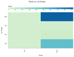 Output for Categorical Heatmap
Box Plot :
python3
Output for Categorical Heatmap
Box Plot :
python3
# for box plot
turicreate.visualization.box_plot(training_data["Street"],
                                  training_data["SalePrice"],
                                  xlabel = "Street",
                                  ylabel = "Sale Price")
Output :
 Output for Box Plot
Histogram :
python3
Output for Box Plot
Histogram :
python3
# for histogram
turicreate.visualization.histogram(training_data["SalePrice"],
                                   xlabel ="Sale Price")
Output :
 Output for Histogram
Similar Reads
Data Visualization in jupyter notebook In this article, we will learn how to visualize data in Jupyter Notebook there are different libraries available in Python for data visualization like Matplotlib, seaborn, Plotly, GGPlot, Bokeh, etc. But in this article, we will use different libraries like Matplotlib, searborn, and Plotly which are
7 min read
Data Visualization with Python In today's world, a lot of data is being generated on a daily basis. And sometimes to analyze this data for certain trends, patterns may become difficult if the data is in its raw format. To overcome this data visualization comes into play. Data visualization provides a good, organized pictorial rep
14 min read
Text Analysis Using Turicreate What is Text Analysis? Text is a group of words or sentences.Text analysis is analyzing the text and then extracting information with the help of text.Text data is one of the biggest factor that can make a company big or small.For example On E-Commerce website people buy things .With Text Analysis t
3 min read
Learn Data Science Tutorial With Python Data Science has become one of the fastest-growing fields in recent years, helping organizations to make informed decisions, solve problems and understand human behavior. As the volume of data grows so does the demand for skilled data scientists. The most common languages used for data science are P
3 min read
Data analysis and Visualization with Python Python is widely used as a data analysis language due to its robust libraries and tools for managing data. Among these libraries is Pandas, which makes data exploration, manipulation, and analysis easier. we will use Pandas to analyse a dataset called Country-data.csv from Kaggle. While working with
4 min read