Excel is one of the most powerful tools for data analysis, allowing you to process, manipulate, and visualize large datasets efficiently. Whether you're analyzing sales figures, financial reports, or any other type of data, knowing how to perform data analysis in Excel can help you make informed decisions quickly. In this guide, we will walk you through the essential steps to analyze data in Excel, including using built-in tools like pivot tables, charts, and formulas to extract meaningful insights. By the end of this article, you’ll have a solid understanding of how to use Excel for data analysis and improve your decision-making process.
Preparing Data for Analysis
Data cleaning becomes an intuitive process with Excel's capabilities, allowing users to identify and rectify issues like missing values and duplicates. PivotTables, a hallmark feature, empower users to swiftly summarize and explore large datasets, providing dynamic insights through customizable cross-tabulations, making Data Analysis Excel an essential skill for professionals.
Preparing Your Dataset
Before getting into analysis, it’s essential to clean and organize your dataset to ensure accuracy.
How to Clean Data in Excel
- Remove Duplicates: Use Data > Remove Duplicates to eliminate redundancy.
- Use TRIM and CLEAN Functions:
TRIM removes unnecessary spaces.CLEAN removes non-printable characters.
- Sort and Structure Data: Convert your dataset into an Excel Table (Insert > Table) for better organization.
Basic Methods of Data Analysis in Excel
Excel offers several methods to analyze data effectively. Here are some key techniques:
1. Charts and Visualization
Any set of information may be graphically represented in a chart. A chart is a graphic representation of data that employs symbols to represent the data, such as bars in a bar chart or lines in a line chart. Data Analysis Excel offers several different chart types available for you to choose from, or you can use the Excel Recommended Charts option to look at charts specifically made for your data and choose one of those.
Charts make it easier to identify trends and relationships in your data:
- Select your dataset and go to Insert > Charts.
- Choose from bar charts, line charts, or pie charts.
- Customize the chart for clarity and impact.

Preview Chart
 Bar Graph
Patterns and trends in your data may be highlighted with the help of conditional formatting. To use it in Data Analysis Excel, write rules that determine the format of cells based on their values. In Excel for Windows, conditional formatting can be applied to a set of cells, an Excel table, and even a PivotTable report. To execute conditional formatting, follow the below steps:
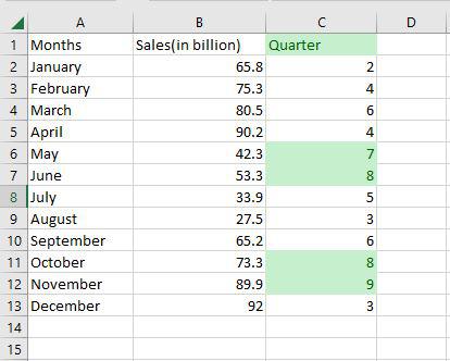
Select any column from the table. Here we are going to select a Quarter column. After that go to the home tab on the top of the ribbon and then in the styles group select conditional formatting and then in the highlight cells rule select Greater than an option.

Then a greater than dialog box appears. Here first write the quarter value and then select the color.

Step 2: Preview Result
As you can see in the excel table Quarter column change the color of the values that are greater than 6.
3. Sorting Data
Data analysis Excel requires sorting the data. A list of names may be arranged alphabetically, a list of sales numbers can be arranged from highest to lowest, or rows can be sorted by colors or icons. Sorting data makes it easier to immediately view and comprehend your data, organize and locate the facts you need, and ultimately help you make better decisions. Both columns and rows can be used to sort. You'll utilize column sorts for the majority of your sorting. By text, numbers, dates, and times, a custom list, format, including cell color, font color, or icon set, you may sort data in one or more columns.
- Single Column: Sort data alphabetically or numerically using Data > Sort.
- Multiple Columns: Perform multi-level sorting by adding criteria in the sort dialog box.
Step 1: Select Data > Data Tab> Sort
Select any column from the table. Here we are going to select a Months column. After that go to the data tab on the top of the ribbon and then in the sort and filters group select sort.

Step 2: Select the Order
Then a sort dialog box appears. Here first select the column, then select sort on, and then Order. After that click OK.

Step 3: Preview Results
Now as you can see the months column is now arranged alphabetically.

4. Filtering Data
You may use filtering to pull information from a given Range or table that satisfies the specified criteria in data analysis excel. This is a fast method of just showing the data you require. Data in a Range, table, or PivotTable may be filtered. You may use Selected Values to filter data. You may adjust your filtering options in the Custom AutoFilter dialogue box that displays when you click a Filter option or the Custom Filter link that is located at the end of the list of Filter options.
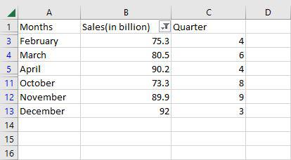
Step 1: Select your dataset and go to Data > Filter
Select any column from the table. Here we are going to select a Sales column. After that go to the data tab on the top of the ribbon and then in the sort and filters group select filter.

Step 2: Select the Filter Option
The values in the sales column are then shown in a drop-down box. Here we are going to select a number of filters and then greater than.

Step 3: Select the Options
Then a custom auto filler dialog box appears. Here we are going to apply sales greater than 70 and then click OK.

Step 4: Preview Results
Now as you can see only the rows greater than 70 are shown.
Excel offers several advanced tools to make data analysis more efficient and powerful. Here are some key tools you can use:
1. Power Query
- Automates data preparation by importing, transforming, and combining data from multiple sources.
- Example: Clean and merge datasets to create a unified report.
- Provides advanced statistical analysis tools like regression and ANOVA.
- Example: Use regression to identify relationships between variables or ANOVA to analyze variance across groups.
3. Solver
- Optimizes complex problems by finding the best solution based on constraints.
- Example: Minimize inventory costs while meeting demand by adjusting stock levels.
These tools help enhance Excel's capabilities for advanced data analysis, making it suitable for more sophisticated tasks.
Essential Excel Functions for Data Analysis
Excel’s built-in functions allow for quick calculations and summaries:
=LEN quickly returns the character count in a given cell. The =LEN formula may be used to calculate the number of characters needed in a cell to distinguish between two different kinds of product Stock Keeping Units, as seen in the example above. When trying to discern between different Unique Identifiers, which might occasionally be lengthy and out of order, LEN is very crucial.
=LEN(Select Cell)
Step 1: Use the LENGTH Function
To find the length of the text in cell A2, use the LENGTH function. This function calculates the number of characters in the given cell.

Step 2: View the Length of Cell A2
Once you apply the LENGTH function, it will display the number of characters present in cell A2.

=TRIM function will remove all spaces from a cell, with the exception of single spaces between words. The most frequent application of this function is to get rid of trailing spaces. When content is copied verbatim from another source or when users insert spaces at the end of the text, this is normal.
=TRIM(Select Cell)
Step 1: Use the TRIM Function
To remove all spaces from cell A2, apply the TRIM function.

Step 2: Observe the Result
After using the TRIM function, all extra spaces will be removed from the text in cell A2.

The Excel Text function "UPPER Function" will change the text to all capital letters (UPPERCASE). As a result, the function changes all of the characters in a text string input to upper case.
=UPPER(Text)
Text (mandatory parameter): This is the text that we wish to change to uppercase. Text can relate to a cell or be a text string.
Step 1: Use the UPPER Function
To convert the text in cell A2 to uppercase, use the UPPER function. This function transforms all lowercase letters into uppercase.
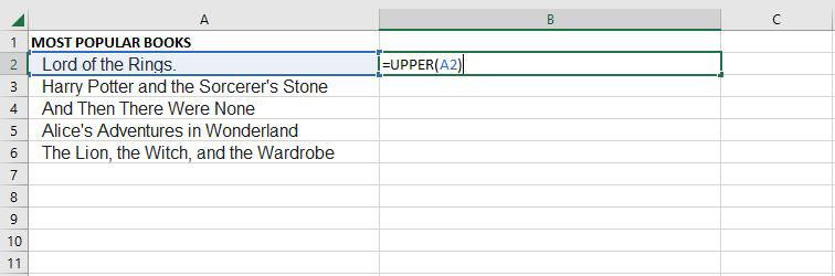
Step 2: View the Converted Text
After applying the UPPER function, the text in cell A2 will be converted to uppercase.

PROPER
Under Excel Text functions, the PROPER Function is listed. Any subsequent letters of text that come after a character other than a letter will also be capitalized by PROPER.
=PROPER(Text)
Text (mandatory parameter): A formula that returns text, a cell reference, or text in quote marks must surround the text you wish to partly capitalize.
Step 1: Use the PROPER Function
To convert the text in cell A2 to proper case (where the first letter of each word is capitalized), use the PROPER function.

Step 2: View the Converted Text
After applying the PROPER function, the text in cell A2 will be formatted with proper case, capitalizing the first letter of each word.

The PROPER function changes the initial letter of every word, letters that follow digits, and other punctuation to uppercase. It could be where we least expect it. The characters for numbers and punctuation remain unaffected.
Excel has a built-in function called COUNTIF that counts the given cells. The COUNTIF function can be used in both straightforward and sophisticated applications in data analysis excel. The fundamental application of counting particular numbers and words is covered in this.
=COUNTIF(range,criteria)
- Range: The size of the cell range to count.
- Criteria: The standards by which cells are selected for counting.
Step 1: Use the COUNTIF Function on the Range B2:B20
To count the number of regions of each type, apply the COUNTIF function to the range B2:B20.

Step 2: Count the Different Regions in the Range F5:F9
Next, use the COUNTIF function on the range F5:F9 to count the different types of regions.

Step 3: Verify the Count for Each Region
As you can see, the COUNTIF function has correctly enumerated the number of regions, such as the 4 East Regions, as expected.

An Excel built-in function called AVERAGEIF determines the average of a range depending on a true or false condition.
=AVERAGEIF(range, criteria, [average_range])
- Range: The size of the cell range to count.
- Criteria: The standards by which cells are selected for counting.
- Average Range: The range in which the function computes the average is known as the average range. But the average range is not required.
Step 1: Use the AVERAGEIF Function on the Range B2:B10
To calculate the average speed of vehicles, apply the AVERAGEIF function on the range B2:B10.

Step 2: Use the AVERAGEIF Function on the Range H4:H7
Next, use the AVERAGEIF function on the range H4:H7 to find the average for the vehicles listed in that range.

Step 3: Verify the Average Calculation
As you can see, the AVERAGEIF function has correctly calculated the average speed of the vehicles, such as the 62.333 average for cars.

A built-in Excel function called SUMIF determines if a condition is true or false before adding the values in a range.
=SUMIF(range, criteria, [sum_range])
- Range: The size of the cell range to count.
- Criteria: The standards by which cells are selected for counting.
- Sum Range: The range that the function uses to calculate the total is known as the sum range.
Step 1: Use the SUMIF Function on the Range B2:B10
To calculate the sum of the vehicle's speed, apply the SUMIF function on the range B2:B10.

Step 2: Use the SUMIF Function on the Range H4:H7
Next, use the SUMIF function on the range H4:H7 to find the sum of the vehicle speeds listed in that range.

Step 3: Verify the Sum Calculation
As you can see, the SUMIF function has correctly calculated the total speed, such as the 187 sum for cars.

VLOOKUP is a built-in Excel function that permits searching across several columns.
=VLOOKUP(lookup_value, table_array, col_index_num, [range_lookup])
- Lookup_value: Choose the cell that will be used to input the search criteria.
- Table_array: The whole table range, which includes each and every cell.
- Col_index_num: The information being searched for. The column's number, starting from the left, is the input.
- Range_lookup: FALSE if text (0), TRUE if numbers (1).
Step 1: Use the VLOOKUP Function to Locate Festival Names
To locate the festival names based on their search ID, use the VLOOKUP function. The festival names will be determined by their corresponding search ID.
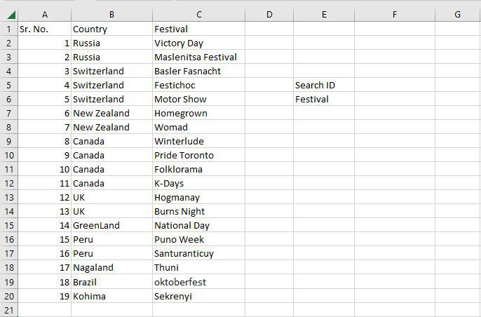
Step 2: Set Up the VLOOKUP Function
In cell F5, enter the search query (lookup value). The table array range is A2:C20, with the col index number set to 3 (since the information is in the third column from the left). Set the range lookup to 0 (False) to ensure an exact match.

Step 3: Handle the #N/A Value
If the lookup value in F5 does not exist in the table, the VLOOKUP function will return a #N/A value, indicating that no match was found.

Step 4: Locate the Festival Using VLOOKUP
The VLOOKUP function successfully identifies the Homegrown Festival with Search ID 6.

In order to create the required report, a pivot table is a statistics tool that condenses and reorganizes specific columns and rows of data in a spreadsheet or database table. The utility simply "pivots" or rotates the data to examine it from various angles rather than altering the spreadsheet or database itself.
Step 1: Select a Cell and Create a Pivot Table
Select any cell in your worksheet, go to the Home tab, and click on "Pivot Table."

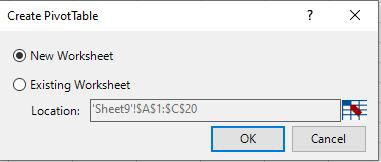
Step 2: Choose the Pivot Table Location
In the Create Pivot Table dialog box, select "New Worksheet" and then click OK.
Step 3: View the Created Pivot Table
You will now see a new worksheet with a blank Pivot Table created.

Step 4: Add Fields to the Pivot Table
Drag the "Country" field to the Row area and the "Days" field to the Value area.

Step 5: View the Complete Pivot Table
The pivot table will now display the data with "Country" and "Days" fields arranged accordingly.

Conclusion
Now that you know how to perform data analysis in Excel, you can confidently apply the techniques discussed to analyze and visualize your data. Whether you're using pivot tables, advanced formulas, or data visualization tools like charts, Excel provides a wide range of features to help you uncover valuable insights. By mastering data analysis in Excel, you’ll be able to optimize your workflow and make data-driven decisions that can lead to better outcomes in your projects or business endeavors.
Similar Reads
How to Create a Graph in Excel: A Step-by-Step Guide for Beginners Anyone who wants to quickly make observations and represent them graphically should know how to create graphs with Excel. Whether it is the preparation of business analysis papers, academic research documents or financial reports among other things, learning how to make graphs in Excel can significa
8 min read
How to Perform an ANCOVA Test in Excel? When a third variable (referred to as the covariate) is present that can be measured but not controlled and has a clear impact on the variable of interest, analysis of covariance (ANCOVA) is a technique used to compare data sets that contain two variables (treatment and effect, with the effect varia
4 min read
15 Data Analysis Examples for Beginners in 2024 Data analysis is a multifaceted process that involves inspecting, cleaning, transforming, and modeling data to uncover valuable insights. It encompasses a wide array of techniques and methodologies, enabling organizations to interpret complex data structures and extract meaningful patterns. Data Ana
9 min read
Top Excel Data Analysis Functions Have you ever analyzed any data? What does it mean? Well, analyzing any kind of data means interpreting, collecting, transforming, cleaning, and visualizing data to discover valuable insights that drive smarter and more effective decisions related to business or anywhere you need it. So, Excel solve
6 min read
How to Evaluate Google Analytics Data in Excel? Google Analytics tracks website traffic and provides useful data for website design, content, and marketing decisions. Analyzing and visualizing this data can be difficult. We can use Excel for analyzing and visualizing Google Analytics data. In this article, we will learn how to evaluate google ana
3 min read