Create GeeksforGeeks logo using HTML and CSS
Last Updated :
06 Nov, 2025
Designing a logo using HTML and CSS allows developers to create scalable, customizable, and lightweight graphical elements directly in the browser without relying on images. In this tutorial, we’ll learn how to design the GeeksforGeeks (GFG) logo using only HTML and CSS.
Steps to create a Logo
Follow these steps to build the GeeksforGeeks logo structure and style it using CSS.
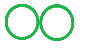
Step 1: Create the Basic Structure
- To create the GFG logo, use two inline divs for circles, wrapped in a flex-display wrapper div.
- Apply a 10px solid green border for the outline.
Step 2: Add Triangles Using Pseudo-Elements
- Now create a triangle on both the circles using the pseudo-element: "after" and absolute position property.
- After applying the triangle we will get the shape like this.

After applying the white background color into the triangles the result is:

Step 3: Add a Square Between Circles
- Now using the pseudo-element :before and position absolute property, create a square.
- You can apply this rule to any of the circles. The resulting logo looks like this:

[Approach]:
- Create two divs having classes named circle1 and circle2, and wrap them into a parent div having the class named wrapper.
- Now assign the CSS property to the wrapper class and style both the circles
- Add the invisible triangles into both the circles using pseudo-element :after
- Now add square onto the logo using before pseudo-element (we are not using after (pseudo-element) because we already used it for creating triangle).
HTML
<!DOCTYPE html>
<html>

<head>
    <style>
        .wrapper {
            display: flex
        }

        #circle {
            height: 100px;
            width: 100px;
            border: 20px solid green;
            border-radius: 100px;
            position: relative;
        }

        #circle:after {
            content: "";
            position: absolute;
            border-top: 100px solid transparent;
            top: -35px;
        }

        .circle1:after {
            border-left: 140px solid #EFEFEF;
            left: -50px;
            top: -35px;
        }

        .circle2:after {
            border-right: 140px solid #EFEFEF;
            right: -50px;
        }

        .circle1:before {
            content: "";
            height: 20px;
            width: 276px;
            position: absolute;
            background: green;
            left: -18px;
            top: 45px;
            z-index: 1;
        }
    </style>
</head>

<body>
    <div class="wrapper">
        <div id="circle" class="circle1"></div>
        <div id="circle" class="circle2"></div>
    </div>
</body>

</html>
Output:
