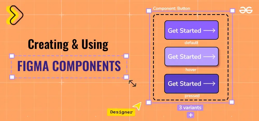
Creating and Using Figma Components
Last Updated :
10 Jul, 2024
Creating and using Figma components makes your design process faster and more organized. Components are reusable design elements, like buttons or icons, that you can use across your project. In this article, we’ll show you how to create and use Figma components to keep your designs consistent and efficient.
 Components in Figma
What are Components in Figma?
Components in Figma are reusable design elements, such as buttons, icons, or forms, that you can use throughout your project. They help keep your design consistent by ensuring that these elements look and behave the same way everywhere they are used. When you update a component, all instances of that component across your design automatically update as well, saving you time and effort. Components make it easier to maintain and scale your designs efficiently.
How to Create Components?
1. Creating component
Step 1: Create a button with some background color & text "Click me" along with an icon placed beside the text.
.png) Button element
Button elementStep 2: Now right click the button and view the options & select Create component, or simply click Ctrl + Alt + K.
.png) Create component
Create componentStep 3: A four dots symbol appears beside the element that has been converted into a component like this:
.png) Button component
Button component2. Creating multiple components
Step 1: Firstly create a set of elements and select all of them together. Click on the triangular symbol at the top and choose one of the options: Create multiple components OR Create component set.
.png) Options
Options Step 2: Create multiple components leads to each of the element being converted to a single component.
.png) Multiple components
Multiple componentsStep 3: Create a component set leads to grouping of several components into a variant set of a number of variants used to depict those elements with similar features.
.png) Component set
Component set3. Creating variants from components
Step 1: Add a button element in the design frame.
Button elementStep 2: Convert the element into a component.
ComponentStep 3: Select variant from the top column and create a variant of the component.
.png) Variant creation
Variant creationStep 4: Two variants will thus be created: Default & Variant 2.
.png) Variants
Variants4. Applying component properties
a. Show Icon property (Boolean property)
Step 1: Create a button & convert it to a component.
-5.png) Button component
Button componentStep 2: Choose the plus button beside the properties tab where several component properties options are displayed and add the property name "Show Icon" and change the value to true.
.png) Component Property
Component PropertyStep 3: Create an instance of the component from the assets tab.
.png) Button Instance
Button InstanceStep 4: Now for the instance, you can toggle over the "Show Icon" property button to add icon or remove the icon & display only the text.
.png) Toggle Button of Show icon
Toggle Button of Show iconb. Change Icon property (Swap Instance property)
Step 1: Add several icons in the design file, convert each icon to a component and then create it's variant. Do it somewhat like this:
.png) Variants of Icons
Variants of IconsStep 2: For the button, add one of the above icon variants at the place of icon. Set the button to auto layout and adjust the padding & margin. The tab at the left should look like this:
.png) Variant Icon
Variant IconStep 3: Now go to the button component element, and for the component property select Swap Instance property.
.png) Swap Instance Property
Swap Instance PropertyStep 4: Set the name of property to "Change Icon" and set the values to different icons lying in the design file.
.png) Swap Instance Property
Swap Instance PropertyStep 5: Create an instance of the button component using the assets tab.
.png) Instance
InstanceStep 6: For the instance, the property would appear like this and now you can change the name of the icon to get the desired results, without having to copy paste the icon every time.
.png) Component property
Component property5. Applying prototypes
Step 1: Click on the Prototype tab for the button component.
00.png) Prototype tab
Prototype tabStep 2: Draw the arrow from plus sign from the button 1 to variant of the default button with a different icon. Select different animations, time duration & hover effect.
.png) Animation type
Animation typeStep 3: Open presentation mode and view the animation that has been formed using the help of components that would look somewhat like this:
 Component animation
Properties
1. Components are of two types:
- Main Component: It is the default element that is converted into a component. We can do so by using the shortcut Ctrl + Alt + K.
- Instance: Instance is a copy of the component that is found in the Assets tab so that the updates or the properties of the main component can be used.
2. The name of component can be used as a shorthand to directly convert the component name into it's component properties and values. For eg. componentName / hover (state) / true.
3. Instances of the components are created to use the component all over the design file. Individually changing the design of each button and creating a new button every time is not possible, hence we use instances.
4. A component consists of Three major properties:
- Instance Swap Property: It allows to effectively swap icons, or text according to the listed options. Say for example, we have a button with house icon. We can add instance swap property to it with other icons such as heart, diamond, smiley etc. This would allow us when creating an instance of the button, to change the icons in one click.
- Boolean Property: It holds two values, true & false. When applied it shows a toggle button to hover over it. Say for example, a button must consist of an icon or not. If we set the boolean property to "hasIcon" and set it to true, then creating an instance of it and setting the value of "hasIcon" to false would remove the icon in the instance button.
- Variant Property: It allows creation of different sections of similar properties. Like we can create 3 types of variants for a button, one for pressed state, one for disabled and the other one for hover state. And then we can individually change their properties and values.
Importance of Components
- Components allow reusability of code and increase efficiency. It is not possible to copy paste every time. Simply changing the state of the instance would do the good.
- Components & their instances are easy to implement and require no complex designing or calculations. It just requires toggling or changing the properties.
- Components help in customization. They allow an easy access to customize every button, such as adding Icon or removing icon from the instance.
- They allow prototyping & testing. Each component can have a new possible type of prototype or animation.
Conclusion
Figma components are a great way to save time & efficiency, and bring about the best in less time. They help in reusing previous designs without having to update much of it and simply toggle the properties of the existing element in the right hand side tab. They are a great way to save time & efforts. Using the above screenshots and examples, one can try out forming new components and use them in their design later.