Comprehensive Guide to Scatter Plot using ggplot2 in R
Last Updated : 23 Jul, 2025
Scatter plot uses dots to represent values for two different numeric variables and is used to observe relationships between those variables. To plot the Scatter plot we will use we will be using the geom_point() function. This function is available in ggplot2 package which is a free and open-source visualization package widely used in R.
This package can be installed using the R function install. packages(). We can use below command to download it.
R
install.packages("ggplot2")
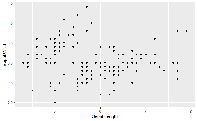
For example: We are using the ggplot2 library to create a scatter plot of the Sepal.Length vs. Sepal.Width from the iris dataset.
Here we will use distinguish the values by a group of data ( factor level data). aes() function controls the color of the group and it should be factor variable.
Syntax:
aes(color = factor(variable))
We are creating a scatter plot of Sepal.Length vs. Sepal.Width from the iris dataset and using the geom_point() function to color the points based on different values of Sepal.Width, treating it as a factor.
Here we use aes() methods color attributes to change the color of the data points with specific variables. We are creating a scatter plot to color the points based on the Species variable.
3. Changing Shape of Data points in a Scatter plot
To change the shape of the data points we will use shape attributes with aes() methods. We are creating a scatter plot to differentiate points by both shape and color based on the Species variable.
To change the aesthetic or data points we will use size attributes in aes() methods. Here, we are creating a scatter plot to set the size of all points to a constant value of 0.5.
To deploy the labels on the data point we will use label into the geom_text() methods. Like in this example, we are creating a scatter plot and customizing the colors of the points based on the Species variable with a manual color palette. Labels are added to the points with geom_text() and the plot is further customized with titles, axis labels and a minimal theme. The legend is positioned to the right.
R
library(ggplot2)color_palette<-c("blue","green","red")ggplot(iris,aes(x=Sepal.Length,y=Sepal.Width,color=Species))+geom_point(size=3)+geom_text(aes(label=Species),position=position_nudge(x=0.05,y=0.05),size=3,show.legend=FALSE)+scale_color_manual(values=color_palette)+theme_minimal()+ggtitle("Sepal Length vs. Sepal Width")+xlab("Sepal Length")+ylab("Sepal Width")+theme(legend.position="right")
Output:
Basic Scatterplot with ggplot2 in R
Regression lines in Scatter plot with ggplot2 in R
Regression models a target prediction value supported independent variables and mostly used for finding out the relationship between variables and forecasting. In R we can use the stat_smooth() function to smoothen the visualization.
Example: We are creating a scatter plot of Sepal.Length vs. Sepal.Width from the iris dataset and adding a linear regression line using stat_smooth() with the lm method to show the best-fit line.
method: It is the smoothing method (function) to use for smoothing the line
formula: It is the formula to use in the smoothing function
geom: It is the geometric object to use display the data
1. Using stat_mooth with LOESS mode in a Scatter plot
We are creating a scatter plot and adding a smoothing line using stat_smooth() which automatically selects the smoothing method (default is LOESS) to fit the data.
method: It is the smoothing method (function) to use for smoothing the line
formula: It is the formula to use in the smoothing function
Example: We are creating a scatter plot and adding a smoothing line using geom_smooth() which automatically selects the smoothing method (default is LOESS) to fit the data.
In order to show the regression line on the graphical medium with help of geom_smooth() function, we pass the method as “loess” and the formula used as y ~ x.
2. Intercept and slope in a Scatter plot
We are creating a scatter plot and adding a customized straight line with a specified intercept of 37, slope of -5, in red color, dashed linetype, and size 1.5 using geom_smooth().
3. Change the point color, shape and size manually
The scale_fill_manual, scale_size_manual, scale_shape_manual, scale_linetype_manual are builtin types which is assign desired colors to categorical data we use one of them scale_color_manual() function which is used to scale (map).
Syntax :
scale_shape_manualValue) for point shapes
scale_color_manual(Value) for point colors
scale_size_manual(Value) for point sizes
Parameter :
values : A set of aesthetic values to map the data. Here we take desired set of colors.
Example: We are creating a scatter plot and coloring the points based on the Species variable. A linear regression line is added using geom_smooth() with no confidence interval (se=FALSE) and extended across the full range. Custom shapes and colors are applied to the points and the legend is positioned at the top.
4. Marginal rugs to a Scatter plot with ggplot2 in R
To add marginal rugs to the scatter plot we will use geom_rug() methods. We are creating a scatter plot and adding marginal rugs using geom_rug() to show the distribution of values along the x and y axes.
To create density estimation in scatter plot we will use geom_density_2d() methods and geom_density_2d_filled() from ggplot2.
Example: We are creating a scatter plot and adding a 2D density contour plot using geom_density_2d() to visualize the density of data points in the plot.
1. Adding aesthetics to the 2-D density estimations
We are creating a scatter plot and adding a semi-transparent 2D density contour plot using geom_density_2d(alpha = 0.5) and filling the contours with colors using geom_density_2d_filled() to visualize the data density in the plot.
To add a circle or ellipse around a cluster of data points, we use the stat_ellipse() function. This function automatically computes the circle/ellipse radius to draw around the cluster of points by categorical data. Like in this example, we are creating a scatter plot and adding ellipses using stat_ellipse() to show the confidence region or distribution of data points for each group in the dataset.