Combine bar and line chart in ggplot2 in R
Last Updated :
24 Jun, 2021
Sometimes while dealing with hierarchical data we need to combine two or more various chart types into a single chart for better visualization and analysis. These are known as “Combination charts”. In this article, we are going to see how to combine a bar chart and a line chart in R Programming Language using ggplot2.
Dataset in use: Courses Sold vs Students Enrolled
| Year | Courses Sold | Percentage Of Students Enrolled |
|---|
| 2014 | 35 | 30% |
| 2015 | 30 | 25% |
| 2016 | 40 | 30% |
| 2017 | 25 | 50% |
| 2018 | 30 | 40% |
| 2019 | 35 | 20% |
| 2020 | 65 | 60% |
In order to plot a bar plot in R, we use the function geom_bar( ).
Syntax:
geom_bar(stat, fill, color, width)
Parameters :
- stat : Set the stat parameter to identify the mode.
- fill : Represents color inside the bars.
- color : Represents color of outlines of the bars.
- width : Represents width of the bars.
Also, the line plot is plotted using the function geom_line( ).
Syntax:
geom_line(mapping=NULL, data=NULL, stat=”identity”, position=”identity”,…)
Example:
R
# Entering data
year <- c(2014, 2015, 2016, 2017, 2018, 2019,2020)
course <- c(35, 30, 40, 25, 30, 35, 65)
penroll <- c(0.3, 0.25, 0.3, 0.5, 0.4, 0.2, 0.6)

# Creating Data Frame
perf <- data.frame(year, course, penroll)
head(perf)

# Plotting Multiple Charts
library(ggplot2)

ggplot(perf)  +
  geom_bar(aes(x=year, y=course),stat="identity", fill="cyan",colour="#006000")+
  geom_line(aes(x=year, y=penroll),stat="identity",color="red")+
  labs(title= "Courses vs Students Enrolled in GeeksforGeeks",
       x="Year",y="Number of Courses Sold")
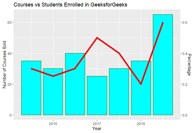
Output:

In the above plot, we can observe that the bar plot is in proper shape as expected, but the line plot is merely visible. It happens due to the scaling factor since the line plot is for the percentage of students which is in decimal and the current vertical axis having very large values. So, we need a secondary axis in order to fit the line properly in the same chart area.
As scaling comes into the picture, we have to use the R function scale_y_continuous( ) which comes in the ggplot2 package. Also, another function sec_axis( ) is used to add a secondary axis and assign the specifications to it.
Syntax:
sec_axis(trans,name,breaks,labels,guide)
Parameters :
- trans : A formula or function needed to transform.
- name : The name of the secondary axis.
Since we are dealing with a secondary Y-axis, so we need to write the command inside scale_y_continuous( ).
Syntax:
scale_y_continuous(name,labels,position,sec.axis,limits,breaks)
The scaling factor is the trickiest part to handle while dealing with a secondary axis. Since the secondary axis needs to be in percentage we have to use the scale factor of 0.01 and write the formula of conversion in the trans argument of sec_axis( ). And you are scaling with 0.01 in the formula, you also have to multiply the same axis with 100 in the geom_line( ) in order to make balance in scaling.
Example:
R
# Entering data
year <- c(2014, 2015, 2016, 2017, 2018, 2019,2020)
course <- c(35, 30, 40, 25, 30, 35, 65)
penroll <- c(0.3, 0.25, 0.3, 0.5, 0.4, 0.2, 0.6)

# Creating Data Frame
perf <- data.frame(year, course, penroll)

# Plotting Charts and adding a secondary axis
library(ggplot2)
ggp <- ggplot(perf)  +
  geom_bar(aes(x=year, y=course),stat="identity", fill="cyan",colour="#006000")+
  geom_line(aes(x=year, y=100*penroll),stat="identity",color="red",size=2)+
  labs(title= "Courses vs Students Enrolled in GeeksforGeeks",
       x="Year",y="Number of Courses Sold")+
  scale_y_continuous(sec.axis=sec_axis(~.*0.01,name="Percentage"))
ggp
Output:
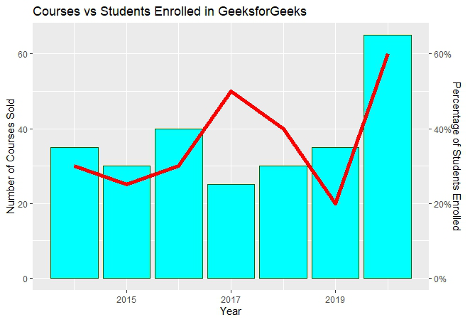
The secondary axis added will be in the form of fractional value as we can see above. But we need the secondary axis in percentage. In order to convert to percentage, we have to use the arguments labels inside the sec_axis( ).
Some important keywords used are :
- scale: It is used for scaling the data. A scaling factor is multiplied by the original data value.
- labels: It is used to assign labels.
The function used is scale_y_continuous( ) which is a default scale in "y-aesthetics" in the library ggplot2. Since we need to add "percentage" in the labels of the Y-axis, the keyword "labels" is used.
Now use below the command to convert the y-axis labels into percentages.
scales : : percent
This will simply scale the y-axis data from decimal to percentage. It multiplies the present value by 100. The scaling factor is 100.
Example:
R
# Entering data
year <- c(2014, 2015, 2016, 2017, 2018, 2019,2020)
course <- c(35, 30, 40, 25, 30, 35, 65)
penroll <- c(0.3, 0.25, 0.3, 0.5, 0.4, 0.2, 0.6)

# Creating Data Frame
perf <- data.frame(year, course, penroll)

# Plotting Multiple Charts and changing
# secondary axis to percentage
library(ggplot2)
ggp <- ggplot(perf)  +
  geom_bar(aes(x=year, y=course),stat="identity", fill="cyan",colour="#006000")+
  geom_line(aes(x=year, y=100*penroll),stat="identity",color="red",size=2)+
  labs(title= "Courses vs Students Enrolled in GeeksforGeeks",
       x="Year",y="Number of Courses Sold")+
  scale_y_continuous(sec.axis=sec_axis(
    ~.*0.01,name="Percentage of Students Enrolled", labels=scales::percent))
ggp
Output:
Similar Reads
Combine Multiple ggplot2 Legend in R In this article, we will see how to combine multiple ggplot2 Legends in the R programming language. Installation First, load the ggplot2 package by using the library() function. If you have not installed it yet, you can simply install it by writing the below command in R Console. install.packages("g
2 min read
Pie and Donut chart on same plot in ggplot2 using R Visualizing categorical data using pie and donut charts can communicate proportions and distributions effectively. While pie charts show data in a circular layout divided into slices, donut charts add a "hole" in the center, providing a different visual perspective. In this article, we'll explore ho
4 min read
Stacked Bar Chart in R ggplot2 A stacked bar plot displays data using rectangular bars grouped by categories. Each group represents a category, and inside each group, different subcategories are stacked on top of each other. It also shows relationships between groups and subcategories, making them useful for various data analysis
4 min read
Add Confidence Band to ggplot2 Plot in R In this article, we will discuss how to add Add Confidence Band to ggplot2 Plot in the R programming Language. A confidence band is the lines on a scatter plot or fitted line plot that depict the upper and lower confidence bounds for all points on the range of data. This helps us visualize the error
3 min read
Combine and Modify ggplot2 Legends with Ribbons and Lines The ggplot2 library is often used for data visualization. One feature of ggplot2 is the ability to create and modify legends for plots. In this tutorial, we will cover how to combine and modify ggplot2 legends with ribbons and lines. To begin, make sure you have the ggplot2 library installed and loa
4 min read