Boxplot is used to see the distribution of numerical data and identify key stats like minimum and maximum values, median, identifying outliers, understanding how data is distributed and can compare the distribution of data across different categories or variables. In Seaborn the seaborn.boxplot() function is used to plot it and in this article we will learn about it.
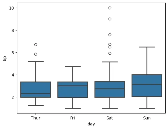
Lets see a example: We will use the tips dataset which is an inbuilt dataset. This dataset contains information about restaurant tips, total bill amount, tip amount, customer details like sex and day of the week etc. Also we will be using Seaborn and Matplotlib libraries for this.
import seaborn as sns
import matplotlib.pyplot as plt

df = sns.load_dataset("tips")
sns.boxplot(x="day", y="tip", data=df)
plt.show()
Output:

Syntax:
seaborn.boxplot(x=None, y=None, hue=None, data=None, color=None, palette=None, linewidth=None,**kwargs)
Parameters:
- x, y, hue: Inputs for plotting long-form data.
- data: Dataset for plotting. If x and y are absent this is interpreted as wide-form.
- color: Color for all of the elements.
Returns: It returns Axes object with the plot drawn on it.
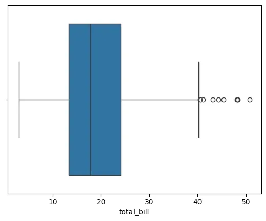
Example 1: Horizontal Boxplot of Total Bill
By changing the axis to x, we can plot distribution of the total bill in a horizontal format. This makes it easy to view data horizontally.
import seaborn as sns
import matplotlib.pyplot as plt

df = sns.load_dataset("tips")
sns.boxplot(x=df["total_bill"])
plt.show()
Output:
Example 2: Boxplot with Hue
We will use hue parameter to color-code the boxplots based on the smoker status. This makes it easier to get a difference between smokers and non-smokers.
import seaborn as sns
import matplotlib.pyplot as plt

df = sns.load_dataset("tips")
sns.boxplot(x="day", y="total_bill", hue="smoker", data=df)
plt.show()
Output:

Example 3: Custom Colors Palette
We use hue and palette parameters to color-code the boxplot based on gender. This helps in making the difference between male and female customers. We will define a custom color palette as skyblue and lightpink for male and female respectively.
import seaborn as sns
import matplotlib.pyplot as plt

df = sns.load_dataset("tips")
palette = {'Male': 'skyblue', 'Female': 'lightpink'}
sns.boxplot(x="day", y="tip", hue="sex", data=df, palette=palette)
plt.show()
Output:

Example 4: Increase Outline Thickness
The linewidth parameter controls thickness of the boxplot lines. By increasing it plot’s boundaries become more thick.
import seaborn as sns
import matplotlib.pyplot as plt

df = sns.load_dataset("tips")
sns.boxplot(x="day", y="tip", data=df, linewidth=2)
plt.show()
Output:
Example 5: Horizontal Boxplot for Multiple Columns
In this example we plot multiple variables horizontally by setting the orient parameter to "h". This helps in comparing distributions of multiple numerical columns.
import seaborn as sns
import matplotlib.pyplot as plt

df = sns.load_dataset("tips")
sns.boxplot(data=df[["total_bill", "tip", "size"]], orient="h")
plt.show()
Output:

Example 6: Set Single Color
We can use color parameter to set a single color for the entire boxplot which ensures a uniform color.
import seaborn as sns
import matplotlib.pyplot as plt

df = sns.load_dataset("tips")
sns.boxplot(x="day", y="tip", data=df, color="green")
plt.show()
Output:

With Seaborn's boxplot() we can easily visualize and compare data distributions which helps us to gain valuable insights into our dataset in a clear and effective manner.