Bootstrap 5 Layout Inline forms
Last Updated :
02 Aug, 2024
Bootstrap 5 Layout Inline forms consist of a responsive horizontal layout. All of the elements are inline and left-aligned, and labels are alongside, and only apply to forms within viewports.
Bootstrap 5 Layout Inline forms used classes:
- row-cols-lg-auto: This class is used to create horizontal layouts.
- input-group: This class is used to enhance an input by adding text in front or behind the input field.
- form-control: This class is used for input elements to provide bootstrap 5 input styling.
- form-select: This class is used to select options from multiple options from the menu.
Syntax:
<form class="row-cols-lg-auto g-* align-items-center">
    <div class="col-*">
        <label class="visually-hidden">
            ...
        </label>
        <div class="input-group">
            <input type="text" class="form-control"
                   placeholder="...">
        </div>
    </div>
</form>
Note: * can take values 1, 2, 3, and so on.
Example 1: In this example, we set the layout inline forms at the level of viewports on the small screen sizes.
HTML
<!DOCTYPE html>
<html lang="en">

<head>
    <meta charset="UTF-8">
    <meta http-equiv="X-UA-Compatible"
        content="IE=edge">
    <meta name="viewport" content=
"width=device-width, initial-scale=1.0">
    <title>Bootstrap 5-GeeksforGeeks </title>

    <link href=
"https://cdn.jsdelivr.net/npm/[email protected]/dist/css/bootstrap.min.css"
        rel="stylesheet">
    <script src=
"https://cdn.jsdelivr.net/npm/[email protected]/dist/js/bootstrap.min.js">
    </script>
</head>

<body class="m-3">
    <div class="container text-center">
        <h1 class="text-success">
              GeeksforGeeks
          </h1>
        <h5>Bootstrap5 Layout Inline forms</h5>
    </div>
    <form class="row p-4 row-cols-sm-auto g-2 border
                 bg-light mt-4 align-items-center">
        <div class="col-1">
            <label class="visually-hidden" for="Display name">
                Display name</label>
            <div class="input-group">
                <input type="text" class="form-control"
                    placeholder="Display name ">
            </div>
        </div>
        <div class="col-2">
            <label class="visually-hidden" for="Mobile Number">
                Mobile Number</label>
            <div class="input-group">
                <input type="text" class="form-control"
                    placeholder="Mobile number">
            </div>
        </div>
        <div class="col-3">
            <label class="visually-hidden" for="confirmation">
                confirmation</label>
            <div class="input-group">
                <input type="text" class="form-control"
                    placeholder="Password">
            </div>
        </div>

        <div class="col-4">
            <div class="input-group">
                <label class="visually-hidden" for="Security">
                    Security pin</label>
                <input type="text" class="form-control"
                    placeholder="Security pin">
            </div>
        </div>
        </div>
        <div class="col-5">
            <button type="submit" class="btn btn-success">
                Sign in</button>
        </div>
    </form>
</body>
</html>
Output:
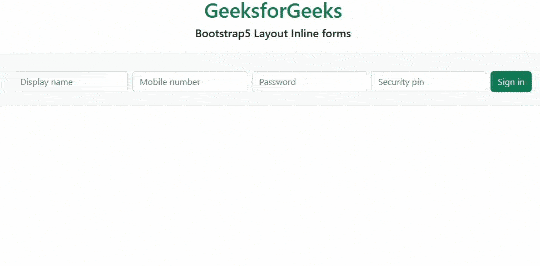 bootstrap5 layout
Example 2: In this example, we set the layout of inline forms at the level of viewports screen sizes.
HTML
<!DOCTYPE html>
<html lang="en">
<head>
    <meta charset="UTF-8">
    <meta http-equiv="X-UA-Compatible"
          content="IE=edge">
    <meta name="viewport"
          content="width=device-width, initial-scale=1.0">
    <title>Bootstrap 5-GeeksforGeeks </title>
    <link href=
"https://cdn.jsdelivr.net/npm/[email protected]/dist/css/bootstrap.min.css"
          rel="stylesheet">
</head>

<body>
    <div class="container text-center ">
        <h1 class="text-success">
              GeeksforGeeks
          </h1>
        <h5>Bootstrap5 Layout Inline forms</h5>
    </div>
    <form class="row p-5 row-cols-sm-auto g-3
                 border text-bg-success mt-4
                 align-items-center">
        <div class="col-1">
            <div class="input-group">
                <input type="text"
                       class="form-control"
                       placeholder="Email address">
            </div>
        </div>
        <div class="col-2">
            <div class="input-group">
                <input type="text" class="form-control"
                       placeholder="Recovery contact number">
            </div>
        </div>
        <div class="col-3 ">
            <div class="form-check text-bg-primary">
                <input class="form-check-input"
                       type="checkbox" id="Check">
                <label class="form-check-label"
                       for="FormCheck1">
                    Correct
                </label>
            </div>
        </div>
        <div class="col-4">
            <div class="input-group">
                <input type="text" class="form-control"
                       placeholder="Captcha">
            </div>
        </div>
    </form>
</body>
</html>
Output:
 Bootstrap5 Layout Inline forms
Reference: https://getbootstrap.com/docs/5.0/forms/layout/#inline-forms