Bootstrap 5 Input group Sass
Last Updated :
23 Jul, 2025
Bootstrap 5 Input group SASS has a set of variables with default values that can be changed to customize the Input groups.
SASS variables for Input group:
- $input-group-addon-padding-y: This variable is used for padding in the y-axis
- $input-group-addon-padding-x: This variable is used for padding in the x-axis
- $input-group-addon-font-weight: This variable is used for the font Weight of the input group
- $input-group-addon-color: This variable is used for the color of the input group
- $input-group-addon-bg: This variable is used for the background color of the input group
- $input-group-addon-border-color: This variable is used for the border color of the input group
Steps to override SCSS of Bootstrap:
Step 1: Install bootstrap using the following command
npm i bootstrap
Step 2: Create your custom scss file and write the variable you want to override. Then include the bootstrap scss file using import.
@import "../node_modules/bootstrap/scss/bootstrap.scss";
$variable_to_override: value;
Step 3: Convert the SCSS file to CSS using a live server extension.
Step 4: Include the CSS file in your HTML file.
<link rel="stylesheet" href="./assets/css/style.css">
Project Structure:

Syntax:
$input-group-addon-padding-y: value;
...
.input-group-text {
      padding: $input-group-addon-padding-y $input-group-addon-padding-x;
      @include font-size($input-font-size);
      font-weight: $input-group-addon-font-weight;
      ...
}
Example 1: Various SASS variables are discussed in this example
style.scss
CSS
@import "../node_modules/bootstrap/scss/bootstrap.scss";

$input-group-addon-padding-y:2rem;
$input-group-addon-padding-x:1rem;
$input-group-addon-font-weight:800;

.input-group-text {
    padding: $input-group-addon-padding-y $input-group-addon-padding-x;
    @include font-size($input-font-size);
    font-weight: $input-group-addon-font-weight;
}
style.css
CSS
.input-group-text {
    padding: 2rem 1rem;
    font-size: 1rem;
    font-weight: 800;
}
index.html
HTML
<!DOCTYPE html>
<html lang="en">
<head>
    <meta charset="UTF-8">
    <meta http-equiv="X-UA-Compatible"
          content="IE=edge">
    <meta name="viewport"
          content="width=device-width, initial-scale=1.0">
    <title>Input group Sass</title>
    <script src=
"https://cdn.jsdelivr.net/npm/[email protected]/dist/js/bootstrap.bundle.min.js">
    </script>
    <link rel="stylesheet" href="./assets/css/style.css">
</head>

<body>
    <div class="text-center">
        <h1 class="text-success">
            GeeksforGeeks
        </h1>
        <h2>
            Bootstrap 5 Input group Sass
        </h2>
        <br><br>
        <div class="input-group mb-3">
            <span class="input-group-text" id="gfg1">@</span>
            <input type="text" class="form-control"
                    placeholder="Username" aria-label="Username"
                aria-describedby="gfg1">
        </div>
        <div class="input-group mb-3">
            <span class="input-group-text">Rs</span>
            <input type="text" class="form-control"
                   aria-label="Amount in nearest Rs">
            <span class="input-group-text">.00</span>
        </div>
        <div class="input-group">
            <span class="input-group-text">
                With textarea
            </span>
            <textarea class="form-control"
                      aria-label="With textarea">
            </textarea>
        </div>
    </div>
</body>
</html>
Output:

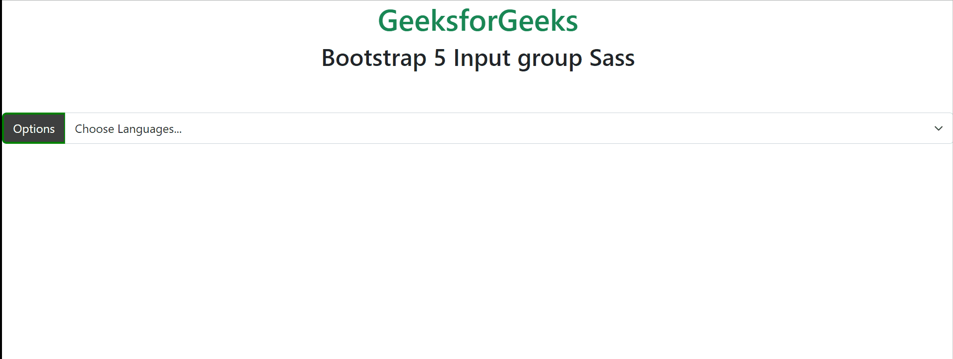
Example 2: Various SASS variables are discussed in this example and their default values are changed
style.scss
CSS
@import "../node_modules/bootstrap/scss/bootstrap.scss";

$input-group-addon-color:white;
$input-group-addon-bg:rgba(8, 8, 8, 0.776);
$input-group-addon-border-color:green;

.input-group-text {
    color: $input-group-addon-color;
    background-color: $input-group-addon-bg;
    border: 3px solid $input-group-addon-border-color;
}
style.css
CSS
.input-group-text {
    color: white;
    background-color: rgba(8, 8, 8, 0.776);
    border: 3px solid green;
}
index.html
HTML
<!DOCTYPE html>
<html lang="en">
<head>
    <meta charset="UTF-8">
    <meta http-equiv="X-UA-Compatible" content="IE=edge">
    <meta name="viewport" content="width=device-width, initial-scale=1.0">
    <title>Input group Sass</title>
    <script src=
"https://cdn.jsdelivr.net/npm/[email protected]/dist/js/bootstrap.bundle.min.js">
    </script>
    <link rel="stylesheet" href="./assets/css/style.css">
</head>

<body>
    <div class="text-center">
        <h1 class="text-success">
            GeeksforGeeks
        </h1>
        <h2>Bootstrap 5 Input group Sass</h2>
        <br><br>
        <div class="input-group mb-3">
            <label class="input-group-text"
                   for="inputGroupSelect01">
                   Options
            </label>
            <select class="form-select" id="inputGroupSelect01">
                <option selected>Choose Languages...</option>
                <option value="1">Java</option>
                <option value="2">C++</option>
                <option value="3">Python</option>
            </select>
        </div>
</body>
</html>
Output:
Reference: https://getbootstrap.com/docs/5.0/forms/input-group/#sass