Bootstrap 5 Customizing the Grid
Last Updated :
25 Jul, 2024
Bootstrap Grid system is one of the most versatile layouts which we can use and it has different responsive variants which can be used to add custom responsiveness. Bootstrap Grid system provides a responsive layout with columns and gutters. Customizing the grid is essentially changing the number of columns or gutters' width or changing the breakpoints at which the grids will attain the specific width given to them.
Grid System Columns and Gutters
Columns are divided into 12 equal parts, allowing you to create flexible and responsive designs. Gutters are the spacing between columns, which can be adjusted using predefined classes. The number of columns and the gutter width can be changed using the SASS version. For this, you can use the $grid-columns and $grid-gutter-width for changing the maximum width occupied by the container at the various breakpoints.
Variables needed to control Grid Columns and gutters and their default values
- $grid-columns
[12]: This variable is used to customize the number of grid columns in the grid. - $grid-gutter-width
[1.5rem]: This variable is used to control the amount of padding between the columns of the grid.
Syntax:
$grid-columns: integer-value;
$grid-gutter-width: value;
Grid system Grid tiers
Across the six default breakpoints, the grid works smoothly, and all these breakpoints can also be called Grid Tiers which can be changed using the SASS version. For this, we can use the $grid-breakpoints and $container-max-widths for changing the maximum width occupied by the container at the various breakpoints.
Variables needed to control Grid tiers and their default values:
- $grid-breakpoints: This variable states the grid tier values(screen sizes of the viewport) where the grid will break into the custom responsive number of columns if specified. Under this variable, the default values are 0 for xs, 576px for sm, 768px for md, 992px for lg, 1200px for xl, and 1400px for xxl.
- $container-max-widths: This variable states the maximum width of the container at any specific given breakpoint or viewport size. Under this variable, the default values are 0 for xs, 540px for sm, 720px for md, 960px for lg, 1140px for xl, and 1320px for xxl.
Syntax:
$variable_to_override: (
    /* Grid Tiers and their values */
) !default;
The Only Approach to customize the grid in Bootstrap that is by using the SASS version of it.
Steps to override SASS of Bootstrap
Step 1: Install Bootstrap using the following command
npm i bootstrap sass
Step 2: Create your custom SCSS file and write the variable you want to override. Then include the bootstrap SCSS file using import.
$variable_to_override: value
@import "../node_modules/bootstrap/scss/bootstrap.scss";
Step 3: Convert the SCSS file to CSS using a live server extension or using this command in terminal
sass styles.scss styles.css
Step 4: Include the CSS file in your HTML file.
<link rel="stylesheet" href="styles.css">
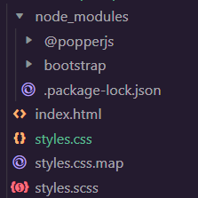
Project Structure
Example 1: The code below demonstrates customizing the grid by changing the number of columns and the padding between the columns using the $grid-columns and $grid-gutter-width variables. The value of the first is changed to 20 here and the second is updated from 1.5rem to 2rem. The values of the sm, md, and lg breakpoints are given as 6, 8, and 4 columns and the padding between these columns in every breakpoint is 2rem. In the output GIF, you can see how when you set col-lg-4 to a column it takes 80% of the total grid area as there are four grid elements and 16 is 80% of 20:
styles.scss:
CSS
$grid-columns: 20 ;
$grid-gutter-width: 5rem;

@import "./node_modules/bootstrap/scss/bootstrap.scss";
styles.css: The above SCSS file is compiled into this CSS file(only the changes shown).
CSS
.col-20 {
    flex: 0 0 auto;
    width: 100%;
}

.col-sm-20 {
    flex: 0 0 auto;
    width: 100%;
}

.col-md-20 {
    flex: 0 0 auto;
    width: 100%;
}

.col-lg-20 {
    flex: 0 0 auto;
    width: 100%;
}

.col-xl-20 {
    flex: 0 0 auto;
    width: 100%;
}

.col-xxl-20 {
    flex: 0 0 auto;
    width: 100%;
}

.row {
    --bs-gutter-x: 5rem;
    --bs-gutter-y: 0;
    display: flex;
    flex-wrap: wrap;
    margin-top: calc(-1 * var(--bs-gutter-y));
    margin-right: calc(-0.5 * var(--bs-gutter-x));
    margin-left: calc(-0.5 * var(--bs-gutter-x));
}
index.html:
HTML
<!doctype html>
<html lang="en">

<head>
    <link rel="stylesheet" href="styles.css">
    <script src=
"https://cdn.jsdelivr.net/npm/[email protected]/dist/js/bootstrap.bundle.min.js">
    </script>
</head>

<body>
    <div class="text-center mt-4">
        <h1 class="text-success">GeeksforGeeks</h1>
        <h3>Bootstrap 5 Grid system Customizing the Grid</h3>
        <div class="mt-4 p-4">
            <div class="row">
                <div class="col-sm-6 col-md-8 col-lg-4">
                    <div class="card mb-3 bg-light">
                        <div class="card-body">
                            <p class="card-text">
                                A data structure is a storage that
                                is used to store and organize data.
                            </p>
                        </div>
                    </div>
                </div>
                <div class="col-sm-6 col-md-8 col-lg-4">
                    <div class="card mb-3 bg-light">
                        <div class="card-body">
                            <p class="card-text">
                                Therefore Algorithm refers to a
                                sequence of finite steps to solve
                                a particular problem.
                            </p>
                        </div>
                    </div>
                </div>
                <div class="col-sm-6 col-md-8 col-lg-4">
                    <div class="card mb-3 bg-light">
                        <div class="card-body">
                            <p class="card-text">
                                C++ is a general-purpose programming
                                language and is widely used nowadays
                                for competitive programming.
                            </p>
                        </div>
                    </div>
                </div>
                <div class="col-sm-6 col-md-8 col-lg-4">
                    <div class="card mb-3 bg-light">
                        <div class="card-body">
                            <p class="card-text">
                                Java is one of the most popular and
                                widely used programming languages.
                            </p>
                        </div>
                    </div>
                </div>
            </div>
        </div>
    </div>
</body>

</html>
Output:
Example 2: The code below demonstrates how we can customize the grid by changing the $grid-breakpoints variable and the different breakpoints values inside it. The values of the sm, md, and lg breakpoints are changed, and the columns change with the new breakpoints. In the output GIF, you can see on the top right corner of the browser window the current size of the screen which it is resized to:
styles.scss:
CSS
$grid-breakpoints: (
    xs: 0,
    sm: 476px,
    md: 650px,
    lg: 1000px,
    xl: 1200px,
    xxl: 1400px) !default;

@import "./node_modules/bootstrap/scss/bootstrap.scss";
styles.css: The above SCSS file is compiled into this CSS file(only the changes shown).
CSS
@media (min-width: 476px) {

    .container-sm,
    .container {
        max-width: 540px;
    }
}

@media (min-width: 650px) {

    .container-md,
    .container-sm,
    .container {
        max-width: 720px;
    }
}

@media (min-width: 1000px) {

    .container-lg,
    .container-md,
    .container-sm,
    .container {
        max-width: 960px;
    }
}

@media (min-width: 1200px) {

    .container-xl,
    .container-lg,
    .container-md,
    .container-sm,
    .container {
        max-width: 1140px;
    }
}

@media (min-width: 1400px) {

    .container-xxl,
    .container-xl,
    .container-lg,
    .container-md,
    .container-sm,
    .container {
        max-width: 1320px;
    }
}
index.html:
HTML
<!doctype html>
<html lang="en">

<head>
    <link rel="stylesheet" href="styles.css">
    <script src=
"https://cdn.jsdelivr.net/npm/[email protected]/dist/js/bootstrap.bundle.min.js">
    </script>
</head>

<body>
    <div class="text-center mt-4">
        <h1 class="text-success">GeeksforGeeks</h1>
        <h3>Bootstrap 5 Grid system Customizing the Grid</h3>
        <div class="mt-4 p-4">
            <div class="row">
                <div class="col-sm-12 col-md-6 col-lg-3">
                    <div class="card mb-3 bg-light">
                        <div class="card-body">
                            <p class="card-text">
                                A data structure is a storage that
                                is used to store and organize data.
                            </p>
                        </div>
                    </div>
                </div>
                <div class="col-sm-12 col-md-6 col-lg-3">
                    <div class="card mb-3 bg-light">
                        <div class="card-body">
                            <p class="card-text">
                                Therefore Algorithm refers to a sequence
                                of finite steps to solve a particular problem.
                            </p>
                        </div>
                    </div>
                </div>
                <div class="col-sm-12 col-md-6 col-lg-3">
                    <div class="card mb-3 bg-light">
                        <div class="card-body">
                            <p class="card-text">
                                C++ is a general-purpose programming
                                language and is widely used nowadays
                                for competitive programming.
                            </p>
                        </div>
                    </div>
                </div>
                <div class="col-sm-12 col-md-6 col-lg-3">
                    <div class="card mb-3 bg-light">
                        <div class="card-body">
                            <p class="card-text">
                                Java is one of the most popular and
                                widely used programming languages.
                            </p>
                        </div>
                    </div>
                </div>
            </div>
        </div>
    </div>
</body>

</html>
Output:
Reference: https://getbootstrap.com/docs/5.0/layout/grid/#customizing-the-grid
Similar Reads
Non-linear Components In electrical circuits, Non-linear Components are electronic devices that need an external power source to operate actively. Non-Linear Components are those that are changed with respect to the voltage and current. Elements that do not follow ohm's law are called Non-linear Components. Non-linear Co
11 min read
JavaScript Tutorial JavaScript is a programming language used to create dynamic content for websites. It is a lightweight, cross-platform, and single-threaded programming language. It's an interpreted language that executes code line by line, providing more flexibility.JavaScript on Client Side: On the client side, Jav
11 min read
Web Development Web development is the process of creating, building, and maintaining websites and web applications. It involves everything from web design to programming and database management. Web development is generally divided into three core areas: Frontend Development, Backend Development, and Full Stack De
5 min read
Spring Boot Tutorial Spring Boot is a Java framework that makes it easier to create and run Java applications. It simplifies the configuration and setup process, allowing developers to focus more on writing code for their applications. This Spring Boot Tutorial is a comprehensive guide that covers both basic and advance
10 min read
React Interview Questions and Answers React is an efficient, flexible, and open-source JavaScript library that allows developers to create simple, fast, and scalable web applications. Jordan Walke, a software engineer who was working for Facebook, created React. Developers with a JavaScript background can easily develop web applications
15+ min read
React Tutorial React is a powerful JavaScript library for building fast, scalable front-end applications. Created by Facebook, it's known for its component-based structure, single-page applications (SPAs), and virtual DOM,enabling efficient UI updates and a seamless user experience.Note: The latest stable version
7 min read
JavaScript Interview Questions and Answers JavaScript is the most used programming language for developing websites, web servers, mobile applications, and many other platforms. In Both Front-end and Back-end Interviews, JavaScript was asked, and its difficulty depends upon the on your profile and company. Here, we compiled 70+ JS Interview q
15+ min read
Class Diagram | Unified Modeling Language (UML) A UML class diagram is a visual tool that represents the structure of a system by showing its classes, attributes, methods, and the relationships between them. It helps everyone involved in a project—like developers and designers—understand how the system is organized and how its components interact
12 min read
3-Phase Inverter An inverter is a fundamental electrical device designed primarily for the conversion of direct current into alternating current . This versatile device , also known as a variable frequency drive , plays a vital role in a wide range of applications , including variable frequency drives and high power
13 min read
Backpropagation in Neural Network Back Propagation is also known as "Backward Propagation of Errors" is a method used to train neural network . Its goal is to reduce the difference between the model’s predicted output and the actual output by adjusting the weights and biases in the network.It works iteratively to adjust weights and
9 min read