Angular PrimeNG is an open-source framework with a rich set of native Angular UI components that are used for great styling and this framework is used to make responsive websites with very much ease. It provides a lot of templates, components, theme design, an extensive icon library, and much more. In this article, we will see the Angular PrimeNG Table Column Toggle Component.
The Table Component is used to display tabular data. PrimeNG provides a lot of customization in properties, methods, templates, and styling to make the component look and function as required. The Table component can also be made dynamic so that the data can be loaded efficiently.
Creating Angular application & module installation:
Step 1: Create an Angular application using the following command.
ng new appname
Step 2: After creating your project folder i.e. appname, move to it using the following command.
cd appname
Step 3: Install PrimeNG in your given directory.
npm install primeng --save
npm install primeicons --save
Project Structure: It will look like the following:

Steps to run the application: To run the above file run the below command:
ng serve --save
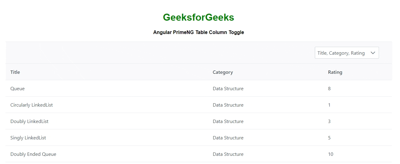
Example 1: This is the basic example that shows how to use the Angular PrimeNG Table Column Toggle using the header filter to the left side.
- app.component.html:
<div style="text-align: center;">
    <h1 style="color: green;">GeeksforGeeks</h1>
    <h4>Angular PrimeNG Table Column Toggle</h4>
</div>

<p-table [columns]="selectedColumns" [value]="tutorials">
    <ng-template pTemplate="caption">
        <p-multiSelect
            [options]="cols"
            [(ngModel)]="selectedColumns"
            optionLabel="header"
            placeholder="Please select columns">
        </p-multiSelect>
    </ng-template>

    <ng-template pTemplate="header" let-columns>
        <tr>
            <th *ngFor="let col of columns">
                {{col.header}}
            </th>
        </tr>
    </ng-template>

    <ng-template pTemplate="body"
         let-tutorial let-columns="columns">
        <tr>
            <td *ngFor="let col of columns">
                {{tutorial[col.field]}}
            </td>
        </tr>
    </ng-template>
</p-table>
- app.component.ts:
import { Component, OnInit, Input } from "@angular/core";

@Component({
    selector: "app-root",
    templateUrl: "./app.component.html"
})

export class AppComponent {
    tutorials: Tutorials[];
    cols: any[];
    _selectedColumns: any[];

    ngOnInit() {
        this.tutorials = [
            {
                title: "Queue",
                category: "Data Structure",
                rating: 8
            },
            {
                title: "Circularly LinkedList",
                category: "Data Structure",
                rating: 1
            },
            {
                title: "Doubly LinkedList",
                category: "Data Structure",
                rating: 3
            },
            {
                title: "Singly LinkedList",
                category: "Data Structure",
                rating: 5
            },
            {
                title: "Doubly Ended Queue",
                category: "Data Structure",
                rating: 10
            },
            {
                title: "Binary Search Tree",
                category: "Data Structure",
                rating: 2
            },
            {
                title: "Red Black Tree",
                category: "Data Structure",
                rating: 9
            },
            {
                title: "Breadth First Search",
                category: "Graph",
                rating: 6
            },
            {
                title: "Floyd's Cycle",
                category: "Algorithm",
                rating: 7
            },
            {
                title: "Travelling Salesman Problem",
                category: "Algorithm",
                rating: 4
            },
            {
                title: "Bellman Ford",
                category: "Graph",
                rating: 8
            },
            {
                title: "KMP Algorithm",
                category: "String",
                rating: 10
            }
        ];

        this.cols = [
            { field: "title", header: "Title" },
            { field: "category", header: "Category" },
            { field: "rating", header: "Rating" }
        ];

        this._selectedColumns = this.cols;
    }

    @Input() get selectedColumns(): any[] {
        return this._selectedColumns;
    }

    set selectedColumns(val: any[]) {
        this._selectedColumns =
            this.cols.filter((col) => val.includes(col));
    }
}

export interface Tutorials {
    title: string;
    category: string;
    rating?: number;
}
- productservice.ts:
import { Injectable } from "@angular/core";

@Injectable()
export class ProductService {
    generateTutorial(): Tutorial {
        const tutorial: Tutorial = {
            title: "My Title",
            category: "Product Category",
            rating: 0
        };
        return tutorial;
    }
}

export interface Tutorial {
    title: string;
    category: string;
    rating?: number;
}
- app.module.ts:
import { NgModule } from "@angular/core";
import { BrowserModule } from "@angular/platform-browser";
import { FormsModule } from "@angular/forms";
import { HttpClientModule } from "@angular/common/http";
import { BrowserAnimationsModule }
    from "@angular/platform-browser/animations";
import { RouterModule } from "@angular/router";
import { AppComponent } from "./app.component";
import { ProductService } from "./productservice";
import { TableModule } from "primeng/table";
import { ToastModule } from "primeng/toast";
import { CalendarModule } from "primeng/calendar";
import { SliderModule } from "primeng/slider";
import { MultiSelectModule } from "primeng/multiselect";
import { ContextMenuModule } from "primeng/contextmenu";
import { DialogModule } from "primeng/dialog";
import { ButtonModule } from "primeng/button";
import { DropdownModule } from "primeng/dropdown";
import { ProgressBarModule } from "primeng/progressbar";
import { InputTextModule } from "primeng/inputtext";

@NgModule({
    imports: [
        BrowserModule,
        BrowserAnimationsModule,
        TableModule,
        CalendarModule,
        SliderModule,
        DialogModule,
        MultiSelectModule,
        ContextMenuModule,
        DropdownModule,
        ButtonModule,
        ToastModule,
        InputTextModule,
        ProgressBarModule,
        HttpClientModule,
        FormsModule,
        RouterModule.forRoot([
            { path: "", component: AppComponent }
        ])
    ],
    declarations: [AppComponent],
    bootstrap: [AppComponent],
    providers: [ProductService]
})

export class AppModule {}
Output:

Example 2: This is another example that shows how to use the Angular PrimeNG Table Column Toggle using the header filter to the right side.
- app.component.html:
<div style="text-align: center;">
    <h1 style="color: green;">GeeksforGeeks</h1>
    <h4>Angular PrimeNG Table Column Toggle</h4>
</div>

<p-table [columns]="selectedColumns" [value]="tutorials">
    <ng-template pTemplate="caption">
        <p-multiSelect
            [options]="cols"
            [(ngModel)]="selectedColumns"
            optionLabel="header"
            [style]="{marginLeft: '1000px'}"
            placeholder="Please select columns">
        </p-multiSelect>
    </ng-template>

    <ng-template pTemplate="header" let-columns>
        <tr>
            <th *ngFor="let col of columns">
                {{col.header}}
            </th>
        </tr>
    </ng-template>

    <ng-template pTemplate="body"
         let-tutorial let-columns="columns">
        <tr>
            <td *ngFor="let col of columns">
                {{tutorial[col.field]}}
            </td>
        </tr>
    </ng-template>
</p-table>
- app.component.ts:
import { Component, OnInit, Input } from "@angular/core";

@Component({
    selector: "app-root",
    templateUrl: "./app.component.html"
})

export class AppComponent {
    tutorials: Tutorials[];
    cols: any[];
    _selectedColumns: any[];

    ngOnInit() {
        this.tutorials = [
            {
                title: "Queue",
                category: "Data Structure",
                rating: 8
            },
            {
                title: "Circularly LinkedList",
                category: "Data Structure",
                rating: 1
            },
            {
                title: "Doubly LinkedList",
                category: "Data Structure",
                rating: 3
            },
            {
                title: "Singly LinkedList",
                category: "Data Structure",
                rating: 5
            },
            {
                title: "Doubly Ended Queue",
                category: "Data Structure",
                rating: 10
            },
            {
                title: "Binary Search Tree",
                category: "Data Structure",
                rating: 2
            },
            {
                title: "Red Black Tree",
                category: "Data Structure",
                rating: 9
            },
            {
                title: "Breadth First Search",
                category: "Graph",
                rating: 6
            },
            {
                title: "Floyd's Cycle",
                category: "Algorithm",
                rating: 7
            },
            {
                title: "Travelling Salesman Problem",
                category: "Algorithm",
                rating: 4
            },
            {
                title: "Bellman Ford",
                category: "Graph",
                rating: 8
            },
            {
                title: "KMP Algorithm",
                category: "String",
                rating: 10
            }
        ];

        this.cols = [
            { field: "title", header: "Title" },
            { field: "category", header: "Category" },
            { field: "rating", header: "Rating" }
        ];

        this._selectedColumns = this.cols;
    }

    @Input() get selectedColumns(): any[] {
        return this._selectedColumns;
    }

    set selectedColumns(val: any[]) {
        this._selectedColumns =
            this.cols.filter((col) => val.includes(col));
    }
}

export interface Tutorials {
    title: string;
    category: string;
    rating?: number;
}
- app.module.ts:
import { NgModule } from "@angular/core";
import { BrowserModule } from "@angular/platform-browser";
import { FormsModule } from "@angular/forms";
import { HttpClientModule } from "@angular/common/http";
import { BrowserAnimationsModule }
    from "@angular/platform-browser/animations";
import { RouterModule } from "@angular/router";
import { AppComponent } from "./app.component";
import { ProductService } from "./productservice";
import { TableModule } from "primeng/table";
import { ToastModule } from "primeng/toast";
import { CalendarModule } from "primeng/calendar";
import { SliderModule } from "primeng/slider";
import { MultiSelectModule } from "primeng/multiselect";
import { ContextMenuModule } from "primeng/contextmenu";
import { DialogModule } from "primeng/dialog";
import { ButtonModule } from "primeng/button";
import { DropdownModule } from "primeng/dropdown";
import { ProgressBarModule } from "primeng/progressbar";
import { InputTextModule } from "primeng/inputtext";

@NgModule({
    imports: [
        BrowserModule,
        BrowserAnimationsModule,
        TableModule,
        CalendarModule,
        SliderModule,
        DialogModule,
        MultiSelectModule,
        ContextMenuModule,
        DropdownModule,
        ButtonModule,
        ToastModule,
        InputTextModule,
        ProgressBarModule,
        HttpClientModule,
        FormsModule,
        RouterModule.forRoot([
            { path: "", component: AppComponent }
        ])
    ],
    declarations: [AppComponent],
    bootstrap: [AppComponent],
    providers: [ProductService]
})

export class AppModule {}
- productservice.ts:
import { Injectable } from "@angular/core";

@Injectable()
export class ProductService {
    generateTutorial(): Tutorial {
        const tutorial: Tutorial = {
            title: "My Title",
            category: "Product Category",
            rating: 0
        };
        return tutorial;
    }
}

export interface Tutorial {
    title: string;
    category: string;
    rating?: number;
}
Output:
Reference: https://www.primefaces.org/primeng/table/coltoggle