Angular PrimeNG Panel Styling
Last Updated :
26 Apr, 2025
A responsive website may be easily created using the open-source Angular PrimeNG framework, which has a wide range of native Angular UI components for superb style. This article will learn how to style Panel Styling in Angular PrimeNG.
The Panel Component enables us to create an element with a header and some associated content. The styling classes are used to add styles to the panel.
Angular PrimeNG Panel Styling:
- p-panel: This class is used to style a container element.
- p-panel-titlebar: This class is used to style the header section.
- p-panel-title: This class is used to style the title text of the panel.
- p-panel-titlebar-toggler: This classis used to style the toggle icon.
- p-panel-content: This class is used to style the panel's content.
Syntax:
<p-panel
    header="...">
    ...
</p-panel>
Creating Angular application and Installing the modules:
Step 1: Use the command below to create an Angular application.
ng new panelStyling
Step 2: Use the following command to move to our project folder, panelStyling, after creating it.
cd panelStyling
Step 3: Install PrimeNG in the specified location.
npm install primeng --save
npm install primeicons --save
Project Structure: The project structure will look like this once the installation is finished:

Steps to run the application: Run the below command to see the output
ng serve --open
Example 1: In this example, we'll be using the inline style or style attribute of p-panel for styling the Panel Component.
HTML
<h1>
    <span>
        <img src=
"https://media.geeksforgeeks.org/wp-content/assets/Group 210.svg"
            class="gfg-logo" alt="icon" />
    </span>

    <span style="color: green; font-size: 40px;">
        GeeksforGeeks
    </span>
</h1>

<h3>PrimeNG Panel Styling</h3>

<p-panel header="About GeeksforGeeks" [style]="{
        width: '450px',
        fontFamily: 'fangsong',
        fontSize: '20px',
        border: '2px solid black',
        borderRadius: '9px'
    }">
    <p>
        We provide a range of services to
        help you grow, learn, and have fun!
        Free tutorials, millions of articles,
        live, online, and in-person classes;
        frequent coding competitions; webinars
        with subject matter experts; internship
        and employment chances. The power of
        knowledge!
    </p>
</p-panel>
import { Component } from '@angular/core';

@Component({
    selector: 'app-root',
    templateUrl: './app.component.html',
    styleUrls: ['./app.component.css']
})

export class AppComponent {
    title = 'panelStyling';
}
import { NgModule } from "@angular/core";
import { BrowserModule } from "@angular/platform-browser";
import { AppComponent } from "./app.component";
import { BrowserAnimationsModule }
    from "@angular/platform-browser/animations";
import { PanelModule } from "primeng/panel";

@NgModule({
    declarations: [AppComponent],
    imports: [
        BrowserModule,
        BrowserAnimationsModule,
        PanelModule
    ],
    providers: [],
    bootstrap: [AppComponent]
})

export class AppModule {}
Output:

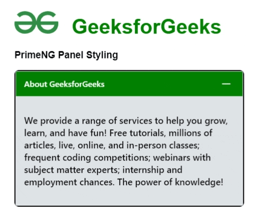
Example 2: In this example, we'll be using a pre-defined styling class for styling the Panel Component.
HTML
<h1>
    <span>
          <img src=
"https://media.geeksforgeeks.org/wp-content/assets/Group 210.svg"
          class="gfg-logo" alt="icon" />
      </span>

      <span style="color: green; font-size: 40px;">
        GeeksforGeeks
      </span>
</h1>
<h3>PrimeNG Panel Styling</h3>
<p-panel header="About GeeksforGeeks"
    [toggleable]="true">
    <p>
        We provide a range of services
          to help you grow, learn, and
          have fun! Free tutorials, millions
          of articles, live, online, and in-person
        classes; frequent coding competitions;
          webinars with subject matter experts;
          internship and employment chances.
          The power of knowledge!
    </p>
</p-panel>
import { Component } from '@angular/core';

@Component({
    selector: 'app-root',
    templateUrl: './app.component.html',
    styleUrls: ['./app.component.css']
})

export class AppComponent {
    title = 'panelStyling';
}
import { NgModule } from "@angular/core";
import { BrowserModule } from
    "@angular/platform-browser";
import { AppComponent } from "./app.component";
import { BrowserAnimationsModule }
    from "@angular/platform-browser/animations";
import { PanelModule } from "primeng/panel";

@NgModule({
    declarations: [AppComponent],
    imports: [
        BrowserModule,
        BrowserAnimationsModule,
        PanelModule
    ],
    providers: [],
    bootstrap: [AppComponent]
})

export class AppModule {}
:host ::ng-deep .p-panel.p-component {
    width: 450px;
    border: 2px solid black;
    border-radius: 9px;
}
:host ::ng-deep .p-panel .p-panel-header {
    background: green !important;
    color: white !important;
}
:host ::ng-deep .p-panel .p-panel-header
.p-panel-header-icon {
    color: white !important;
}
:host ::ng-deep .p-panel .p-panel-content {
    background: #dee2e6 !important;
    color: black !important;
    font-weight: 500;
    font-size: 18px;
}
:host ::ng-deep .p-panel .p-panel-header
.p-panel-header-icon:focus {
    box-shadow: 0 0 0 0.2rem white !important;
}
:host ::ng-deep .p-panel .p-panel-header
.p-panel-header-icon:enabled:hover {
    background: green !important;
}
Output:
Reference: https://primefaces.org/primeng/panel
Similar Reads
Angular PrimeNG PanelMenu Styling
The open-source Angular PrimeNG framework is used to create responsive websites with great simplicity and has a large set of native Angular UI components that are utilized for superb style. In this article, we will learn how to style the PanelMenu Component in Angular PrimeNG using its styling class
4 min read
Angular PrimeNG Inplace Styling
Angular PrimeNG is a UI component library for Angular Applications. It offers many pre-built themes and UI components for a variety of tasks like inputs, menus, charts, Buttons, etc. In this article, we will see Angular PrimeNG Inplace Styling. The Inplace component is used to provide an easy to do
3 min read
Angular PrimeNG Image Styling
Angular PrimeNG is an open-source framework with a rich set of native Angular UI components that are used for great styling and this framework is used to make responsive websites with very much ease. It provides a lot of templates, components, theme design, an extensive icon library, and much more.
3 min read
Angular PrimeNG Badge Styling
Angular PrimeNG is a collection of Interactive UI components for Angular applications. Developers can use these components to make beautiful and responsive web interfaces in no time as most of the components have all the necessary functions implemented. In this article, we will see the Angular Prime
3 min read
Angular PrimeNG Carousel Styling
Angular PrimeNG is an open-source framework with a rich set of native Angular UI components that are used for great styling and this framework is used to make responsive websites with very much ease. It provides a lot of templates, components, theme design, an extensive icon library, and much more.
4 min read
Angular PrimeNG Dialog Styling
A responsive website may be created with great ease using the open-source Angular PrimeNG framework, which has a wide range of native Angular UI components for superb style. In this article, we will learn how to style the Dialog Styling in Angular PrimeNG. The Dialog component is used to create a c
4 min read
Angular PrimeNG Menu Styling
A responsive website may be easily created using the open-source Angular PrimeNG framework, which has a wide range of native Angular UI components for superb style. In this article, we will learn how to style the Menu Component in Angular PrimeNG. A component that holds information and allows both s
4 min read
Angular PrimeNG Card Styling
A responsive website may be created with great ease using the open-source Angular PrimeNG framework, which has a wide range of native Angular UI components for superb style. In this article, we will learn how to style the Card Component in Angular PrimeNG. A card is a display device for extensible a
4 min read
Angular PrimeNG Chip Styling
Angular PrimeNG is a UI component catalog for angular applications. It consists of a wide range of UI components that help in making fast and scalable websites. In this article, we will see Chip Styling in Angular PrimeNG. The Chip Component represents entities with the help of labels, icons, and im
3 min read
Angular PrimeNG Paginator Styling
Angular PrimeNG is an open-source framework with a rich set of native Angular UI components that are used for great styling and this framework is used to make responsive websites with very much ease. In this article, we will learn about Angular PrimeNG Paginator Styling. The Paginator Component is u
3 min read