Angular PrimeNG Drag and Drop Attributes
Last Updated :
26 Apr, 2025
Angular PrimeNG is a UI component library for Angular Applications. It offers many pre-built themes and UI components for a variety of tasks like inputs, menus, charts, Buttons, etc. In this article, we will Angular PrimeNG Drag and Drop Attributes.
The Drag and Drop directives (pDraggable and pDroppable) are used to apply drag and drop behavior to any element.
Angular PrimeNG Drag and Drop Draggable Attributes:
- dragEffect: It is used to define the cursor style. The acceptable values for this field are none, copy, move, link, copyMove, linkMove, and all. It is of string type and the default value is null.
- dragHandle: It is a selector and is used to define the drag handle. By default, they can be started anywhere on the target element. It is of string type and the default value is null.
- pDraggableDisabled: It is used to check the element's draggability, which is important for conditional circumstances. It is of boolean type and the default value is false.
Angular PrimeNG Drag and Drop Droppable Attributes:
- dropEffect: It is used to define the cursor style on drag over. The acceptable values for this field copy, relocate, link and move. It is of string type and the default value is null.
- pDroppableDisabled: It is used to check the element's droppability, which is important for conditional circumstances. It is of boolean type and the default value is false.
Syntax:
<div class="grid">
    <div class="col-6" drag-column>
        <p-table [value]="..." responsiveLayout="...">
            <ng-template pTemplate="header">
               ....
            </ng-template>
            <ng-template pTemplate="body" let-person>
                ....
           </ng-template>
    </p-table>
</div>


<div responsiveLayout="scroll">
    <p-table [value]="...">
        <ng-template pTemplate="header">
            ....
        </ng-template>
        <ng-template pTemplate="body" let-person>
            ....
        </ng-template>
    </p-table>
</div>

<p-toast [preventOpenDuplicates]="true"></p-toast>
Creating Angular Application and Installing the Module:
Step 1: Create an Angular application using the following command.
ng new appname
Step 2: After creating your project folder i.e. appname, move to it using the following command.
cd appname
Step 3: Finally, Install PrimeNG in your given directory.
npm install primeng --save
npm install primeicons --save
Project Structure: The project Structure will look like this after following the above steps:

Steps to run the application: Run the below command to see the output
ng serve --save
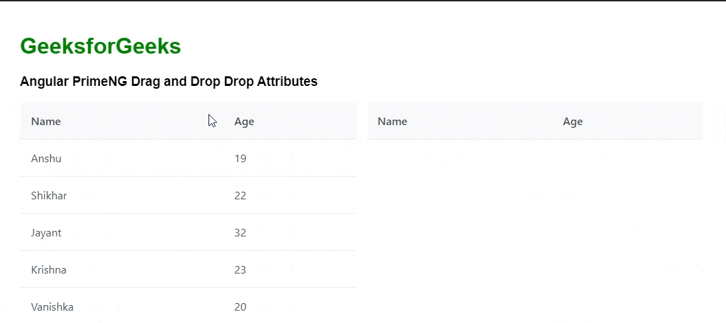
Example 1: The below example illustrates the use of the Angular PrimeNG Drag and Drop Attribute using pDraggableDisabled="true". This will not allow dragging the element.
HTML
<h1 style="color: green;">GeeksforGeeks</h1>
<h3>Angular PrimeNG Drag and Drop Attributes</h3>

<div class="grid">
    <div class="col-6" drag-column dragEffect="link">
        <p-table [value]="available" responsiveLayout="scroll">
            <ng-template pTemplate="header">
                <tr>
                    <th>Name</th>
                    <th>Age</th>
                </tr>
            </ng-template>
            <ng-template pTemplate="body" let-person>
                <tr
                    pDraggableDisabled="true"
                    pDraggable="products"
                    (onDragStart)="dragStart(person)"
                    (onDrag)="drag()"
                    (onDragEnd)="dragEnd()">
                    <td>{{ person.name }}</td>
                    <td>{{ person.age }}</td>
                </tr>
            </ng-template>
        </p-table>
    </div>

    <div
        class="col-6"
        drop-column
        pDroppable="products"
        (onDrop)="drop()"
        responsiveLayout="scroll">
        <p-table [value]="selected">
            <ng-template pTemplate="header">
                <tr>
                    <th>Name</th>
                    <th>Age</th>
                </tr>
            </ng-template>
            <ng-template pTemplate="body" let-person>
                <tr>
                    <td>{{ person.name }}</td>
                    <td>{{ person.age }}</td>
                </tr>
            </ng-template>
        </p-table>
    </div>
</div>
<p-toast [preventOpenDuplicates]="true"></p-toast>
import { Component } from "@angular/core";
import { MessageService } from "primeng/api";

interface Person {
    id: String;
    name: String;
    age: number;
}

@Component({
    selector: "app-root",
    templateUrl: "./app.component.html",
    styleUrls: ["./app.component.css"],
    providers: [MessageService]
})

export class AppComponent {
    constructor(private msg: MessageService) {}
    available: Person[] = [];
    selected: Person[] = [];

    currentlyDragging: Person | null = null;

    ngOnInit() {
        this.available = [
            {
                id: "ASDF12",
                name: "Anshu",
                age: 19
            },
            {
                id: "KJHY45",
                name: "Shikhar",
                age: 22
            },
            {
                id: "LKIO34",
                name: "Jayant",
                age: 32
            },
            {
                id: "LPOI21",
                name: "Krishna",
                age: 23
            },
            {
                id: "VANI12",
                name: "Vanishka",
                age: 20
            }
        ];
    }

    // On Drag Start
    dragStart(person: Person) {
        this.currentlyDragging = person;

        // Show the toast message on the frontend
        this.msg.add({
            severity: "info",
            summary: "Drag Started",
            detail: "onDragStart Event"
        });
    }

    drag() {
        // Show the toast message on the frontend
        this.msg.add({
            severity: "success",
            summary: "Dragging...",
            detail: "onDrag Event"
        });
    }

    // On Drag End
    dragEnd() {
        this.currentlyDragging = null;
        // Show the toast message on the frontend
        this.msg.add({
            severity: "error",
            summary: "Drag End",
            detail: "onDragEnd Event"
        });
    }

    // On Drop of Item to droppable area
    drop() {
        if (this.currentlyDragging) {
            let currentlyDraggingIndex = this.findIndex(this.currentlyDragging);
            this.selected = [...this.selected, this.currentlyDragging];
            this.available = this.available.filter(
                (val, i) => i != currentlyDraggingIndex
            );
            this.currentlyDragging = null;
        }
    }

    // Find the Index of a Person
    findIndex(person: Person) {
        let index = -1;
        for (let i = 0; i < this.available.length; i++) {
            if (person.id === this.available[i].id) {
                index = i;
                break;
            }
        }
        return index;
    }
}
import { NgModule } from "@angular/core";
import { BrowserModule } from "@angular/platform-browser";
import { HttpClientModule } from "@angular/common/http";
import { BrowserAnimationsModule }
    from "@angular/platform-browser/animations";
import { AppComponent } from "./app.component";
import { FormsModule } from "@angular/forms";
import { TableModule } from "primeng/table";
import { ToastModule } from "primeng/toast";
import { DragDropModule } from "primeng/dragdrop";

@NgModule({
    imports: [
        BrowserModule,
        BrowserAnimationsModule,
        HttpClientModule,
        FormsModule,
        TableModule,
        ToastModule,
        DragDropModule
    ],
    declarations: [AppComponent],
    bootstrap: [AppComponent]
})

export class AppModule {}
Output:

Example 2: Below is another example code that illustrates the use of the Angular PrimeNG Drag and Drop Attribute using pDroppableDisabled="true". This will allow dragging the element but not allow dropping the element.
HTML
<h1 style="color: green;">GeeksforGeeks</h1>
<h3>Angular PrimeNG Drag and Drop Attributes</h3>

<div class="grid">
    <div class="col-6" drag-column>
        <p-table [value]="available" responsiveLayout="scroll">
            <ng-template pTemplate="header">
                <tr>
                    <th>Name</th>
                    <th>Age</th>
                </tr>
            </ng-template>
            <ng-template pTemplate="body" let-person>
                <tr
                    pDraggable="products"
                    (onDragStart)="dragStart(person)"
                    (onDrag)="drag()"
                    (onDragEnd)="dragEnd()">
                    <td>{{ person.name }}</td>
                    <td>{{ person.age }}</td>
                </tr>
            </ng-template>
        </p-table>
    </div>

    <div
        class="col-6"
        drop-column
        pDroppableDisabled="true"
        pDroppable="products"
        (onDrop)="drop()"
        responsiveLayout="scroll">
        <p-table [value]="selected">
            <ng-template pTemplate="header">
                <tr>
                    <th>Name</th>
                    <th>Age</th>
                </tr>
            </ng-template>
            <ng-template pTemplate="body" let-person>
                <tr>
                    <td>{{ person.name }}</td>
                    <td>{{ person.age }}</td>
                </tr>
            </ng-template>
        </p-table>
    </div>
</div>
<p-toast [preventOpenDuplicates]="true"></p-toast>
import { Component } from "@angular/core";
import { MessageService } from "primeng/api";

interface Person {
    id: String;
    name: String;
    age: number;
}

@Component({
    selector: "app-root",
    templateUrl: "./app.component.html",
    styleUrls: ["./app.component.css"],
    providers: [MessageService]
})

export class AppComponent {
    constructor(private msg: MessageService) {}
    available: Person[] = [];
    selected: Person[] = [];

    currentlyDragging: Person | null = null;

    ngOnInit() {
        this.available = [
            {
                id: "ASDF12",
                name: "Anshu",
                age: 19
            },
            {
                id: "KJHY45",
                name: "Shikhar",
                age: 22
            },
            {
                id: "LKIO34",
                name: "Jayant",
                age: 32
            },
            {
                id: "LPOI21",
                name: "Krishna",
                age: 23
            },
            {
                id: "VANI12",
                name: "Vanishka",
                age: 20
            }
        ];
    }

    // On Drag Start
    dragStart(person: Person) {
        this.currentlyDragging = person;

        // Show the toast message on the frontend
        this.msg.add({
            severity: "info",
            summary: "Drag Started",
            detail: "onDragStart Event"
        });
    }

    drag() {
        // Show the toast message on the frontend
        this.msg.add({
            severity: "success",
            summary: "Dragging...",
            detail: "onDrag Event"
        });
    }

    // On Drag End
    dragEnd() {
        this.currentlyDragging = null;
        // Show the toast message on the frontend
        this.msg.add({
            severity: "error",
            summary: "Drag End",
            detail: "onDragEnd Event"
        });
    }

    // On Drop of Item to droppable area
    drop() {
        if (this.currentlyDragging) {
            let currentlyDraggingIndex = this.findIndex(this.currentlyDragging);
            this.selected = [...this.selected, this.currentlyDragging];
            this.available = this.available.filter(
                (val, i) => i != currentlyDraggingIndex
            );
            this.currentlyDragging = null;
        }
    }

    // Find the Index of a Person
    findIndex(person: Person) {
        let index = -1;
        for (let i = 0; i < this.available.length; i++) {
            if (person.id === this.available[i].id) {
                index = i;
                break;
            }
        }
        return index;
    }
}
import { NgModule } from "@angular/core";
import { BrowserModule } from "@angular/platform-browser";
import { HttpClientModule } from "@angular/common/http";
import { BrowserAnimationsModule }
    from "@angular/platform-browser/animations";
import { AppComponent } from "./app.component";
import { FormsModule } from "@angular/forms";
import { TableModule } from "primeng/table";
import { ToastModule } from "primeng/toast";
import { DragDropModule } from "primeng/dragdrop";

@NgModule({
    imports: [
        BrowserModule,
        BrowserAnimationsModule,
        HttpClientModule,
        FormsModule,
        TableModule,
        ToastModule,
        DragDropModule
    ],
    declarations: [AppComponent],
    bootstrap: [AppComponent]
})

export class AppModule {}
Output:
Reference: https://primefaces.org/primeng/dragdrop
Similar Reads
Angular PrimeNG Drag and Drop Component
Angular PrimeNG is a UI component library for Angular Applications. It offers many pre-built themes and UI components for a variety of tasks like inputs, menus, charts, Buttons, etc. In this article, we will Angular PrimeNG Drag and Drop Component. The Drag and Drop directives (pDraggable and pDropp
6 min read
Angular PrimeNG Tree Drag and Drop
Angular PrimeNG is an open-source framework with a rich set of native Angular UI components that are used for great styling and this framework is used to make responsive websites with very much ease. In this article, we will see Angular PrimeNG Tree Drag and Drop. The tree component is used to hiera
4 min read
Angular PrimeNG Drag and Drop Events
Angular PrimeNG is a UI component library for Angular Applications. It offers many pre-built themes and UI components for a variety of tasks like inputs, menus, charts, Buttons, etc. In this article, we will learn about Angular PrimeNG Drag and Drop Events. The Drag and Drop directives (pDraggable a
6 min read
Angular PrimeNG Drag and Drop to Table
Angular PrimeNG is a UI component library for Angular Applications. It offers many pre-built themes and UI components for a variety of tasks like inputs, menus, charts, Buttons, etc. In this article, we will see how to use the Drag and Drop to Table in Angular PrimeNG. Angular PrimeNG Drag and Drop
5 min read
Angular PrimeNG Tree DragDrop
Angular PrimeNG is an open-source framework with a rich set of native Angular UI components that are used for great styling and this framework is used to make responsive websites with very much ease. In this article, we will see how to use the Tree DragDrop in Angular PrimeNG. The Tree DragDrop ena
4 min read
Angular PrimeNG Drag and Drop Drop Indicator
Angular PrimeNG is a collection of Interactive UI components for Angular applications. Developers can use these components to make beautiful and responsive web interfaces in no time as most of the components have all the necessary functions implemented. In this article, we will see Angular PrimeNG D
2 min read
Angular PrimeNG PickList DragDrop
Angular PrimeNG is an open-source framework with a rich set of native Angular UI components that are used for great styling and this framework is used to make responsive websites with very much ease. It provides a lot of templates, components, theme design, an extensive icon library, and much more.
3 min read
Angular 17 Attribute directive
In Angular, attribute directives are a powerful feature that allows you to manipulate the behavior and appearance of HTML elements. They are a fundamental building block for extending and customizing the behavior of components in Angular applications. In this article, we'll learn more about the conc
4 min read
Angular PrimeNG Dragdrop Complete Reference
Angular PrimeNG Dragdrop Component facilitates the implementation of the drag & drop functionality to any element, by applying the related attribute to it. By implementing this component, it enhances the overall user interaction with the website along with increasing the experience. The complete
1 min read
Angular PrimeNG OrderList DragDrop
Angular PrimeNG is an open-source framework with a rich set of native Angular UI components that are used for great styling and this framework is used to make responsive websites with very much ease. In this article, we will learn about OrderList DragDrop in Angular PrimeNG. The OrderList component
3 min read