Angular PrimeNG is an open-source framework with a rich set of native Angular UI components that are used for great styling and this framework is used to make responsive websites with very much ease. This article will show us how to use the Angular PrimeNG Divider Basic. We will also learn about the properties along with their syntaxes that will be used in the code.
A Divider Component is used to make a component that divides the content using a divider.
Syntax:
<p-divider
    type="..."
    align="...">
      ...
</p-divider>
Angular PrimeNG Divider Basic properties:
- type: It is the border style type. It is of string data type & the default value is solid.
- align: It is used to set the alignment of the content. It is of string data type & the default value is null.
Creating Angular application & module installation:
Step 1: Create an Angular application using the following command.
ng new appname
Step 2: After creating your project folder i.e. appname, move to it using the following command.
cd appname
Step 3: Install PrimeNG in your given directory.
npm install primeng --save
npm install primeicons --save
Project Structure: It will look like the following:

Run the below command to see the output.
ng serve --open
Example 1: This is the basic example code that illustrates the use of Angular PrimeNG Divider Basic.
<div class="card text-center">
    <h2 style="color: green;">GeeksforGeeks</h2>
    <h5>Angular PrimeNG Divider Basic</h5>
    <p>
        Angular PrimeNG is a framework used
        with angular to create components with
        great styling and this framework is
        very easy to use and is used to make
        responsive websites.
    </p>

    <p-divider></p-divider>

    <p>
        Angular PrimeNG is a framework used
        with angular to create components with
        great styling and this framework is
        very easy to use and is used to make
        responsive websites.
    </p>

    <p-divider></p-divider>

    <p>
        Angular PrimeNG is a framework used
        with angular to create components with
        great styling and this framework is
        very easy to use and is used to make
        responsive websites.
    </p>
</div>
import { Component } from "@angular/core";

@Component({
    selector: "app-root",
    templateUrl: "./app.component.html"
})

export class AppComponent {}
import { NgModule } from "@angular/core";
import { BrowserModule }
    from "@angular/platform-browser";
import { BrowserAnimationsModule }
    from "@angular/platform-browser/animations";
import { AppComponent } from "./app.component";
import { DividerModule } from "primeng/divider";
import { ButtonModule } from "primeng/button";

@NgModule({
    imports: [
        BrowserModule,
        BrowserAnimationsModule,
        DividerModule,
        ButtonModule
    ],
    declarations: [AppComponent],
    bootstrap: [AppComponent]
})
export class AppModule { }
Output:

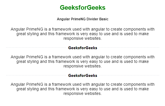
Example 2: Below is another example code that illustrates the use of Angular PrimeNG Divider Basic using align and type properties.
<div class="card text-center">
    <h2 style="color: green">GeeksforGeeks</h2>
    <h5>Angular PrimeNG Divider Basic</h5>
    <p>
        Angular PrimeNG is a framework used
        with angular to create components with
        great styling and this framework is
        very easy to use and is used to make
        responsive websites.
    </p>

    <p-divider align="center" type="dashed">
        <b>GeeksforGeeks</b>
    </p-divider>

    <p>
        Angular PrimeNG is a framework used
        with angular to create components with
        great styling and this framework is
        very easy to use and is used to make
        responsive websites.
    </p>
</div>
import { Component } from "@angular/core";

@Component({
    selector: "app-root",
    templateUrl: "./app.component.html"
})

export class AppComponent {}
import { NgModule } from "@angular/core";
import { BrowserModule }
    from "@angular/platform-browser";
import { BrowserAnimationsModule }
    from "@angular/platform-browser/animations";
import { AppComponent } from "./app.component";
import { DividerModule } from "primeng/divider";
import { ButtonModule } from "primeng/button";

@NgModule({
    imports: [
        BrowserModule,
        BrowserAnimationsModule,
        DividerModule,
        ButtonModule
    ],
    declarations: [AppComponent],
    bootstrap: [AppComponent]
})

export class AppModule { }
Output:
Reference: https://www.primefaces.org/primeng/divider