Angular PrimeNG Accordion Templates
Last Updated :
28 Apr, 2025
Angular PrimeNG is a UI component library built by PrimeTek to help out Angular developers for easing the process of developing consistent and scalable web interfaces in less time. In this article, we will talk about Accordion Templates in Angular PrimeNG.
The Accordion Component displays the content in a collection of tabs. By default, only one of the tabs of the Accordion can be opened but this can be overridden by setting the “multiple” property of the component to true. This article will show the Accordion Templating in Angular PrimeNG. The templates are used to put some content on some pre-structured containers.
Accordion templates are discussed below:
- header: This is used to place the header of the Accordion component.
- content: This is used to place the content of the Accordion component.
Creating Angular application & module installation:
Step 1: Create an Angular application using the following command.
ng new appname
Step 2: After creating your project folder i.e. appname, move to it using the following command.
cd appname
Step 3: Install PrimeNG in your given directory.
npm install primeng --save
npm install primeicons --save
Project Structure: It will look like the following:

Steps to run the application: Run the below command to see the output
ng serve --save
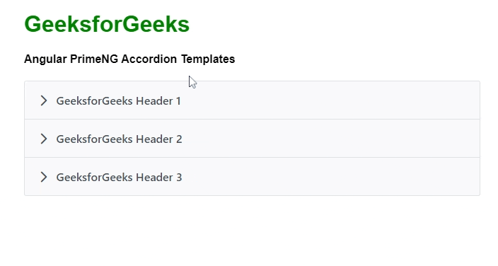
Example 1: Below is the example code that illustrates the use of Angular PrimeNG Accordion Templates using pTemplate="header".
HTML
<h1 style="color:green;">GeeksforGeeks</h1>
<h4> Angular PrimeNG Accordion Templates </h4>

<p-accordion>
    <p-accordionTab>
        <ng-template pTemplate="header">
            GeeksforGeeks Header 1
        </ng-template>
    </p-accordionTab>

    <p-accordionTab>
        <ng-template pTemplate="header">
            GeeksforGeeks Header 2
        </ng-template>
    </p-accordionTab>
    <p-accordionTab>
        <ng-template pTemplate="header">
            GeeksforGeeks Header 3
        </ng-template>
    </p-accordionTab>
</p-accordion>
import { Component } from '@angular/core';

@Component({
    selector: 'app-root',
    templateUrl: './app.component.html'
})

export class AppComponent { }
import { NgModule } from '@angular/core';
import { BrowserAnimationsModule }
    from '@angular/platform-browser/animations';
import { AppComponent }   from './app.component';
import { AccordionModule } from 'primeng/accordion';

@NgModule({
    imports: [
        BrowserAnimationsModule,
        AccordionModule,
    ],
    declarations: [ AppComponent ],
    bootstrap:    [ AppComponent ]
})

export class AppModule { }
Output:
Example 2: Below is another example code that illustrates the use of Angular PrimeNG Accordion Templates using pTemplate="content".
HTML
<h1 style="color:green;">GeeksforGeeks</h1>
<h4> Angular PrimeNG Accordion Templates </h4>

<p-accordion>
    <p-accordionTab header="Geeks 1">
        <ng-template pTemplate="content">
            GeeksforGeeks Content 1
        </ng-template>
    </p-accordionTab>

    <p-accordionTab header="Geeks 2" >
        <ng-template pTemplate="content">
            GeeksforGeeks Content 2
        </ng-template>
    </p-accordionTab>
    <p-accordionTab header="Geeks 3">
        <ng-template pTemplate="content">
            GeeksforGeeks Content 3
        </ng-template>
    </p-accordionTab>
</p-accordion>
import { Component } from '@angular/core';

@Component({
    selector: 'app-root',
    templateUrl: './app.component.html'
})

export class AppComponent { }
import { NgModule } from '@angular/core';
import { BrowserAnimationsModule }
    from '@angular/platform-browser/animations';
import { AppComponent }   from './app.component';
import { AccordionModule } from 'primeng/accordion';

@NgModule({
    imports: [
        BrowserAnimationsModule,
        AccordionModule,
    ],
    declarations: [ AppComponent ],
    bootstrap:    [ AppComponent ]
})

export class AppModule { }
Output:

Reference: https://primefaces.org/primeng/accordion
Similar Reads
Angular PrimeNG Accordion Selected Angular PrimeNG is an open-source framework with a rich set of native Angular UI components that are used for great styling and this framework is used to make responsive websites with very much ease. In this article, we will see how to use the Accordion Selected in Angular PrimeNG, along with unders
4 min read
Angular PrimeNG Accordion Styling Angular PrimeNG is an open-source framework with a rich set of native Angular UI components that are used for great styling and this framework is used to make responsive websites with very much ease. In this article, we will see the Angular PrimeNG Accordion Styling. An Accordion Component is used t
3 min read
Angular PrimeNG Accordion Programmatic Angular PrimeNG is an open-source framework with a rich set of native Angular UI components that are used for great styling and this framework is used to make responsive websites with very much ease. In this article, we will know how to use the Accordion Programmatic in Angular PrimeNG. We will also
4 min read
Angular PrimeNG Tree Templates Angular PrimeNG is an open-source framework with a rich set of native Angular UI components that are used for great styling and this framework is used to make responsive websites with very much ease. It provides a lot of templates, components, theme design, an extensive icon library, and much more.
4 min read
Angular PrimeNG Card Templates Angular PrimeNG is an open-source framework with a rich set of native Angular UI components that are used for great styling and this framework is used to make responsive websites with very much ease. This article will show us how to use the Card Templates in Angular PrimeNG. The Card Component is us
3 min read
Angular PrimeNG Panel Templates Angular PrimeNG is an open-source framework with a rich set of native Angular UI components that are used for great styling and this framework is used to make responsive websites with very much ease. This article will show us how to use the Panel Templates in Angular PrimeNG. The Panel Component all
4 min read
Angular PrimeNG Image Templates Angular PrimeNG is an open-source library that consists of native Angular UI components that are used for great styling and this framework is used to make responsive websites with very much ease. In this article, we will discuss Angular PrimeNG Image Templates. The Image Component is used to show an
3 min read
Angular PrimeNG Accordion Events Angular PrimeNG is an open-source framework with a rich set of native Angular UI components that are used for great styling and this framework is used to make responsive websites with very much ease. In this article, we will know Events of Accordion component in Angular PrimeNG. Accordion component
3 min read
Angular PrimeNG Dialog Templates Angular PrimeNG is an open-source framework with a rich set of native Angular UI components that are used for great styling and this framework is used to make responsive websites with very much ease. In this article, we will know how to use the Dialog Templates in Angular PrimeNG. The Dialog Compone
3 min read
Angular PrimeNG Accordion Default Angular PrimeNG is an open-source framework with a rich set of native Angular UI components that are used for great styling and this framework is used to make responsive websites with very much ease. In this article, we will see how to use the Accordion Default in Angular PrimeNG, along with underst
4 min read