MDBootstrap is a Material Design and bootstrap-based Angular UI library that is used to make attractive webpages with its seamless and easy-to-use component. In this article, we will know how to use the Forms Input Component in Angular MDBootstrap.
Forms Inputs Component allows a user to make a field in which the user can input some text, number, etc. The Forms are generally used to receive & transmit the user's data.
List of types of Form Inputs in MDBootstrap:
- button: It is used to define the clickable button in the form.
- checkbox: It is used to define a checkbox field.
- email: It is used to define a field for the email addresses.
- file: It is used to specify the file select field and add a button to choose a file for upload to the form.
- hidden: It is used to define the visibility of form elements.
- number: It is used to specify an input field for entering a number.
- password: It is used to specify the password field of an input tag.
- radio: It is used to define a Radio Button.
- range: It is used to define control for a number entered by the user.
- reset: It is used to define a reset button.
- search: It is used to define a text field that entered a search string.
- submit: It is used to define a submit button.
- tel: It is used to define a field that enters a user's telephone number.
- text: It is used to define a single-line text field.
- textarea: It is used to specify the one or more forms that the <Textarea> element belongs to.
Syntax:
<div class="md-form">
   <input mdbInput/>
   <label>Label:</label>
</div>
Approach:
- Download Angular MDBootstrap from the official site.
- Extract the files and change them to the working directory.
- Install npm in the current project using the following command:
npm install- After creating your project folder i.e. appname, move to it using the following command:
cd appname- Start the server using the following command:
ng serveProject Structure: After complete installation, it will look like the following:

Example 1: This is the basic example that illustrates how to use the Forms Inputs Component in Angular MDBootstrap.
Filename: app.component.html
<div id='gfg'>
    <h1>GeeksforGeeks</h1>
    <h4>Angular MDBootstrap Inputs Component</h4>
    <br />
    <div class="md-form">
        <input mdbInput placeholder="Input Text Here!" type="text" class="form-control"/>
        <label >Label:</label>
    </div>
</div>
Filename: app.component.ts
import { Component } from '@angular/core';

@Component({
  selector: 'app-root',
  templateUrl: './app.component.html',
  styleUrls: ['./app.component.css']
})
export class AppComponent {}
Filename: app.module.ts
import { BrowserModule } from "@angular/platform-browser";
import { NgModule } from "@angular/core";
import { BrowserAnimationsModule }
    from "@angular/platform-browser/animations";

import { AppComponent } from "./app.component";
import { MDBBootstrapModule } from "angular-bootstrap-md";
import { FormsModule } from "@angular/forms";

@NgModule({
  declarations: [AppComponent],
  imports: [
    BrowserModule,
    BrowserAnimationsModule,
    MDBBootstrapModule.forRoot(),
    FormsModule,
  ],
  providers: [],
  bootstrap: [AppComponent],
})
export class AppModule {}
Output:

Example 2: In this example, we will know how to make a two-way binding in the forms inputs component.
Filename: app.component.html
<div id='gfg'>
    <h1>GeeksforGeeks</h1>
    <h4>Angular MDBootstrap Inputs Component</h4>
    <br />
    <div class="md-form">
        <input mdbInput placeholder="Input Text Here!"
               [(ngModel)]="g"
               type="text"
               class="form-control"/>
        <label >Label:</label>
        <p> {{g}}</p>
    </div>
</div>
Filename: app.component.ts
import { Component } from '@angular/core';

@Component({
  selector: 'app-root',
  templateUrl: './app.component.html',
  styleUrls: ['./app.component.css']
})
export class AppComponent {
  g = '';
}
Filename: app.module.ts
import { BrowserModule } from "@angular/platform-browser";
import { NgModule } from "@angular/core";
import { BrowserAnimationsModule }
    from "@angular/platform-browser/animations";

import { AppComponent } from "./app.component";
import { MDBBootstrapModule } from "angular-bootstrap-md";
import { FormsModule } from "@angular/forms";

@NgModule({
  declarations: [AppComponent],
  imports: [
    BrowserModule,
    BrowserAnimationsModule,
    MDBBootstrapModule.forRoot(),
    FormsModule,
  ],
  providers: [],
  bootstrap: [AppComponent],
})
export class AppModule {}
Output:

Example 3: In this example, we will know how to change the size of the forms inputs component.
Filename: app.component.html
<div id='gfg'>
    <h1>GeeksforGeeks</h1>
    <h4>Angular MDBootstrap Inputs Component</h4>
    <br />
    <div class="md-form">
        <input mdbInput placeholder="Input Text Here!"
               type="text"
               class="form-control form-control-sm"/>
        <label >Label:</label>
        <input mdbInput placeholder="Input Text Here!"
               type="text"
               class="form-control form-control-lg"/>
    </div>
</div>
Filename: app.component.ts
import { Component } from '@angular/core';

@Component({
  selector: 'app-root',
  templateUrl: './app.component.html',
  styleUrls: ['./app.component.css']
})
export class AppComponent {}
Filename: app.module.ts
import { BrowserModule } from "@angular/platform-browser";
import { NgModule } from "@angular/core";
import { BrowserAnimationsModule }
    from "@angular/platform-browser/animations";

import { AppComponent } from "./app.component";
import { MDBBootstrapModule } from "angular-bootstrap-md";
import { FormsModule } from "@angular/forms";

@NgModule({
  declarations: [AppComponent],
  imports: [
    BrowserModule,
    BrowserAnimationsModule,
    MDBBootstrapModule.forRoot(),
    FormsModule,
  ],
  providers: [],
  bootstrap: [AppComponent],
})
export class AppModule {}
Output:

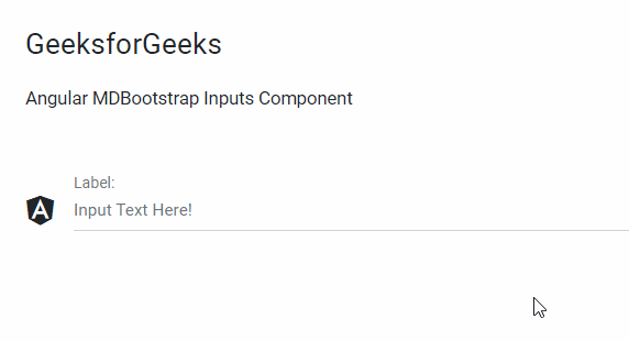
Example 4: In this example, we will know how to add icons in the forms inputs component.
Filename: app.component.html
<div id='gfg'>
    <h1>GeeksforGeeks</h1>
    <h4>Angular MDBootstrap Inputs Component</h4>
    <br />
    <div class="md-form">
        <mdb-icon fab icon="angular"
                  class="prefix"></mdb-icon>
        <input mdbInput placeholder="Input Text Here!"
               type="text"
               class="form-control" />
        <label >Label:</label>
    </div>
</div>
Filename: app.component.ts
  import { Component } from '@angular/core';
  @Component({
    selector: 'app-root',
    templateUrl: './app.component.html',
    styleUrls: ['./app.component.css']
  })
  export class AppComponent {}
Filename: app.module.ts
import { BrowserModule } from "@angular/platform-browser";
import { NgModule } from "@angular/core";
import { BrowserAnimationsModule }
    from "@angular/platform-browser/animations";

import { AppComponent } from "./app.component";
import { MDBBootstrapModule } from "angular-bootstrap-md";
import { FormsModule } from "@angular/forms";

@NgModule({
  declarations: [AppComponent],
  imports: [
    BrowserModule,
    BrowserAnimationsModule,
    MDBBootstrapModule.forRoot(),
    FormsModule,
  ],
  providers: [],
  bootstrap: [AppComponent],
})
export class AppModule {}
Output:
Example 5: In this example, we will know how to add a placeholder in the forms inputs component.
Filename: app.component.html
<div id='gfg'>
    <h1>GeeksforGeeks</h1>
    <h4>Angular MDBootstrap Inputs Component</h4>
    <br />
    <div class="md-form">
        <input mdbInput placeholder="Input Text Here!"
               type="text"
               class="form-control"/>
        <label >Label:</label>
    </div>
</div>
Filename: app.component.ts
import { Component } from '@angular/core';

  @Component({
    selector: 'app-root',
    templateUrl: './app.component.html',
    styleUrls: ['./app.component.css']
  })
  export class AppComponent {}
Filename: app.module.ts
import { BrowserModule } from "@angular/platform-browser";
import { NgModule } from "@angular/core";
import { BrowserAnimationsModule }
    from "@angular/platform-browser/animations";

import { AppComponent } from "./app.component";
import { MDBBootstrapModule } from "angular-bootstrap-md";
import { FormsModule } from "@angular/forms";

@NgModule({
  declarations: [AppComponent],
  imports: [
    BrowserModule,
    BrowserAnimationsModule,
    MDBBootstrapModule.forRoot(),
    FormsModule,
  ],
  providers: [],
  bootstrap: [AppComponent],
})
export class AppModule {}
Output:

Example 6: In this example, we will know how to add Prefilling Text Inputs in the forms inputs component.
Filename: app.component.html
<div id='gfg'>
    <h1>GeeksforGeeks</h1>
    <h4>Angular MDBootstrap Inputs Component</h4>
    <br />
    <div class="md-form">
        <input value="GeeksforGeeks"
               mdbInput placeholder="Input Text Here!"
               type="text"
         class="form-control"/>
        <label >Label:</label>
    </div>
</div>
Filename: app.component.ts
import { Component } from '@angular/core';

  @Component({
    selector: 'app-root',
    templateUrl: './app.component.html',
    styleUrls: ['./app.component.css']
  })
  export class AppComponent {}
Filename: app.module.ts
import { BrowserModule } from "@angular/platform-browser";
import { NgModule } from "@angular/core";
import { BrowserAnimationsModule }
    from "@angular/platform-browser/animations";

import { AppComponent } from "./app.component";
import { MDBBootstrapModule } from "angular-bootstrap-md";
import { FormsModule } from "@angular/forms";

@NgModule({
  declarations: [AppComponent],
  imports: [
    BrowserModule,
    BrowserAnimationsModule,
    MDBBootstrapModule.forRoot(),
    FormsModule,
  ],
  providers: [],
  bootstrap: [AppComponent],
})
export class AppModule {}
Output:

Example 7: In this example, we will know how to disable the forms inputs component.
Filename: app.component.html
<div id='gfg'>
    <h1>GeeksforGeeks</h1>
    <h4>Angular MDBootstrap Inputs Component</h4>
    <br />
    <div class="md-form">
        <input disabled mdbInput placeholder="Input Text Here!"
               type="text"
         class="form-control"/>
        <label >Label:</label>
    </div>
</div>
Filename: app.component.ts
import { Component } from '@angular/core';

  @Component({
    selector: 'app-root',
    templateUrl: './app.component.html',
    styleUrls: ['./app.component.css']
  })
  export class AppComponent {}
Filename: app.module.ts
import { BrowserModule } from "@angular/platform-browser";
import { NgModule } from "@angular/core";
import { BrowserAnimationsModule }
    from "@angular/platform-browser/animations";

import { AppComponent } from "./app.component";
import { MDBBootstrapModule } from "angular-bootstrap-md";
import { FormsModule } from "@angular/forms";

@NgModule({
  declarations: [AppComponent],
  imports: [
    BrowserModule,
    BrowserAnimationsModule,
    MDBBootstrapModule.forRoot(),
    FormsModule,
  ],
  providers: [],
  bootstrap: [AppComponent],
})
export class AppModule {}
Output:
