Angular MDBootstrap Carousel Component
Last Updated :
12 Apr, 2025
MDBootstrap is a Material Design and bootstrap-based Angular UI library that is used to make attractive webpages with its seamless and easy-to-use component. In this article, we will know how to use Carousel Component in Angular MDBootstap. The Carousel Component is used to make a slideshow that uses CSS 3D transforms and a little JavaScript to cycle through a sequence of content, based on a collection of pictures.
Properties:
- allowSwipe: It is used to allow users to use swipe gestures.
- animation: It is used to allow users to specify animation type.
- interval: It is used to show the amount of time to delay between automatically cycling an item.
- noPause: It is the no pauses in the cycling of the carousel.
- noWrap: It is used to specify whether the carousel should cycle continuously or have hard stops.
- keyboard: It is used to specify whether the carousel should react to keyboard events.
- activeSlideIndex: It is the index of the currently displayed slide.
- isControls: If set to false, the carousel won't show the next and previous buttons.
- type: It is used to allow users to specify carousel type.
Syntax:
<mdb-carousel>
    <mdb-carousel-item>
      <img src="link" alt="First slide">
   </mdb-carousel-item>
</mdb-carousel>
Approach:
- Download Angular MDBootstrap from the official site.
- Extract the files to the current working directory.
- Install npm in the current project using the following command:
npm install
- After creating your project folder i.e. appname, move to it using the following command:
cd appname
- Start the server using the following command:
ng serve
Project Structure: After complete installation, it will look like the following:
 Project Structure
Example 1: This is the basic example that illustrates how to use the Carousel component in Angular MDBootstrap.
app.component.html
<div id='gfg'>
    <h2>GeeksforGeeks</h2>
    <h4>Angular MDBootstrap Carousel Component</h4>
    <br />
    <mdb-carousel [isControls]="false">
        <mdb-carousel-item>
            <img class="w-25" src=
"https://media.geeksforgeeks.org/wp-content/uploads/20220221102734/1.jpg"
                 alt="First slide">
        </mdb-carousel-item>
        <mdb-carousel-item>
            <img class="w-25" src=
"https://media.geeksforgeeks.org/wp-content/uploads/20220221102734/2.png"
                 alt="Second slide">
        </mdb-carousel-item>
        <mdb-carousel-item>
            <img class="w-25" src=
"https://media.geeksforgeeks.org/wp-content/uploads/20220221102735/3.png"
                 alt="Third slide">
        </mdb-carousel-item>
    </mdb-carousel>
</div>
import { Component } from '@angular/core';

@Component({
  selector: 'my-app',
  templateUrl: './app.component.html',
  styleUrls: ['./app.component.css']
})
export class AppComponent{}
import { BrowserModule } from '@angular/platform-browser';
import { NgModule } from '@angular/core';
import { BrowserAnimationsModule }
    from '@angular/platform-browser/animations';

import { AppComponent } from './app.component';

import { MDBBootstrapModule } from 'angular-bootstrap-md';
import { FormsModule } from '@angular/forms';

@NgModule({
  declarations: [
    AppComponent
  ],
  imports: [
    BrowserModule,
    BrowserAnimationsModule,
    MDBBootstrapModule.forRoot(),
    FormsModule,
  ],
  providers: [],
  bootstrap: [AppComponent]
})
export class AppModule{}
Output:
 Angular MDBootstrap Carousel Component
Example 2: This example illustrates the caption addition in a Carousel Component.
app.component.html
<div id="gfg">
    <mdb-carousel>
        <mdb-carousel-item>
            <div class="view w-100">
                <img style="height: 600px;"
                     class="d-block w-100"
                     src=
"https://media.geeksforgeeks.org/wp-content/uploads/20220221104121/1.jpg"
                     alt="First slide">
                <div class="mask rgba-black-light waves-light" mdbWavesEffect>
                </div>
            </div>
            <div class="carousel-caption">
                <h3 class="h3-responsive">
                    GeeksforGeeks
                </h3>
                <p>Red</p>

            </div>
        </mdb-carousel-item>
        <mdb-carousel-item>
            <div class="view w-100">
                <img style="height: 600px;"
                     class="d-block w-100"
                     src=
"https://media.geeksforgeeks.org/wp-content/uploads/20220221104122/2.png"
                     alt="Second slide">
                <div class="mask rgba-black-light waves-light" mdbWavesEffect>
                </div>
            </div>
            <div class="carousel-caption">
                <h3 class="h3-responsive">
                    GeeksforGeeks
                </h3>
                <p>Blue</p>

            </div>
        </mdb-carousel-item>
        <mdb-carousel-item>
            <div class="view w-100">
                <img style="height: 600px;"
                     class="d-block w-100"
                     src=
"https://media.geeksforgeeks.org/wp-content/uploads/20220221104123/3.png"
                     alt="Third slide">
                <div class="mask rgba-black-light waves-light" mdbWavesEffect>
                </div>
            </div>
            <div class="carousel-caption">
                <h3 class="h3-responsive">
                    GeeksforGeeks
                </h3>
                <p>Green</p>

            </div>
        </mdb-carousel-item>
    </mdb-carousel>
</div>
import { Component } from '@angular/core';

@Component({
  selector: 'my-app',
  templateUrl: './app.component.html',
  styleUrls: ['./app.component.css']
})
export class AppComponent{}
import { BrowserModule } from '@angular/platform-browser';
import { NgModule } from '@angular/core';
import { BrowserAnimationsModule }
    from '@angular/platform-browser/animations';

import { AppComponent } from './app.component';
import { MDBBootstrapModule } from 'angular-bootstrap-md';
import { FormsModule } from '@angular/forms';

@NgModule({
  declarations: [
    AppComponent
  ],
  imports: [
    BrowserModule,
    BrowserAnimationsModule,
    MDBBootstrapModule.forRoot(),
    FormsModule,
  ],
  providers: [],
  bootstrap: [AppComponent]
})
export class AppModule{}
Output:
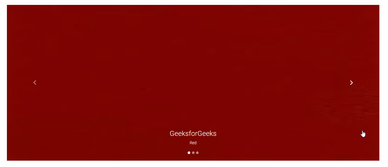 Adding a caption to the Carousel in Carousel Component