Angular PrimeNG Galleria Indicator
Last Updated :
28 Apr, 2025
Angular PrimeNG is an open-source UI component library for Angular Applications. Using the components provided by Angular PrimeNG, one can create stunning and responsive angular applications. In this article, we will see the Angular PrimeNG Galleria Indicator.
Galleria is an advanced component to display images in an attractive manner. It needs a template named item and an array of objects as the value. The use of the galleria component betters the user experience of the application. The Galleria Indicator allows users to navigate quickly through the galleria items.
Angular PrimeNG Galleria Indicator Properties:
- showIndicators: This property is used to enable/disable the indicators.
- indicatorsPosition: This property specifies the position of the indicators. There are 4 valid values: "bottom", "top", "left" and "right".
- showIndicatorsOnItem: This property specifies whether to show the indicators on the top of the item.
- changeItemOnIndicatorHover: When this is true, the galleria items will change when the user hovers over the indicator.
- value: This property accepts an array of objects to display as galleria items.
- numVisible: This property defines the number of thumbnails to show on one page.
- showThumbnails: When this is false, the galleria thumbnails will not be shown.
Angular PrimeNG Galleria Indicator Templates:
- item: The item template is used to specify how a single item galleria item will be structured.
- indicator: This template tells how a single indicator will be structured.
Syntax:
<p-galleria [value]="img"
            [showIndicators]="true"
            indicatorsPosition="top">
       ...
</p-galleria>
Creating Angular application and Installing the Modules:
- Create an Angular application using the following command.
ng new myapp
- After creating your project folder i.e myapp, move to it using the following command.
cd myapp
- Install PrimeNG in your given directory.
npm install primeng --save
npm install primeicons --save
Project Structure: After completing the above steps, the structure will look like the following:
 Project Structure
Example 1: In this example, we set the showIndicators property to true and by default, the indicators will show outside the content the current item of the galleria will change when we click on the indicators.
HTML
<h2 style="color: green">GeeksforGeeks</h2>
<h3>Angular PrimeNG Galleria Indicators</h3>

<h4>
    Indicators with Click Event
    and Outside the content
</h4>

<p-galleria [value]="img"
            [containerStyle]="{'max-width': '500px'}"
            [numVisible]="3"
            [showIndicators]="true"
            [showThumbnails]="false">
       <ng-template pTemplate="item" let-img>
              <img [src]="img.URL"
                   style="width: 100%;
                          display: block;" />
       </ng-template>
</p-galleria>
import { Component } from '@angular/core';

interface GalleriaImage {
    URL: String;
}

@Component({
    selector: 'app-root',
    templateUrl: './app.component.html',
})
export class AppComponent {
    img: GalleriaImage[] = [];

    ngOnInit() {
        this.img = [
            {
                URL:
'https://media.geeksforgeeks.org/wp-content/uploads/20220927235505/eximg1.gif',
            },
            {
                URL:
'https://media.geeksforgeeks.org/wp-content/uploads/20220927235504/eximg2-300x157.png',
            },
            {
                URL:
'https://media.geeksforgeeks.org/wp-content/uploads/20220927235504/eximg3-300x157.png',
            },
            {
                URL:
'https://media.geeksforgeeks.org/wp-content/uploads/20220927235503/eximg4-300x157.png',
            },
            {
                URL:
'https://media.geeksforgeeks.org/wp-content/uploads/20220927235501/eximg5-300x157.png',
            },
        ];
    }
}
import { NgModule } from '@angular/core';
import { BrowserModule }
    from '@angular/platform-browser';
import { BrowserAnimationsModule }
    from '@angular/platform-browser/animations';
import { AppComponent } from './app.component';
import { GalleriaModule } from 'primeng/galleria';

@NgModule({
    imports: [
        BrowserModule,
        BrowserAnimationsModule,
        GalleriaModule
    ],
    declarations: [AppComponent],
    bootstrap: [AppComponent],
})
export class AppModule { }
Output:

Example 2: In this example, the changeItemOnIndicatorHover property is set to true to change the galleria item when we hover over the indicators and the showIndicatorsOnItem property is also set to true to show the indicators on the top of the content.
HTML
<h2 style="color: green">GeeksforGeeks</h2>
<h3>Angular PrimeNG Galleria Indicators</h3>

<h4>
     Indicators with Hover Event
     and Inside the content
</h4>

<p-galleria [value]="img"
            [containerStyle]="{'max-width': '500px'}"
            [numVisible]="3"
            [changeItemOnIndicatorHover]="true"
            [showIndicatorsOnItem]="true"
            [showIndicators]="true"
            [showThumbnails]="false">

       <ng-template pTemplate="item" let-img>
              <img [src]="img.URL"
                   style="width: 100%;
                          display: block;" />
       </ng-template>
</p-galleria>
import { Component } from '@angular/core';

interface GalleriaImage {
    URL: String;
}

@Component({
    selector: 'app-root',
    templateUrl: './app.component.html',
})
export class AppComponent {
    img: GalleriaImage[] = [];

    ngOnInit() {
        this.img = [
            {
                URL:
'https://media.geeksforgeeks.org/wp-content/uploads/20220927235505/eximg1.gif',
            },
            {
                URL:
'https://media.geeksforgeeks.org/wp-content/uploads/20220927235504/eximg2-300x157.png',
            },
            {
                URL:
'https://media.geeksforgeeks.org/wp-content/uploads/20220927235504/eximg3-300x157.png',
            },
            {
                URL:
'https://media.geeksforgeeks.org/wp-content/uploads/20220927235503/eximg4-300x157.png',
            },
            {
                URL:
'https://media.geeksforgeeks.org/wp-content/uploads/20220927235501/eximg5-300x157.png',
            },
        ];
    }
}
import { NgModule } from '@angular/core';
import { BrowserModule }
    from '@angular/platform-browser';
import { BrowserAnimationsModule }
    from '@angular/platform-browser/animations';
import { AppComponent } from './app.component';
import { GalleriaModule } from 'primeng/galleria';

@NgModule({
    imports: [
        BrowserModule,
        BrowserAnimationsModule,
        GalleriaModule
    ],
    declarations: [AppComponent],
    bootstrap: [AppComponent],
})
export class AppModule { }
Output:

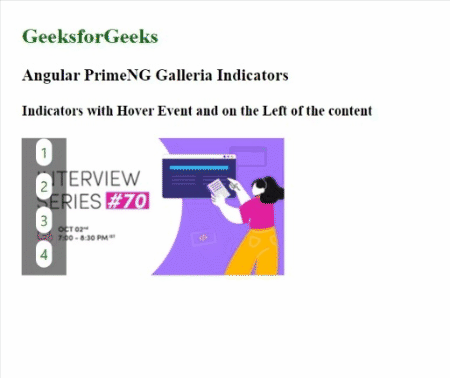
Example 3: In this example, we set the indicatorsPosition property to the left to show the indicators on the left of the content and used the indicator template to show custom indicators.
HTML
<h2 style="color: green">GeeksforGeeks</h2>
<h3>Angular PrimeNG Galleria Indicators</h3>

<h4>
    Indicators with Hover Event
    and on the Left of the content
</h4>

<p-galleria [value]="img"
            [containerStyle]="{'max-width': '500px'}"
            [numVisible]="3"
            [changeItemOnIndicatorHover]="true"
            [showIndicatorsOnItem]="true"
            [showIndicators]="true"
            indicatorsPosition="left"
            [showThumbnails]="false">

       <ng-template pTemplate="item" let-img>
              <img [src]="img.URL"
                   style="width: 100%;
                          display: block;" />
       </ng-template>

       <ng-template pTemplate="indicator" let-i>
              <div style="background: white;
                          padding: 5px;
                          border-radius: 10px">
                     <span style="color: green;
                                  cursor: pointer">
                            {{i + 1}}
                     </span>
              </div>
       </ng-template>
</p-galleria>
import { Component } from '@angular/core';

interface GalleriaImage {
    URL: String;
}

@Component({
    selector: 'app-root',
    templateUrl: './app.component.html',
})
export class AppComponent {
    img: GalleriaImage[] = [];

    ngOnInit() {
        this.img = [
            {
                URL:
'https://media.geeksforgeeks.org/wp-content/uploads/20220927235504/eximg2-300x157.png',
            },
            {
                URL:
'https://media.geeksforgeeks.org/wp-content/uploads/20220927235504/eximg3-300x157.png',
            },
            {
                URL:
'https://media.geeksforgeeks.org/wp-content/uploads/20220927235503/eximg4-300x157.png',
            },
            {
                URL:
'https://media.geeksforgeeks.org/wp-content/uploads/20220927235501/eximg5-300x157.png',
            },
        ];
    }
}
import { NgModule } from '@angular/core';
import { BrowserModule }
    from '@angular/platform-browser';
import { BrowserAnimationsModule }
    from '@angular/platform-browser/animations';
import { AppComponent } from './app.component';
import { GalleriaModule } from 'primeng/galleria';

@NgModule({
    imports: [
        BrowserModule,
        BrowserAnimationsModule,
        GalleriaModule
    ],
    declarations: [AppComponent],
    bootstrap: [AppComponent],
})
export class AppModule { }
Output:
Reference: https://primefaces.org/primeng/galleria/indicator
Similar Reads
Carousel Component
Angular PrimeNG Carousel ComponentAngular PrimeNG is an open-source framework with a rich set of native Angular UI components that are used for great styling and this framework is used to make responsive websites with very much ease. It provides a lot of templates, components, theme design, an extensive icon library, and much more.
5 min read
Angular PrimeNG Carousel BasicAngular PrimeNG is an open-source framework with a rich set of native Angular UI components that are used for great styling and this framework is used to make responsive websites with very much ease. This article will show us how to use Basic Carousel in Angular PrimeNG. Angular PrimeNG Basic Carous
4 min read
Angular PrimeNG Carousel VerticalAngular PrimeNG is an open-source framework with a rich set of native Angular UI components that are used for great styling and this framework is used to make responsive websites with very much ease. This article will show us how to use Basic Carousel in Angular PrimeNG. Angular PrimeNG Basic Carous
4 min read
Angular PrimeNG Carousel Items Per Page and Scroll ItemsAngular PrimeNG is an open-source framework with a rich set of native Angular UI components that are used for great styling and this framework is used to make responsive websites with very much ease. This article will show us how to use Carousel in Angular PrimeNG. Angular PrimeNG Basic Carousel is
4 min read
Angular PrimeNG Carousel ResponsiveAngular PrimeNG is an open-source framework with a rich set of native Angular UI components that are used for great styling and this framework is used to make responsive websites with very much ease. This article will show us how to use Basic Carousel in Angular PrimeNG. Angular PrimeNG Basic Carous
4 min read
Angular PrimeNG Carousel Header and FooterAngular PrimeNG is an open-source framework with a rich set of native Angular UI components that are used for great styling and this framework is used to make responsive websites with very much ease. This article will show us how to use Basic Carousel in Angular PrimeNG. Angular PrimeNG Basic Carous
4 min read
Angular PrimeNG Carousel OrientationAngular PrimeNG is an open-source framework with a rich set of native Angular UI components that are used for great styling and this framework is used to make responsive websites with very much ease. This article will show us how to use Carousel in Angular PrimeNG. Angular PrimeNG Basic Carousel is
4 min read
Angular PrimeNG Carousel AutoPlay and CircularAngular PrimeNG is an open-source framework with a rich set of native Angular UI components that are used for great styling and this framework is used to make responsive websites with very much ease. This article will show us how to use Basic Carousel in Angular PrimeNG. Angular PrimeNG Basic Carous
4 min read
Angular PrimeNG Carousel PropertiesAngular PrimeNG is an open-source framework with a rich set of native Angular UI components that are used for great styling and this framework is used to make responsive websites with very much ease. It provides a lot of templates, components, theme design, an extensive icon library, and much more.
4 min read
Angular PrimeNG Carousel EventsAngular PrimeNG is an open-source framework with a rich set of native Angular UI components that are used for great styling and this framework is used to make responsive websites with very much ease. It provides a lot of templates, components, theme design, an extensive icon library, and much more.
4 min read
Angular PrimeNG Carousel TemplatesAngular PrimeNG is an open-source framework with a rich set of native Angular UI components that are used for great styling and this framework is used to make responsive websites with very much ease. It provides a lot of templates, components, theme design, an extensive icon library, and much more.
4 min read
Angular PrimeNG Carousel StylingAngular PrimeNG is an open-source framework with a rich set of native Angular UI components that are used for great styling and this framework is used to make responsive websites with very much ease. It provides a lot of templates, components, theme design, an extensive icon library, and much more.
4 min read
Galleria Component
Angular PrimeNG Galleria ComponentAngular PrimeNG is an open-source framework with a rich set of native Angular UI components that are used for great styling and this framework is used to make responsive websites with very much ease. In this article, we will be seeing Angular PrimeNG Galleria Component. Angular PrimeNG Galleria is a
6 min read
Angular PrimeNG Galleria DocumentaionAngular PrimeNG is an open-source framework with a rich set of native Angular UI components that are used for great styling and this framework is used to make responsive websites with very much ease. In this article, we will see Angular PrimeNG Galleria Component. The Galleria in Angular PrimeNG is
4 min read
Angular PrimeNG Galleria ProgrammaticAngular PrimeNG is an open-source framework with a rich set of native Angular UI components that are used for great styling and this framework is used to make responsive websites with very much ease. In this article, we will see the Angular PrimeNG Galleria Programmatic. The Galleria is an advanced
4 min read
Angular PrimeNG Galleria IndicatorAngular PrimeNG is an open-source UI component library for Angular Applications. Using the components provided by Angular PrimeNG, one can create stunning and responsive angular applications. In this article, we will see the Angular PrimeNG Galleria Indicator. Galleria is an advanced component to di
5 min read
Angular PrimeNG Galleria ThumbnailAngular PrimeNG is an open-source UI component library for Angular Applications. Using the components provided by Angular PrimeNG, one can create stunning and responsive angular applications. In this post, we will see Angular PrimeNG Galleria Thumbnail. Galleria is an advanced component to display i
5 min read
Angular PrimeNG Galleria NavigatorAngular PrimeNG is an open-source UI component library for Angular Applications. Using the components provided by Angular PrimeNG, one can create stunning and responsive angular applications. In this article, we will see Angular PrimeNG Galleria Navigator. Galleria is an advanced component to displa
4 min read
Angular PrimeNG Galleria ResponsiveAngular PrimeNG is an open-source framework with a rich set of native Angular UI components that are used for great styling and this framework is used to make responsive websites with very much ease. In this article, we will see the Angular PrimeNG Galleria Responsive. Galleria in Angular PrimeNG is
4 min read
Angular PrimeNG Galleria FullScreenAngular PrimeNG is an open-source UI component library for Angular Applications. Using the components provided by Angular PrimeNG, one can create stunning and responsive angular applications. In this post, we will see Angular PrimeNG Galleria FullScreen. Galleria is an advanced component to display
4 min read
Angular PrimeNG Galleria AutoPlayAngular PrimeNG is an open-source UI component library for Angular Applications. Using the components provided by Angular PrimeNG, one can create stunning and responsive angular applications. In this article, we will see Angular PrimeNG Galleria AutoPlay. Galleria is an advanced component to display
3 min read
Angular PrimeNG Galleria CaptionAngular PrimeNG is an open-source UI component library for Angular Applications. Using the components provided by Angular PrimeNG, one can create stunning and responsive angular applications. In this post, we will see Angular PrimeNG Galleria Caption. Galleria is an advanced component to display ima
4 min read
Image Component
Angular PrimeNG Image ComponentAngular PrimeNG is an open-source framework with a rich set of native Angular UI components that are used for great styling and this framework is used to make responsive websites with very much ease. It provides a lot of templates, components, theme design, an extensive icon library, and much more.
4 min read
Angular PrimeNG Image BasicAngular PrimeNG is an open-source UI component library for Angular Applications. Using the components provided by Angular PrimeNG, one can create stunning and responsive angular applications. In this post, we will see Angular PrimeNG Image Basic. The Image component is used to show a single image to
3 min read
Angular PrimeNG Image PreviewAngular PrimeNG is an open-source UI component library for Angular Applications. Using the components provided by Angular PrimeNG, one can create stunning and responsive angular applications. In this post, we will see Angular PrimeNG Image Preview. The Image component is used to show a single image
3 min read
Angular PrimeNG Image Indicator TemplatingAngular PrimeNG is an open-source UI component library for Angular Applications. Using the components provided by Angular PrimeNG, one can create stunning and responsive angular applications. In this post, we will see Angular PrimeNG Image Indicator Templating. The Image Component is used to show a
3 min read
Angular PrimeNG Image PropertiesAngular PrimeNG is an open-source UI component library for Angular Applications. Using the components provided by Angular PrimeNG, one can create stunning and responsive angular applications. In this article, we will see Angular PrimeNG Image Properties. The Image component is used to show a single
3 min read
Angular PrimeNG Image EventsAngular PrimeNG is an open-source framework with a rich set of native Angular UI components that are used for great styling and this framework is used to make responsive websites with very much ease. In this article, we will know how to use Angular PrimeNG Image Events. The Image Component is used t
3 min read
Angular PrimeNG Image TemplatesAngular PrimeNG is an open-source library that consists of native Angular UI components that are used for great styling and this framework is used to make responsive websites with very much ease. In this article, we will discuss Angular PrimeNG Image Templates. The Image Component is used to show an
3 min read
Angular PrimeNG Image StylingAngular PrimeNG is an open-source framework with a rich set of native Angular UI components that are used for great styling and this framework is used to make responsive websites with very much ease. It provides a lot of templates, components, theme design, an extensive icon library, and much more.
3 min read