

Matrix plots are used to visualize data in a matrix format, making it easier to identify relationships, patterns, and correlations between variables. Seaborn provides specialized matrix plots that are particularly useful for exploratory data analysis and correlation analysis.
Types of Matrix Plots
The two most commonly used matrix plots in Seaborn are
1. Heatmap
A Heatmap represents data values using different colors. Higher and lower values are displayed with varying color intensities, making patterns and correlations easier to identify.
- Correlation Analysis: Helps identify the strength and direction of relationships between numerical variables in a dataset.
- Feature Relationship Visualization: Makes it easier to understand how different features interact and influence one another.
- Missing Value Analysis: Highlights missing data patterns, helping detect incomplete or inconsistent records.
- Data Exploration: Provides a quick visual overview of the dataset, making it easier to identify trends, patterns, and anomalies.
2. Cluster Map
A Cluster Map combines a heatmap with hierarchical clustering. It automatically groups similar rows and columns together based on their similarity.
- Pattern Discovery: Helps uncover hidden structures and similarities within the data by grouping related observations together.
- Feature Grouping: Automatically clusters features with similar behavior, making relationships easier to interpret.
- Customer Segmentation: Groups customers with similar characteristics or purchasing behavior for targeted analysis and decision making.
- Gene Expression Analysis: Used in bioinformatics to identify genes with similar expression patterns and study biological relationships.
Implementation
1. Import Required Libraries
These libraries are used for data visualization.
import seaborn as sns
import matplotlib.pyplot as plt
2. Load Dataset
Loads the built-in tips dataset provided by Seaborn.
tips = sns.load_dataset("tips")
3. Create Correlation Matrix
Calculates the correlation between numerical features.
corr_matrix = tips.corr(numeric_only=True)
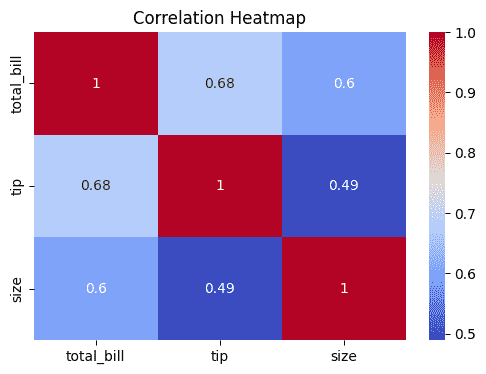
4. Plot Heatmap
- annot=True displays correlation values inside each cell.
- cmap="coolwarm" specifies the color scheme.
- Darker colors indicate stronger relationships.
plt.figure(figsize=(6,4))

sns.heatmap(
    corr_matrix,
    annot=True,
    cmap="coolwarm"
)

plt.title("Correlation Heatmap")
plt.show()
Output:
5. Plot Cluster Map
- clustermap() performs hierarchical clustering.
- Similar variables are grouped together.
- Dendrograms show the clustering hierarchy.
sns.clustermap(
    corr_matrix,
    cmap="coolwarm",
    annot=True
)

plt.show()
Output:

Download full code from here