Chart Visualizations in Excel Power View help users represent data in a clear and interactive graphical format. Power View allows users to create dynamic charts such as scatter, bubble, pie, line, bar, and column charts to analyze patterns, compare values, and understand relationships in data. These visualizations make large datasets easier to interpret and support better decision-making through interactive reports and dashboards.
The following chart visualizations are available in Power View:
- Scatter Chart
- Bubble Chart
- Pie Chart
- Line Chart
- Bar Chart
- Column Chart
Example
To create any chart follow the steps:
Step 1: First, enter data in the format shown below.

Step 2: Navigate to the Insert tab on the Excel ribbon and select the Power View option at the end of the list.

Step 3: When you select the Power View option, a power view report will be loaded and generated within the same worksheet. As illustrated in the picture below, you will have a power view report:

Step 4: Within Power View Fields, pick the Month, Quarter, and Sales Columns from the Range1 section. The ∑ sign is in the Quarter, Sales, and Percentage of Sales columns. It is present because those columns contain numeric data and may be summed.

Step 5: We will now include a graph. Navigate to the Design tab at the top of the ribbon to explore several design possibilities under the Power View Report sheet. Switch Visualization is one among them. This option allows you to include graphs in the Power View Report. Select the choice from the Other Chart.

Step 6: Select the Scatter option from the Other Chart dropdown menu.

Scatter Chart
Scatter charts are used to understand the correlation between two variables easily.
A scatter chart always has two value axes: one set of numerical data running horizontally and another set of numerical data running vertically.
Each dot in the scatter chart below represents a month, with the horizontal X axis representing the Quarter and the vertical Y axis representing Sales. Power view can distribute these data points evenly or unevenly across the horizontal axis. It is determined by the data that the chart represents.

Advantages of the Scatter Chart
- Easy to understand.
- Simple.
- It does not get affected by external data.
- It is the initial step in understanding the relationship between two variables.
Limitations of the Scatter Chart
- Non-mathematical method.
- Can't be used for more than two variables.
- It does not give results in quantitative form.
Bubble Chart
To create a Bubble Chart, follow the same steps as a Scatter Chart, but add a third numeric column to define the size of each bubble.
A bubble chart is an extension of a scatter chart used to show the relationship between three numerical variables. Each bubble represents a data point, where the X-axis shows one value, the Y-axis shows another value, and the bubble size represents the third value.

Advantages of Bubble Chart
- It can be used for the 3-Dimensional dataset.
- Different colors and sizes of bubbles attract the user.
- A bubble chart in Excel is better than a table format.
Limitations of Bubble Chart
- The overlapping of bubbles is the biggest problem.
- The size of the bubbles might confuse the user.
- It might be difficult for the user to understand as compared to other charts.
Pie Chart
To create a pie chart, follow the same steps as other charts. A pie chart is used to show the part-to-whole relationship of data. In Power View, pie charts can include features like drill-down and cross-filtering with other charts. Pie charts work best when the number of categories is 8 or fewer, as too many slices make them difficult to read

Advantages of the Pie Chart
- Summarize large data in visual form.
- More Visually appealing than other types of graphs.
- Display relative proportions of multiple classes of data.
Limitations of the Pie Chart
- It becomes less effective if too many pieces of data are used.
- It becomes complicated if more than one data set is compared, as this chart is used only for a single data set.
- This may lead to taking more time to analyze and assimilate the result.
Line Chart
Line charts is used to compare data points across multiple data series. It displays categories on the horizontal axis (such as months) and numerical values on the vertical axis..

Advantages of a Line Chart
- They are easy to draw, read and compare.
- Can be used for a huge range of data.
- It can help us to show slight change also.
Limitations of a Line Chart
- It is not suitable for plotting fractions or decimal values.
- It can only be used for data that have values in numbers and total figures for example total salary of employees.
- It can only be used for inconsistent scales on the axis, which can result in accurate data.
Bar Chart
To create a bar chart, go to the Design tab → Switch Visualization → Bar Chart → Clustered Bar.

Bar charts is used to compare values across different categories. It displays categories vertically and numerical values horizontally. In Power View, bar charts include stacked, 100% stacked, and clustered types.

Advantages of Bar Chart
- Accessible to a wide audience.
- Quick and accurate estimating results.
- Summarize a huge data set in visual form.
Disadvantages of a Bar Graph
- It does not indicate the critical activities of a project.
- Unnecessary additional information is required.
- It can't be used as a control device, as it does not show progress in the report.
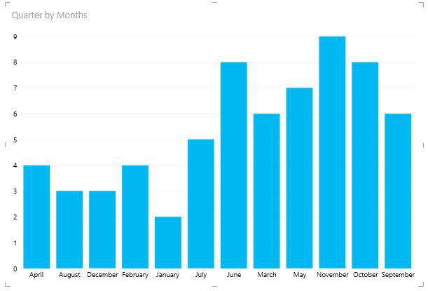
Column Chart
A column chart may be used to depict data that is organized in columns or rows on a spreadsheet. Column charts are great for displaying data changes over time or presenting comparisons between things.
Column charts include horizontal axes for categories and vertical axes for values. There are three column chart subtypes available in Power View: stacked, 100% stacked, and clustered.
The months are shown horizontally, while the numerical data is displayed vertically.
Power View's charts are interactive. When you click on a value in one of the charts in Power View, that value is highlighted, and all of the tables, matrices, and tiles in Power View are filtered to that value.
Advantages of Column Chart
- Helps when there are multiple values for each category.
- Easy to compare the values of each category.
- Useful for time series analysis.
Limitations of Column Chart
- It is difficult to understand the stack column chart as there is no common baseline for measurements.
- Key assumptions and patterns are not revealed.